
Free Visualization Software. This page gives some more explanation of what Visualize Free provides.
You can also read the Visualize Free Documentation. If you need further help, you can search and submit posts on the InetSoft User Forum under the Visualize Free heading. To be able to submit posts, please request registration using our contact form. 1. Upload You can upload your own private data... Datasets can be Excel files (both XLS and XLSX) or text (CSV and tab-delimited TXT).
Click here to create a dataset If you do not have data of your own, here are some public sources: 2. You can drag and drop components, and data fields to create an interactive dashboard... After you create a dataset, click New in the last column on the datasets page. You can also experiment with the following little sandboxes: ProductSales, US Sales, Sales Explore, Analysis These example datasets are the ones used in the Visualize Free Documentation. 3.
You can view a visualization, but the real power comes from interacting with it... Data Visualizations, Challenges, Community. Sketchpad - Online Paint/Drawing application. Introduction to Circos, Features and Uses // CIRCOS Circular Genome Data Visualization. D3.js - Data-Driven Documents. StatWorld - Interactive Maps of Open Data. Many Eyes. Many Eyes. Inkscape. Draw Freely. Online Charts Builder. Hohli Online Charts Builder New version: Try new version of Charts Builder, it based on new Google Charts API Load From Image URL: Chart Data can't equal to original, but very similar to it.

Only for images on chart.apis.google.com Chart Type: 3D Pie charts Lines Bar charts Pie charts For Pie Charts with labels choose 1000x300 or 800x375 size Venn diagrams Scatter plots Radar charts Chart Size: 320x240 Horizontal 1000x300 800x375 600x500 320x240 Vertical 300x1000 375x800 500x600 240x320 Square 546x546 400x400 300x300 200x200 Chart Ads: Data: Should be consists only positive numbers, use minus one (-1) for missing value, separated by coma, space or semi(,; ), e.g.: 23, 432, 456, 341 For Lines (pairs): Input data as x-axis and y-axis coordinates, e.g.: x1,y1, x2,y2, x3,y3 Title: Use a pipe character (|) to force a line break in title.
Background: Chart is ready you can save it as image Right click on the chart Select "Save image as" Save the image to your computer © 2011 Charts Builder. Developed by Anton Shevchuk. Examples of Gliffy Flow Charts. Flowcharts let you describe complex processes by breaking them down to their component parts and showing the relationships between people, data, processes, and objects.
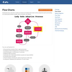
You can use flowcharts for: Documenting a decision flow or approval process Clarifying product development or production process Identifying gaps or inefficiencies in a process Mapping sales processes Ensuring clear relationships between people and responsibilities Charting cause and effect Pareto analysis (showing the relative importance of data sets) Histograms (displaying the distribution of a set of data) Drag & Drop Gliffy makes it easy to communicate complex processes and flows clearly.
Just drag and drop shapes from our symbol libraries to create professional quality flow charts. Themes & Templates Gliffy makes it easy to create well designed diagrams and charts. Collaborate & Share Whether you have a small group or need a secure workspace for an enterprise, Gliffy makes it easy to collaborate with anyone. Screenshots. DIY Chart Builder - Free online create and design charts and graphs. Diagrams Online.
Interactive mapping software from InstantAtlas™ Fizz, A Social Network Visualization on Datavisualization. Fizz is a social network visualization that provides a playful view on your own social graph and what’s currently happening.
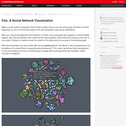
It’s one of the first two projects of the new visualization super group called Bloom. After your connect the application with Facebook or Twitter, your social graph gets mapped in a colorful bubble diagram. Big circles are people, small circles are their status updates. Unfortunately the meaning of the color is a bit cryptic. Clicking on a bubble reveals the content of the status and let’s you jump to the belonging page. While the functionality may seem limited, Ben Cerveny points out that “they [Bloom's first visualizations] are the foundations of a constant flow of ongoing iterative development”.
Bloom is focused on creating pop-cultural instruments for data expression and exploration. Wanna have your work featured here?