
New Tree Of Life Published - And Most Of The Species On It Are A Complete Mystery To Us. The addition of bacteria that have never been grown in the lab and are only known about from sequencing their DNA has radically expanded the tree of life.

These uncultivatable microbes are now thought to account for up to a third of all biodiversity, massively swamping all the species we can see and usually think make up the majority of our ecosystems. “This is the first three-domain genome-based tree to incorporate these uncultivable organisms, and it reveals the vast scope of as yet little-known lineages,” explains Jill Banfield from UC Berkeley, who co-authored the paper published in Nature Microbiology. This animated map shows how religion... - Business Insider.
10 Maps That Will Change How You View The World. Maps are one of those things you can lose yourself in for hours. Since their humble origins as scribbles in the sand thousands of millennia ago, maps have been useful companions during the development of human culture and society. Now, in an age of seemingly endless information, maps are more abundant, advanced and fascinating than ever before. Here's What London's Underground System Actually Looks Like. If you glanced at the London underground map for the first time, you probably wouldn’t think there’s much to write home about.

Color-coded lines, dots and zones: it’s pretty easy to run your finger over and work out a journey. But residents and frequenters of the city know that it’s completely inaccurate. Distance between points, and where the points are, often don’t reflect actual distances or locations with respect to other areas. Take Embankment, for example. This Is What Supercontinent Pangea Looks Like Mapped With Modern Borders.
Imagine traveling from China to Antarctica, crossing through Canada, Brazil and India – without setting foot in any water.
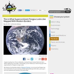
Unfortunately, you’ve missed your chance long ago as the supercontinent of Pangea no longer exists. But thanks to the illustrative talents of Massimo Pietrobon, you can see how Pangea may have looked before the epic landmass started ripping itself apart 200 million years ago to form the continents and countries of the world today. This Is What A World Map Looks Like When Scaled According To Population Size. Where in the world did Australia go?!
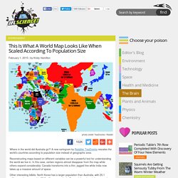
A new cartogram by Redditer TeaDranks rescales the world’s countries according to population size instead of geographic area. Reconstructing maps based on different variables can be a powerful tool for understanding the world we live in. In this case, certain regions almost disappear from the map while others expand considerably; Canada transforms into a thin, jagged line while India now takes up a massive amount of space.
Other interesting tidbits: North Korea has a larger population than Australia, with 25.1 million people compared to 23.7 million, respectively. Denmark has almost disappeared from the map compared to the mighty space it usually takes up, and China now dwarfs Russia instead of vice versa. IndoEuropeanTreeDielli1. Temperature Maps - Dedman College. The SMU temperature-at-depth maps start from the actual temperature measured in the Earth at as many sites as possible.
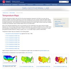
In addition, the thermal conductance of the rocks (changing as the rock minerals change with deeper depths), the area heat flow, and the rock density (sedimentary rocks are less dense than basement rocks) are used to calculate the deeper temperatures. SMU Geothermal Lab calculates temperatures at specific depth intervals using these variables to produce the temperature maps at different depth slices for the United States. Most of the measured temperatures used in the calculations are from sedimentary rocks which overlie the harder basement rock. The oil and gas industry has drilled into sedimentary rock as deep as 26,000 (ft) or 8 km in West Texas, yet more typical oil and gas drilling is 4,000 to 10,000 ft (1.2 to 3 km) depending on the depth to the resource.
Google cost searches - Business Insider. This Is The True Size Of Africa. How large is Africa compared to the United States, or Western Europe?
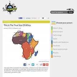
Most inhabitants of the latter places might guess it is a little larger, but few would have any idea of the scale of the difference. This has led German graphics designer Kai Krause to produce this map to shake people's perceptions a little. Kai Krause. Click to view larger. A Map Of The Loneliest Places On Earth. New Study Reveals Most Influential Languages. What makes a language important on a global scale?

Is it the oldest? The one spoken by the most people? What about the one that has the greatest ability to reach other people by being translated? Global Language Network. La carte des émotions dessinée sur le corps. Lorsque l'on ressent une émotion forte, le corps réagit de différentes façons.
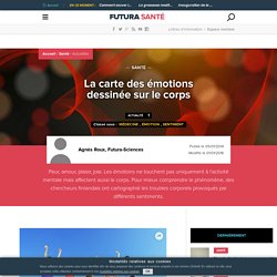
Si l'on est amoureux par exemple, on éprouve fréquemment une sensation de chaleur et un sentiment de bien-être. La peur, quant à elle, déclenche plutôt une sensibilité importante au niveau du ventre et de la poitrine. « Le système émotionnel envoie des signaux au corps qui préparent l'organisme à faire face à une situation donnée, explique Lauri Nummenmaa, une scientifique de l'université Aalto en Finlande.
Si l'on se retrouve face à un animal sauvage par exemple, l'apport d'oxygène augmente dans les muscles et le cœur se met à battre plus rapidement. » Elle poursuit : « C'est un système automatique qui se met en place sans que nous ayons besoin d'y penser, cela permet de mieux affronter la menace et de prendre rapidement ses jambes à son coup. » Ski : le top 10 des stations les plus chères et les moins chères. Challenges > Monde > Galeries Photos > Le top 10 des stations de ski les plus chères et les moins chères Le top 10 des stations de ski les plus chères et les moins chères Le top 10 des stations de ski les plus chères et les moins chères TripAdvisor s'est amusé à comparer les prix selon différents critères (hôtel, location d'équipement, forfait de ski, repas, bière) de 41 stations de ski européennes.
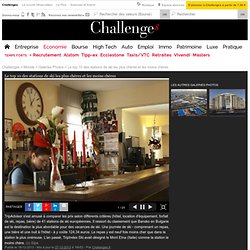
Il ressort du classement que Bansko en Bulgarie est la destination la plus abordable pour des vacances de ski. Une journée de ski - comprenant un repas, une bière et une nuit à l’hôtel - à y coûte 124,34 euros. Le repas y est neuf fois moins cher que dans la station la plus onéreuse. . - Par Challenges.fr. Earth wind map. Map of Europe: 1000 AD to present day. Flightradar24.com - Live flight tracker! Plan du métro detaille. CartoMetroParis.v3.6. Carte des prix de location à Paris. Velib.