
Untitled. Untitled. World Map - Advanced - MapChart. Untitled. Untitled. Missing Maps. Metrocosm - Data Visualization, Maps, and Statistical Analysis. * NEW * Getting to Grips with Grid References Lesson Pack - Grid. This Enlightening Map Shows the Literal Meaning of Every Country's Name. Food Editor Updated: 23 March 2018 Have you ever wondered what the name of a country means?
What it REALLY means? It shows the historical meaning of each country’s name, as far back as their earliest literal translations go. Screen Shot 2018-03-22 at 5.08.46 pm © Credit Card Compare Europe Surprisingly, a lot of factors seem to influence the name of a country, from geography to climate to wildlife. Sometimes the name is a term which describes the inhabitants of a country, such as Macedonia, which means ‘Land of Tall People’. Asia Africa South America Some countries have beautifully poetic names. Papua New Guinea, which means ‘Frizzy-Haired Men’, would surely agree with the fact that not all country names are complimentary – but France, whose name means ‘Land of the Fierce’, must be happy with their designation. Oceania North America The US might win the prize for most to-the-point name, with it meaning exactly what it says – the ‘United States of America’.
What.If - What if Flat-Earthers were right? Beginners guide to using a compass. Even with a GPS in your phone, knowing how to navigate using a map and a compass is a great life skill.
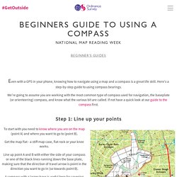
Here's a step-by-step guide to using compass bearings. We're going to assume you are working with the most common type of compass used for navigation, the baseplate (or orienteering) compass, and know what the various bit are called. PlayGround + - The world map as you know it is fake. And... More Accurate World Map Wins Prestigious Design Award. The most accurate map you'll ever see.

You probably won't like it. Authagraph You probably don’t realize it, but virtually every world map you’ve ever seen is wrong. Cross section mapwork / mapping. Harvey Maps Romer - Above and Beyond. At Above and Beyond we only sell quality goods that we would be happy to use ourselves, which in many cases we do.
We also thoroughly inspect everything and take great care when packaging your goods to ensure that they arrive in perfect condition. However, sometimes accidents happen or perhaps an item may not fit quite as expected. If you need to return an item please read below for instructions. Our 90 Days Return Policy As defined by Distance Selling Regulations the standard "cooling off period" is 7 working days after the date of receipt of goods. Map Romer Scale Grid Reference Tool - Grid Reference Tool, Navigation Aids, UNS Recommended Kit - ShavenRaspberry. Oxford Education Blog. Like most geography departments across the UK, our Year 7s complete a map skills unit within months of arriving at the school.

This year, we made it as engaging as possible, drawing lines of latitude and longitude drawn in chalk on the playground, bringing out OS maps of their local area, and using GIS to bring maps to life. More Accurate World Map Wins Prestigious Design Award. Ordnance Survey's digital map of Britain offers stunning views. This map of Earth is the most accurate ever produced, and it looks completely different. Japanese architect Hajime Narukawa claims to have tackled a centuries-old problem - how to draw an oblate spheroid Earth on a flat plane.
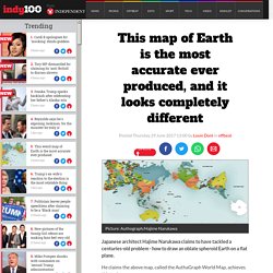
He claims the above map, called the AuthaGraph World Map, achieves this task. The projection, first created in 1999, frames the world's physical components in a 2D rectangle, attempting to represent their relative sizes as accurately as possible. Cubical Pseudoglobes. World Population Cube - Views of the World. Last November’s theme of the Super Science Saturday at the Oxford University Museum of Natural History was Planet Earth.
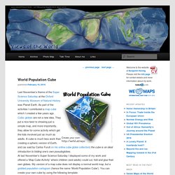
As part of the activities I contributed a map cube which I created a few years ago.Cubic globes are not a new idea. They put a nice twist to showing just a simple map, and more importantly, they allow for some activity which get the kids involved just as much as adults. A cube is much less work than creating a spheric version of Earth, and (as said by Carlos Furuti on his online cube globe collection) the cube is an ideal introduction to folding one’s own pseudoglobes. At last November’s Super Science Saturday I displayed some of my work and offered a ‘Map Cube Activity’ where children (and adults) could cut, fold and glue their own globes.
Pinterest. Danny Dorling: Maps that show us who we are (not just where we are) 17 Maps That Will Change The Way You Look At The World Forever. These 10 Maps Will Change The Way You See The World. International statistics: Compare countries on just about anything! NationMaster.com. Huffingtonpost. Word Map. This experiment brings together the power of Google Translate and the collective knowledge of Wikipedia to put into context the relationship between language and geographical space.
Please let us know if you have any suggestions. Note that not all languages are currently supported by Google Translate. To browse, just zoom in/out, pan around and click on the word to learn more. Enjoy! This Is What A World Map Looks Like When Scaled According To Population Size. Where in the world did Australia go?!
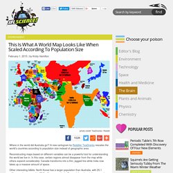
A new cartogram by Redditer TeaDranks rescales the world’s countries according to population size instead of geographic area. Reconstructing maps based on different variables can be a powerful tool for understanding the world we live in. In this case, certain regions almost disappear from the map while others expand considerably; Canada transforms into a thin, jagged line while India now takes up a massive amount of space. Other interesting tidbits: North Korea has a larger population than Australia, with 25.1 million people compared to 23.7 million, respectively. Denmark has almost disappeared from the map compared to the mighty space it usually takes up, and China now dwarfs Russia instead of vice versa. Cartography: The true true size of Africa. LAST month Kai Krause, a computer-graphics guru, caused a stir with a map entitled "The True Size of Africa", which showed the outlines of other countries crammed into the outline of the African continent.
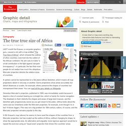
His aim was to make "a small contribution in the fight against rampant Immappancy"—in particular, the fact that most people do not realise how much the ubiquitous Mercator projection distorts the relative sizes of countries. A sphere cannot be represented on a flat plane without distortion, which means all map projections distort in one way or another. Some projections show areas accurately but distort distances or scales, for example; others preserve the shapes of countries but misrepresent their areas. You can read all the gory details on Wikipedia. Gerardus Mercator's projection, published in 1569, was immediately useful because it depicts a line of constant bearing as a straight line, which is handy for marine navigation.
Here's How Bad Corruption Is Around The World. Latitude and Longitude is Useful One Direction Remix HD. Longitude and Latitude song. Map_what_europe_would_look_like_if_all_the_separatist_movements_got_their. This article originally appeared in Business Insider.
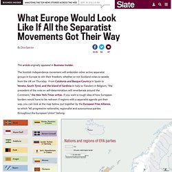
The Scottish independence movement will embolden other active separatist groups in Europe to win their freedom, whether or not Scotland votes to secede from the UK on Thursday. From Catalonia and Basque Country in Spain to Veneto, South Tyrol, and the island of Sardinia in Italy to Flanders in Belgium, "the precedent of the vote on self-determination will reverberate around the Continent," the New York Times writes. If you want a rough idea of how European borders would have to be redrawn if regions with a separatist agenda got their way, you can look at the map below, put together by the European Free Alliance, to which "40 progressive nationalist, regionalist and autonomous parties throughout the European Union" belong.
European Free Alliance.