
Fonts, Typography, Lettering, Design. Create Your Icon Fonts - Fontastic. Caractères Typographiques Pour l’Apprentissage de la Lecture. Les polices de caractères destinées à l’apprentissage de la lecture et de l’écriture, que l’on appelle communément les polices de cahier, sont largement représentées sur la toile.
Pour peu que l’on pousse la recherche au-delà des frontières de notre Éducation Nationale, l’impression vient tout à coup d’errer dans une forêt de signes ; comme l’enfant au seuil de l’apprentissage. Typography. Fonte Helvetica, 11 alternatives typographiques méconnues. La fonte Helvetica est une police de caractères sans serif populaire dans le monde entier. Les graphistes et les typographes lui louent des propriétés qu'aucune autre fonte ne peut égaler. Typo/graphic posters.
TM Research Archive. Infographiclarge_v2. Art of the Title. Font Yukle - Le premier site de la police. Home. Typeverything. FreeTypography – The best free fonts, typefaces and typography. Gibson – Canada Type. 1554 : répertoire de la scène typographique française vivante. « Là où croît le péril, croît aussi ce qui sauve. » — Friedrich Hölderlin Cela pourrait commencer ainsi : la scène typographique française est en pleine ébullition.
Comme partout pourtant, le monde de la typographie en France a été touché de plein fouet par l’avènement de la PAO (Publication Assistée par Ordinateur) au milieu des années 1980. Ce bouleversement sans précédent a fait quasiment disparaître le deuxième et le troisième corps typographiques (respectivement les compositeurs et les correcteurs, le premier étant celui des dessinateurs de caractères). Les correcteurs ont été remplacés par des logiciels et d’autres logiciels ont banalisé le métier des compositeurs.
Fonts, Wordpress themes and icons designed by Ed Merritt. Emigre Home. Font Aid IV : The Society of Typographic Aficionados. The Society of Typographic Aficionados is proud to announce the release of “Coming Together”, a font created exclusively for Font Aid IV to benefit the victims of the 2010 earthquake in Haiti.

The font consists entirely of ampersands, to represent the idea of people coming together to help one another. Type designers, graphic designers, and other artists from around the world contributed artwork to the font. The font is being be sold for $20US and is available through font distributors Ascender Fonts, Veer, and MyFonts. All proceeds from the sale of the font will go to Doctors Without Borders, to help with their relief efforts in Haiti. The “Coming Together” font contains over 400 glyphs and is supplied as a single, cross-platform OpenType font. SOTA is especially grateful to Chank Diesel who assembled the final font.
Thanks to all the contributors! Nearly 400 designers contributed to “Coming Together”: These designers represented the following countries: Spread the word! Characters Font Foundry { Shizzle Blackbelt Kungfu Typography } Minimalism, Typography, Modernism. Gazette. Typographie et valeurs sémantiques, décryptage des courants graphiques et typographiques. Actualités, histoire, théorie, pour tous les amateurs de typographie et les typographes-amateurs… Typography Daily. Typographica. Type Reviews, Books, Commentary. FontLists. Fonts, buy fonts, download fonts. Parcourir les typos, Tester des typos, Télécharger des typos, Acheter des typos. Polices à télécharger. Téléchargez vos fontes, de plus classique à plus cool – Linotype.com.
Die 100 Besten Schriften. Handpicked free fonts for graphic designers with commercial-use licenses. Lost Type Co-op. On snot and fonts. May 2012 Showcase. P22 Type Foundry. Typotheque type foundry - high quality fonts for print and web. ITCFonts.com. By far, the most influential and successful type foundry of the 1970s and well into the 1980s was International Typeface Corporation.
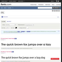
For nearly four decades, ITC has designed and marketed typefaces to creative professionals. The ITC® Library – comprised of more than 1,650 designs – features the work of world-class typeface designers. Some of ITC’s most esteemed designs include the ITC Avant Garde Gothic family – a typeface designed by Tom Carnase based upon Herb Lubalin’s logo for Avant Garde magazine – as well as the ITC Berkeley Oldstyle design, a revival of Fredric Goudy’s serifed custom typeface for the University of California Press at Berkley.
Other watershed revivals include the handsome ITC Garamond and robust ITC Franklin Gothic families. The ethos driving International Typeface Corporation’s formation is as profound as the typefaces they produce: ITC began as Lubalin, Burns & Co and called itself “the first typo-graphics agency.” Jobs poured into the company. Type at work in the real world. Butterick’s Practical Typography. Download Spree: 45 Free Fonts for Designers. Selecting the right typeface for a projects isn’t an easy task.
With thousands of fonts available, finding the right one to fit your style is like digging for gold. Among the design community, we’ve seen a huge fluctuation of type foundries releasing stunning fonts at the sweet price of zero dollars. Typerepublic: the republic of type. MyFonts: Webfonts & Desktop Fonts. Tiff - a visual typeface diff tool. Fountain. Jacob Cass - Graphic Designer - New York, USA. Jacob Cass at TEDxCMU, giving a talk on Personal Branding.

Hi, my name is Jacob Cass and I am the founder of ‘JUST™ Creative’. On this website you will find my personal graphic design portfolio (My design services are currently available for hire), as well as a blog on the main subject of graphic design which provides free graphic design tips, articles & resources on all subjects of design, ranging from but not limited to; print design, logo design, web design, branding, typography, advertising & more.
There is a lot of information on this page so please feel free to jump through using the menu below. About Page Sub Navigation: Comic Sans Criminal - There's help available for people like you! Fonts, typefaces and all things typographical — I love Typography (ILT) Exljbris Font Foundry. Typographic Marks Unknown. There are many typographic marks which are familiar to most, but understood by few.

Most of these glyphs have interesting histories and evolutions as they survived the beatings given to them through rushed handwriting of scribes and misuses through history. They now mostly live on our keyboards and in our software, and a few are used often, so it seems only fitting to know where they come from and how to correctly use them. The Pilcrow History of the Pilcrow Replacing another symbol, the paragraphos, to become the new mark representing a paraph—a new line of thought or break in text—it evolved over time through the natural development of handwriting. Using the Pilcrow Initially the pilcrow was used to separate blocks of text, rather than dividing them with space.
While graphic designers, and especially those outside the field, would have no major need to think about using the pilcrow, it is worth noting that they can be a pleasure to design for our typographic friends. The Ampersand Asterisk. Typetype™ - fonts by signalgrau designbureau.