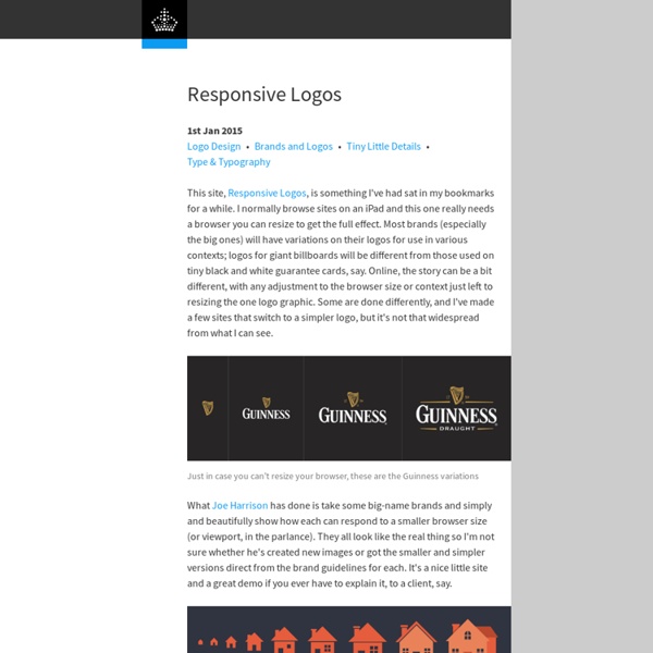
Edward Tufte’s “Slopegraphs”
After you read this post, you’ll probably want to check out the follow-up, A Slopegraph Update. Back in 2004, Edward Tufte defined and developed the concept of a “sparkline”. Odds are good that — if you’re reading this — you’re familiar with them and how popular they’ve become.
Mixing Fonts
A palette with wit Use typefaces with complementary moods to evoke an upbeat, energetic air. It’s the interplay between fonts that gives them energy.
LettError
These are some resources about Gerrit Noordzij. TDC Award 2013 Gerrit’s words [PDF] after receiving the TDC Medal on October 10, 2013. Stamps The Kat Ran Press keeps a nice collection of the stamps designed by Gerrit Noordzij.
The Darling Tree
Now you’ve had a chance to explore The Darling Tree & learn a bit more about working with me, it’s time to start your gorgeous adventure. what you need to know to get started. Being the one and only designer in the business and striving to keep a high quality of work and good relationships with clients, I am only able to take on one or two new projects each month. As the rest of 2013 is mostly full, I will soon be planning out projects for 2014. Please understand that if you require a designer urgently or within a few weeks, unfortunately I may not be available.
Five simple steps to better typography
– April 13th, 2005 – Typography, I find, is still a bit of mystery to a lot of designers. The kind of typography I’m talking about is not your typical “What font should I use” typography but rather your “knowing your hanging punctuation from your em-dash” typography. Call me a little bit purist but this bothers me. So, in an attempt to spread the word here’s the first of five simple steps to better typography. To kick it off, part one is about the Measure.
TypeRadio
December 2013, Typeradio held a two day workshop in cooperation with Indra Kupferschmid and 10 students of the Hochschule der Bildenden Künste (HBK Saar) in Saarbrücken, Germany. Each student was assigned a typeface, designed by a Dutch designer, along with the assignment: ‘translate the typeface into a one minute sound piece’.
 The resulting 10 sound pieces were the starting point of another workshop, in collaboration with Jan Willem Stas and the students of the Type]Media 2014 typography master coarse in The Hague, The Netherlands. Each T]M student was handed an (anonymously labelled) sound piece and their challenge was to ‘create a typeface concept inspired by the sound’. The results were quite surprising! 1) Original typeface: Neutral by Kai Bernau 2) Sound piece by Maria Sieradzki 3) Chinese whispered typeface by James Taylor Edmondson
I remember a conversation from back in my student days where my typophile friends and I debated what the ultimate typeface of the twentieth century was, a typeface that summed up all of the era’s advancements and knowledge into a coherent whole, one that would be a reference for years to come. Helvetica was one of the candidates for its sheer ubiquity, proof of its overall acceptance. Another, more subtle proposal was Jan van Krimpen’s Romulus, one of the first typefaces to have related Sans and Serif versions. And another, my personal pick, was Univers by Adrian Frutiger.
Cover Story: Bat for Lashes
Across 2006’s Fur and Gold and 2009’s Two Suns, much of Khan’s mystic brand of pop involved a tension between open-hearted sympathy and something more rogue, her guileless voice keeping the flights of fancy just earthward enough. She wants the new album to sound like “an inventor living in a lighthouse” somewhere on the English coast. Twist your ear the right way and you can sort of hear it: that salt-washed, weathered, mechanical, isolated, magical, guiding feel, looking to a man whose purpose is to generate beams of light as well as light-bulb moments. Khan wrote a song about a lighthouse keeper of sorts for The Haunted Man, though it didn’t make the final record. Hopefully she’ll release it one day, as the concept is bewitching: She imagined being the wife of Dutch sculptor Theo Jansen, best known as the creator of enormous, animal-like, moving structures dubbed Strandbeests. Eventually, the songs started to come, often arriving fully formed, within an hour.
Vox-ATypI classification
In typography, the Vox-ATypI classification makes it possible to classify typefaces in eleven general classes. Devised by Maximilien Vox in 1954, it was adopted in 1962 by the Association Typographique Internationale (ATypI) and in 1967 as a British Standard, as British Standards Classification of Typefaces (BS 2961:1967), which is a very basic interpretation of the earlier Vox-ATypI classification. Originally a ten-part classification, Vox revised his original proposal within months to a more compact nine-part scheme.