
Database of Dimensioned Drawings. The Wisdom and/or Madness of Crowds. Besides the NASA Challenger explosion, the most notorious example of groupthink was the Bay of Pigs fiasco. In 1961, US President John F. Kennedy and his team of advisors thought — for some reason — it would be a good idea to secretly invade Cuba and overthrow Fidel Castro. They failed. Actually, worse than failed: it led to the Cuban Missile Crisis of 1962, the closest the world had ever been to full-scale nuclear war.
Werner’s Nomenclature of Colours. DataViz Cheatsheet. Reality, Representation, and the Search for Meaning: Argentine Artist Mirtha Dermisache’s Invented Graphic Languages. IBM Design Language. WYSIWYG HTML Editor, Design Blocks, Website Page Builder. Mashrooi. Augmented Intelligence (AI) Software – CognitiveScale. Argodesign - Product Design, Experience, & Innovation Firm. This Is The World’s First Graphical AI Interface. Machine learning and artificial intelligence are so difficult to understand, only a few very smart computer scientists know how to build them.
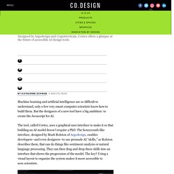
But the designers of a new tool have a big ambition: to create the Javascript for AI. The tool, called Cortex, uses a graphical user interface to make it so that building an AI model doesn’t require a PhD. The honeycomb-like interface, designed by Mark Rolston of Argodesign, enables developers–and even designers–to use premade AI “skills,” as Rolston describes them, that can do things like sentiment analysis or natural language processing. They can then drag and drop these skills into an interface that shows the progression of the model. The key? 'The Last Jedi''s User Interfaces Aren't Just Cool-Looking. Art Museum Virtual Collections.
Design Systems Handbook - DesignBetter.Co. THE LOOP: a documentary on IBM design thinking. IBM's new tools and practices for software design Russell Parrish and Bobby Smith of IBM discuss new tools and practices the company uses to create enterprise leading software—including agile practices and improving workflow handoffs.
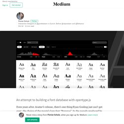
View the Webinar Go inside the design language driving design transformation at IBM A couple of the creators behind IBM's design language talked to us about the challenges of creating a flexible—and scalable—language capturing IBM's unique brand. Read the Article. Presentation Design: A Visual Guide to Creating Beautiful Slides. What You Call a Color Depends on How You Use It. The Anatomy of a Thousand Typefaces – Florian Schulz. Even years after Avatar’s release, there’s one thing Ryan Gosling just can’t get over: the choice of the movie’s logo font “Papyrus”.
In the parody produced by Saturday Night Live, the designer of the logo opens the font menu, browses the fonts one by one, and randomly decides to go with “Papyrus”. The seemingly mindless choice of a font is a general problem with font menus: there are either too few or too many options. On one hand, a limitation to system fonts, as seen in the video, can lead to a bad choice because there simply isn’t something better installed. On the other hand, web font libraries with hundreds or thousands of fonts can be quite overwhelming and lead to a paradox of choice. Dinner for none: The font menu’s bitter taste. The Anatomy of a Thousand Typefaces. A Five Minutes Guide to Better Typography. Color-Coding to Make Dense Information Feel Less Complicated. 35 Innovative User Interface Examples - Xerox. Interfaces are where humans touch technology.
They provide smarter ways to use simple things and simpler ways to use smart things. Interfaces release the potential of complex systems and technologies to the users who need them. Useful resources and inspiration for creative minds. Design thinking, where it came from and the types of people who made it all happen. As a final note I would like to acknowledge some of the women of design thinking I have found on my obscure hunts through white papers and internet searches.
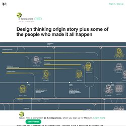
I am convinced that there are more. Help me find them. Angelika Dilschmann, Ewa Gunnarsson, Susanne Bødker, Kerstin Frenckner, Caroline Nordquist, Kerstin Severinson Eklundh from Project Utopia. Constance Abernathy was a trained architect that directed Buckminster Fuller’s office in New York and then founded a private architecture firm.
Ruth Asawa who won the First Dymaxion Award for Artist/Scientist, and attended Black Mountain College. IBM Design Language. IBM Design: design in motion. 39 studies about human perception in 30 minutes – kennedy elliott – Medium. Bars and pies for proportions.
A Visual Dictionary of Philosophy: Major Schools of Thought in Minimalist Geometric Graphics. By Maria Popova Rodin believed that his art was about removing the stone not part of the sculpture to reveal the essence of his artistic vision.
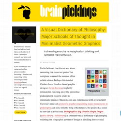
Perhaps this is what Catalan-born, London-based graphic designer Genis Carreras implicitly intended in chiseling away the proverbial philosopher’s stone to sculpt its minimalist essence. Many moons ago, I discovered with great delight Carreras’s series of geometric graphics explaining major movements in philosophy and now, with the help of Kickstarter, the project has come to new life in book form.
Philographics: Big Ideas in Simple Shapes (public library | IndieBound) is a vibrant visual dictionary of philosophy, enlisting the telegraphic powers of design in distilling the essential principles of 95 schools of thought into visual metaphors and symbolic representation. Carreras writes: Common Speaking Mistakes To Avoid. Whenever I go to academic conferences, I have to sit through some terrible talks. It continues to amaze me that so many people make mistakes that are so easy to avoid.
Here are a few I noticed just in the last two days. Spend first two minutes apologizing I understand the impulse to apologize. The Best Presentations of 2016. Every December, we look back at the last 12 months and handpick some of our favorite SlideShares published during the previous year.

From humorous presentations that make dry subjects more digestible, to ones that weave compelling narratives, these slide decks provide valuable nuggets of advice for all those looking to start the new year with a bang. To make sure there’s something for everyone, we organized our Best Presentations of 2016 into a variety of categories, awards-ceremony style. And the Oscar goes to… Best Presentations on Future Trends. Tubik Studio. Medium’s Best Design Writing of 2016 – The Startup – Medium. Creative, insightful, helpful, and actionable; we’ve curated and categorized 75 of Medium’s best design posts from the past year.
Enjoy! See Medium’s Best Design Writing of 2015. Approaches to the Creative Process. Log In. In the Architecture School at Milan Polytechnic in the late 1980s, to lecture halls packed to the gills like a Milan A.C. championship final, the great Achille Castiglioni would extol redesign as an indispensable duty of any professional designer.
In his view, anything — designed by anybody, in any part of the world, at any time, no matter how brilliant its initial conception — was fair game in a process of progressive update and refinement carried out for the benefit of the entire society. Get Inspired With These Data Visualisations. These days, if you can’t show your data in a visually intuitive way, it’s essentially useless. No one is going to spend a long time on a web page trying to interpret data. Figma: the collaborative interface design tool. MinnPost Styles. Welcome to MinnPost Styles, a super-fly, style guide focused on interactive and news applications made by the MinnData team. A work in progress. About MinnPost Styles is a CSS and JS framework. The CSS source is written in SASS and is extendable if you want to include the framework via SASS.
Dataviz-style-guide/Sunlight-StyleGuide-DataViz.pdf at master · amycesal/dataviz-style-guide. Urban Institute Data Visualization style guide. Urban's main colors are cyan, gray, and black. Yellow and magenta are used as secondary colors throughout the new Urban brand. Teriary colors for graphics include space gray, green, and red, and should be used infrequently. Style Guides. Qualitative Chart Chooser. Colorgorical. To generate a palette with n colors, just enter the number of colors you want and click Generate. The Graphic Continuum - ScribbleLive. The Graphic Continuum. Revolutionary User Interfaces. Why Sketch is more powerful with a Prototyping buddy — Design + Sketch App. Visme Introduces 50 Beautiful Color Combination Presets. 50 Beautiful Color Combinations (And How to Apply Them to Your Designs)
Science Fiction Interfaces. Paletton - The Color Scheme Designer. Vaadin – User Interface Components for business apps. Entypo - 250+ carefully crafted pictograms. RHSD - Innovation with Color. This post imbues the importance of innovation with color in data visualization, offers a variety of resources and reference materials, and encourages personal innovation with color as absolutely vital to moving your visual communication of data forward in Tableau. The effective use of color is fundamental to the visual communication of data. As our eyes take in color, they communicate with the hypothalamus, which in turn signals the pituitary gland. Then, on to the endocrine system, the thyroid gland signals the release of hormones. Those hormones influence BEHAVIORS and EMOTIONS. Color is so powerful, in fact, that the effective use of color can improve learning by 75% and increase comprehension by up to 73%. 1.
Leveraging Color to Improve Your Data Visualization. Tableau Public. Choosing Colors for Accessibility. The Psychology of Color. Color Theory Do’s and Don’ts for Data Visualization. Introduction - Material design - Google design guidelines. ACM Interactions. How Colors in Business Dashboards Affect Users' Decision Making. Stereotropes - tropes. Design and Redesign. ColorBrewer: Color Advice for Maps. How We Created Color Scales — Interactive Things — Medium. TeachingToSee. The Encyclopedia of Human-Computer Interaction, 2nd Ed. Design and Redesign.