
Mapping Segregation in American Schools. Schools in the southern states of America are as segregated now as they were 50 years ago.
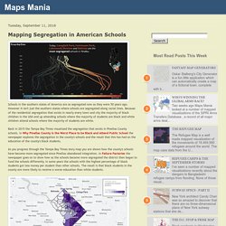
However it isn't just the southern states where schools are segregated along racial lines. Atlas of the Historical Geography of the United States. A spectacular historical atlas refashioned for the 21st century Here you will find one of the greatest historical atlases: Charles O.
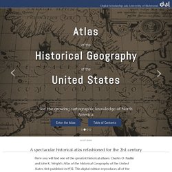
Paullin and John K. How does America use its land? These maps show a whole new way to look at the U.S. Using surveys, satellite images and categorizations from various government agencies, the U.S. Department of Agriculture divides the U.S. into six major types of land. The data can’t be pinpointed to a city block—each square on the map represents 250,000 acres of land. But piecing the data together state-by-state can give a general sense of how U.S. land is used. Gathered together, cropland would take up more than a fifth of the 48 contiguous states. The Growth of the Interstate Highway System. The Evolution of the Interstate is an animated map which allows you to view the construction of the U.S.
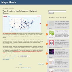
Interstate Highway System from 1956 to 2017. National Geographic’s Maps Archive. Mapping the Historical Layers of London. A new interactive map plans to document the history of London from the time of the Romans right up to the present day.
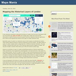
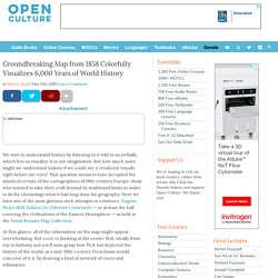
Layers of London uses vintage maps, images and crowd-sourced information to identify locations across the capital which have important historical significance. All of which can be explored and viewed on the Layers of London interactive map. The Atlanta Rap Map. Groundbreaking Map from 1858 Colorfully Visualizes 6,000 Years of World History. We start to understand history by listening to it told to us verbally, which lets us visualize it in our imagination.
But how much more might we understand history if we could see it rendered visually right before our eyes? That question seems to have occupied the minds of certain of the cartographers of 19th-century Europe, those who wanted to take their craft beyond its traditional limits in order to do for chronology what it had long done for geography. An Animated Map of the Rise and Fall of Communism.
The Spread of Communism is an animated map that shows the rise and fall of communism from 1917 through 2017.
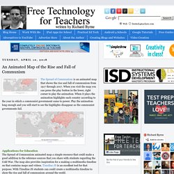
When you visit the map you can press the play button in the lower, right corner to play the animation. When it plays the animation highlights each country according to the year in which a communist government came to power. What Kills Americans & Where. FiveThirtyEight has updated its U.S. mortality rates map to cover more categories of disease and causes of death.
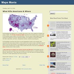
The 35 Years of American Death map shows the mortality rates in each county for the leading causes of death in the United States. The new causes of death added to the map include nine categories of chronic respiratory disease, four categories of infectious disease, HIV/AIDS, tuberculosis, self-harm, interpersonal violence, alcohol use and drug use. A Digital Map Leads to Reparations for Black and Indigenous Farmers by Jean Willoughby. Last month, Dallas Robinson received an email from someone she didn’t know, asking if she would be open to receiving a large sum of money—with no strings attached.
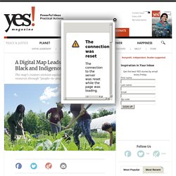
For once, it wasn’t spam. She hit reply. “We need more of this people-to-people giving.” Robinson is a beginning farmer with experience in organic agriculture, and has had plans to establish the Harriet Tubman Freedom Farm on 10 acres of family land near her home in Rocky Mount, North Carolina. Located in an area where the poverty rate hovers at nearly 20 percent, according to census data, and where both food insecurity and obesity rates are even higher, the farm will focus on serving the needs of the surrounding community by producing vegetables, herbs, and mushrooms. Income Inequality in Your Town. Perhaps the biggest political issue of our time is the ever increasing rise in income inequality.
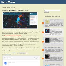
In the United States the gap between the rich and everyone else has been growing for the last thirty years. Esri has created a new interactive map which allows you to explore how this inequality of income distribution plays out in towns and cities across America. Esri's Predominant Income Range by Households map shows how much money people are earning in each census tract in the United States. The Geography of Restaurant Food. Google News Lab has been busy mapping America's major food regions.
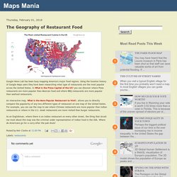
Using the location history of Google Maps users they have been researching what type of restaurants are the most popular across the United States. In What is the Pizza Capital of the US? You can discover where Pizza restaurants are more popular than Mexican food and where BBQ restaurants are more popular than seafood restaurants. An interactive map, What is the More Popular Restaurant to Visit? Charles Booth's London. An interactive map of debt in America. The Urban Institute has built an interactive map for exploring debt in America. Credit can be a lifeline during emergencies and a bridge to education and homeownership.
But debt-which can stem from credit or unpaid bills-often burdens families and communities and exacerbates wealth inequality. This map shows the geography of debt in America at the national, state, and county levels. I’d love to hear why the “share with any debt in collections” is so relatively low in the Upper Midwest, Minnesota in particular. Update: Unsurprisingly, health insurance coverage is a significant factor in American debt…and Minnesota has a low rate of medical debt in collections along with a relatively low rate of uninsured. More about... Colorful Maps from 1914 and 2016 Show How Planes & Trains Have Made the World Smaller and Travel Times Quicker. This time of year especially, we complain about the greed and arrogance of airlines, the confusion and inefficiency of airports, and the sardine seating of coach. But we don’t have to go back very far to get a sense of just how truly painful long-distance travel used to be.
Just step back a hundred years or so when—unless you were a WWI pilot—you traveled by train or by ship, where all sorts of misadventures might befall you, and where a journey that might now take several dull hours could take several dozen, often very uncomfortable, days. Mapping Segregation in America. The University of Iowa’s Placing Segregation project is using historical records to map how U.S. cities in the Nineteenth Century were racially, economically and socially segregated. The Placing Segregation project uses historical census records to map individuals to their place of residence.
These historical places of residence can then be filtered by the user by ethnicity, wealth and social class. So, for example, on the project's 1860 map of Washington D.C. you can select the 'People of Color' option to view where most non-white residents lived in the city in 1860. How Is Digital Mapping Changing The Way We Visualize Racism and Segregation? Fried Chicken Dividing Lines. Fried chicken shops are now the most important tool in demographics. On Flipboard. Confederate Monuments in Georgia. Georgia CSA Monuments. The Words That Are “Most Hip Hop” By The Detroit News using Odyssey.js. Walter Grzanka, 45, white, initially reported as shot by police, then changed to shot by store owner, during apparent looting of Temple Market at 2844 Fourth.
UCLA to Teach Course on ‘Spatial Injustice,’ Blames Poverty in Los Angeles on Geography and ‘Car Culture’ US Health Map. Worlds Revealed: Geography & Maps at The Library Of Congress. Today’s guest post is from Erin Kelly, a GIS Library Technician in the Geography and Map Division. Mapping Inequality. UPDATED: Mapped - a world at war. New Interactive Map Visualizes the Chilling History of Lynching in the U.S. (1835-1964) Whether we like to admit it or not, the history of the U.S. is in great degree a history of genocide and racist terror.
Researchers map fear and happiness in historic London. Maps help us locate landmarks and can even trace historical change. Mapped: Where American income has grown the most since 1990 — Quartz. This week's #fridayreads is our #blog about the Meandering #MississippiRiver! Comparing Old Maps. Meander Maps of the Mississippi. Follow the Path of the Freedom Riders in This Interactive Map. Mapping the emotions of London. New Book: “Picturing America: The Golden Age of Pictorial Maps” New Interactive Map Visualizes the Chilling History of Lynching in the U.S. (1835-1964) Storymap JS - Tell Stories With Maps. Why Space Matters in the Arab Uprisings (and Beyond) ZeeMap. Unfolding Maps: Unfolding is a library to create interactive maps and geovisualizations in Processing and Java. StoryMap JS.
Online. Scribble Maps : Draw On Maps and Make Them Easily. GmapGIS: Web application to draw on Google maps; Create, share,link,embed and publish interactive maps with polygons, lines, circles, markers and labels. Make Maps Online with Click2Map. Story Maps. Odyssey.js. NatGeo Mapmaker Interactive. Editor for Google Maps [MapFab.com] Wikimapia - Let's describe the whole world! Mapme: Plot your story.
Create Custom Map. EZ Map - Google Maps Made Easy. Religious Congregations & Membership Study. Gangs of New York. A day in the life of old London.