
Information aesthetics - Information Visualization & Visual Communication. Information Visualization. USLeditor3.doc - Fourni par Google Documents. Folksonomy and Tagging in the Social Web. NewsTools Apps. Spectra Spectra merges the news spectrum and the color spectrum into an expansive news viewing experience.
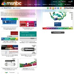
With comprehensive live news coverage, striking design, complete customization, dynamic browsing, human body interaction and many other unique features, Spectra brings A Fuller Spectrum of News to life in our most immersive extension yet. Select msnbc.com topics fromthe news channel palette. Your Channels managesactive news topics. Left, right or scrollbar flipsthrough summaries and images. Use your webcamfor human interaction. Apps & Games Podcasts Podcast Gallery Dispatch Feeds. Voyage - RSS feed reader. Oursignal.
Information visualization. Bestiario. Nicholas Christakis : L'influence cachée des réseaux sociaux. Manuel Lima at TEDGlobal 2009: Running notes from Session 5. Unedited running notes from TEDGlobal 2009.
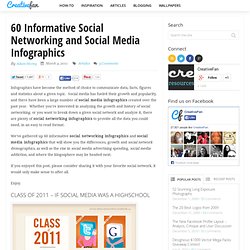
A visual exploration on mapping complex networks. A world of tweets. Visualize your LinkedIn network. Public Data Explorer. Google Ngram Viewer. Gephi, an open source graph visualization and manipulation software. A visual exploration on mapping complex networks. Les 50 meilleures infographics et data visualization. 60 Informative Social Networking and Social Media Infographics. Infographics have become the method of choice to communicate data, facts, figures and statistics about a given topic.
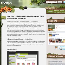
Cool Infographics - Blog. Fantastic Information Architecture and Data Visualization Resources - Noupe Design Blog. Jan 15 2010 Information architecture can be a daunting subject for designers who’ve never tried it before.
Also, creating successful infographics and visualizations takes skill and practice, along with some advance planning. But anyone with graphic design skills can learn to create infographics that are effective and get data across in a user-friendly manner. 50 Great Examples of Data Visualization. Wrapping your brain around data online can be challenging, especially when dealing with huge volumes of information.

And trying to find related content can also be difficult, depending on what data you’re looking for. But data visualizations can make all of that much easier, allowing you to see the concepts that you’re learning about in a more interesting, and often more useful manner. Below are 50 of the best data visualizations and tools for creating your own visualizations out there, covering everything from Digg activity to network connectivity to what’s currently happening on Twitter. Music, Movies and Other Media Narratives 2.0 visualizes music.
Liveplasma is a music and movie visualization app that aims to help you discover other musicians or movies you might enjoy. Tuneglue is another music visualization service. MusicMap is similar to TuneGlue in its interface, but seems slightly more intuitive. Digg, Twitter, Delicious, and Flickr. 25+ Useful Infographics for Web Designers. Infographics can be a great way to quickly reference information.
Instead of pouring over figures and long reports to decipher data, an infographic can immediately make apparent exactly what a dataset actually means. Below are more than 25 infographics that can be useful to web designers. Some are incredibly practical, some provide information that might be of interest to designers and some just present data that might be interesting to those who design websites all day. If you know of any good ones that we may have missed, please add them in the comments section below. Le pool visual information. Le pool Info Graphics. 7 Visualization Groups On Flickr to Find Inspiration. § Section Design. A poster created for Texas-based creative agency Test Monki.
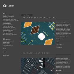
It was used to promote their s’mores themed open house event to show off their new studio space. We decided to use the idea of a s’more as a metaphor for the services that Test Monki provide. This was something quite different to my usual style of work but also a very enjoyable project to work on. More images » A personal project inspired by reading a book about what was at the time the longest and most complicated bombing raid ever devised. More images » A 1 page graphic which illustrates every single manned space flight in history, and categorises them by country of origin and destination. This was published in a special issue of the Financial Times Weekend magazine – April 2/3 2011. We Love Datavis. - Looking 4 datavisualization. Information Design. Design - An Early Triumph in Information Design. Tools on Datavisualization. A Carefully Selected List of Recommended Tools 07 May 2012 Tools Flash, JavaScript, Processing, R When I meet with people and talk about our work, I get asked a lot what technology we use to create interactive and dynamic data visualizations.
To help you get started, we have put together a selection of the tools we use the most and that we enjoy working with. Read more Pathline: Connecting Designers With Scientists 18 Apr 2012 Tools. Complete Beginner’s Guide to Information Architecture. Timothy Greig structures the information flow of a library website.
Photo by Timothy Greig Information architecture is an often misunderstood job title. Are they Designers? Developers? Managers? Infoviz « regarde : le blog / magazine des tendances et des curiosites creatives! Art numerique, installations interactives, design hypermedia, game art, machinimas, sexe et jeux vidéo. Dissertation-050312b-acrobat.pdf (Objet application/pdf) CSCI E-64 Videos. CS 171 Visualization. About - GENERATIVE GESTALTUNG. Embed / vimeo link Diese Website ergänzt das Buch »Generative Gestaltung« (erschienen im Verlag Hermann Schmidt Mainz, 2009) und bietet direkten Zugriff auf alle Processing-Quellcodes der im Buch beschriebenen Programme.
Im Buch »Generative Gestaltung« geht es darum, wie Bilder mittels Code erzeugt werden können. Ein Bild wird also nicht mehr »von Hand« geschaffen, sondern dadurch, dass eine visuelle Idee in ein Regelwerk übersetzt und dann in einer Programmiersprache in Form eines Quellcodes umgesetzt wird. Die Folge ist, dass ein solches Programm nicht nur ein einzelnes Bild erzeugen kann, sondern dass durch Veränderung von Parametern ganze Bilderwelten entstehen. Wir, die Autoren, wollen mit dem Buch eine solide Grundlage dafür schaffen, wie dieser veränderte Gestaltungsprozess genutzt werden kann. Neben der Bereitstellung der Codes soll diese Website vor allem zur Kommunkation zwischen Ihnen und uns dienen. Polymaps. Well-formed.eigenfactor.org : Visualizing information flow in science.