
Design+Code - Learn to design and code React and Swift apps. 10 Ways to Improve Your Website Design. Nowadays, a company’s website is similar to the first handshake with someone—it represents the good (or the bad) start of a potential cooperation.
However, a handshake is more than a form of greeting. A handshake establishes trust while giving you the power to diminish the negative first impression. The same thing goes for a website. A website should be as strong as a CEO’s handshake. What does this mean? No matter the market, companies are becoming more and more competitive and customers/consumers more and more impatient. Why Separate Mobile & Desktop Web Pages? As use of mobile devices continues to skyrocket across the globe, we're seeing more ways to tackle the challenge of creating great Web experiences across multiple devices.
But which approach is right for any given project? In an effort to help answer that question, I've compiled the reasons we opted to use a dual (separate mobile and desktop) template system to build our start-up, Bagcheck. 15 tutoriels pour créer des maquettes web sur Photoshop. Tutorials Archives. Tutorials In this section you will find in-depth how-tos involving common web development and web design techniques. Twisted Colorful Spheres with Three.js By Mario Carrillo on January 26, 2021. Best Design Courses & Tutorials Recommended by the Design Community - instructy-design. Best Design Courses & Tutorials Recommended by the Design Community - instructy-design. The Command Line for Web Design - Envato Tuts+ Web Design Tutorials. Infographic: Flat design vs. skeuomorphism. It’s easy to get wrapped up in a trend and choose the option you think is most popular.
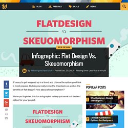
But do you really know the drawbacks as well as the benefits of flat design? How about skeuomorphism? We’ve put together this fun infographic to help you work out the best option for your project. All Design Lessons. Atomic Design by Brad Frost. Responsive Images Done Right: A Guide To And srcset. Advertisement Many companies try to create a great experience for customers. But few are willing to make the changes required to deliver on that promise. In fact most don’t even realize just how bad their experience can be. This is why we made a new book called “User Experience Revolution,” a practical battle plan for placing the user at the heart of your company.
Get the book now! Images are some of the most important pieces of information on the web, but over the web’s 25-year history, they haven’t been very adaptable at all. Responsive Web Design. Responsive Web Design · An A List Apart Article. The English architect Christopher Wren once quipped that his chosen field “aims for Eternity,” and there’s something appealing about that formula: Unlike the web, which often feels like aiming for next week, architecture is a discipline very much defined by its permanence.
Article Continues Below A building’s foundation defines its footprint, which defines its frame, which shapes the facade. Each phase of the architectural process is more immutable, more unchanging than the last. Creative decisions quite literally shape a physical space, defining the way in which people move through its confines for decades or even centuries. Working on the web, however, is a wholly different matter. But the landscape is shifting, perhaps more quickly than we might like. How to build a living style guide in Webflow. Behind every powerful, consistently expressed brand, there is a document: a style guide.
And while most of them live in the form of hard-to-find and even-harder-to-update PDF formats, the best of the best live on the web, in the form of living style guides. In this post, we’ll show you how to build one, and perhaps even more importantly, why. Design Systems. The most important part of responsive web design is that, no matter what the viewport width, the content is accessible in an optimum display.
The best responsive designs are those that allow you to go from one optimised display to another, but with the feeling that these experiences are part of a greater product whole. Responsive design: where we’ve been going wrong Responsive web design was a shock to my web designer system. Those of us who had already been designing sites for mobile probably had the biggest leap to make. Website Design in Adobe XD Tutorial. As someone who has spent the last 15 years using Adobe Photoshop for designing websites, Adobe XD is a breath of fresh air.
I'm exclusively a Windows guy, so I haven't had a chance to experiment with Sketch. Adobe XD (Experience Design) is Adobe's response to the popularity of Sketch. Responsive web design : Les autres usages. Beginner’s Guide to Responsive Web Design. Whether you’re a beginner or a seasoned web professional, creating responsive designs can be confusing at first, mostly because of the radical change in thinking that’s required.
As time goes on, responsive web design is drifting away from the pool of passing fads and rapidly entering the realm of standard practice. In fact, the magnitude of this paradigm shift feels as fundamental as the transition from table based layouts to CSS. Simply put, this is a very different way of designing websites and it represents the future. Developing your eye for design – Jonathan Z. White – Medium. A simple strategy Here are some things that you can do to train your eye.
Browse design inspiration Keep a folder and save designs that inspire you over the course of the week. At the end of the week, look through your folder and ask yourself some of these questions. You don’t have to answer each one of those questions for every design, but do keep them in the back of your mind. Adaptative - Applications. Les applications web adaptatives utilisent des technologies comme les media queries et viewport pour être sûre que leur interface convient avec tout les facteurs de forme: bureau, téléphone, tablette, ou peut importe ce qui viendra après.
Guides. In Search of the Ultimate User Experience - Marvel Blog. Part I: Experience is everything The origin of imagination Around 70,000 years ago, Sapiens figuratively ate an apple from the Tree of Knowledge, and a mutation occurred that scientists still can’t explain to this day. According to Yuval Noah Harari, author of Sapiens: A Brief History of Humankind, between 70,000 and 30,000 years ago, new ways of thinking and communicating suddenly propelled Homo Sapiens to the top of the food chain. This ‘mutation’ led to the invention of boats, oil lamps, and the bow and arrow. The sewing needle enabled entire tribes to shed the fig leaf and stay warm during harsh winters. Responsive Images in CSS. The term "responsive images" has come to mean "responsive images in HTML", in other words, the srcset and sizes attribute for <img> and the <picture> element.
But how do the capabilities that these things provide map to CSS? CSS generally wasn't really involved in the responsive images journey of the last few years. That's for good reason: CSS already has the tools. Responsive images was, in a sense, just catching up to what CSS could already do. Let's take a look. srcset in CSS. Webdesign Tutoriaux .com. Color - Style - Material design guidelines. Tuto Photoshop : Créer un webdesign de qualité avec Photoshop. Étape 1 : Création du .psd et mise en place des règles Je crée un document de 1400x1450, résolution 72 pixels/pouce. Je place ensuite deux règles à 220px et 1180px, dans le sens de la largeur. The Makings of a Great Logo - BOLD by Pixelapse. Your company's logo is the fundamental foundation to your business branding. It is probably the first interaction that you will have with your customers.
An effective logo can establish the right tone and set the proper ethos. Recruiting a Designer? Here's What You Should Know - BOLD by Pixelapse. Design is a rather broad and vague term. When someone says "I'm a designer", it is not immediately clear what they actually do day to day. There are a number of different responsibilities encompassed by the umbrella term designer.
Design related roles span many industries, ranging from industrial design (e.g. cars, furniture) to the traditional print industry (e.g. magazines, publications), to the new media tech industry (e.g. websites, mobile apps). With the relatively recent influx of tech companies focused on creating interfaces for screens, many new design roles have emerged.
Job titles like UX or UI designer are confusing to the uninitiated and unfamiliar even to designers who come from other industries. Tutoriel Vidéo Divers Avocode. Lorsque l'on fait de l'intégration on est souvent obligé de travailler avec des fichiers PSDs qui nécessitent l'utilisation Photoshop. Le principal problème de ce logiciel est qu'il est conçu pour le traitement photo plutôt que le Webdesign. Inspecter les propriétés des calques et exporter les assets et loin d'être pratique. Certains designers ont même sauté le pas et utilisent maintenant Sketch plus adapté au webdesign. Web designer freelance – 6 conseils pour augmenter vos revenus. Tendance Webdesign 2016 - Les tendances web design en 2016 - Agence web pour la performance de l'entreprise. Les grilles dans le webdesign.
Mockups & Rough : gagnez du temps ! Ça y est, vous devez créer un nouveau site internet ! Comme d'habitude, après avoir sabré une célèbre boisson alcoolisée, c'est direction tête baissée dans Photoshop pour attaquer le design. Conception de site web. La création et la conception de site web ou web design est la conception de l'interface web : l’architecture interactionnelle, l’organisation des pages, l’arborescence et la navigation dans un site web. Design Universal Windows Platform (UWP) app - Windows app development. Design. iOS Human Interface Guidelines.
As an app designer, you have the opportunity to deliver an extraordinary product that rises to the top of the App Store charts. To do so, you'll need to meet high expectations for quality and functionality. Three primary themes differentiate iOS from other platforms: Clarity. Throughout the system, text is legible at every size, icons are precise and lucid, adornments are subtle and appropriate, and a sharpened focus on functionality motivates the design. Negative space, color, fonts, graphics, and interface elements subtly highlight important content and convey interactivity.Deference.
On The Future of Web Design Tools. Des contre-exemples ergonomiques illustrés. Flat design et skeuomorphisme... Itérer son design avec invision. UXPin ou comment améliorer son workflow en webdesign. Kit de survie du créatif. Building your design portfolio? Here are 8 things I wish I’d known. — Doing the Work. Design a single page app with Ember. Product Design Training. Ébauche de projets de mise en page, où que vous soyez, avec Comp CC. Flat Design - What’s it ? Material Design, What is it ? The 11 Best Tutorials on Mobile Design.
Documents. Macromedia Flash (SWF) Movie Created by Camtasia Studio 2. The Ultimate Guide to Becoming a Full-Stack Web Design Freelancer. A Beginner’s Guide to Growing Your Web Design or Development Business. Slides – Create and share presentations online. 6 ways to make your personal website more effective. Apprendre à utiliser Material Design Lite : La grille.