
Responsive design: retour d’experience Le développement du thème actuel m’a permis de travailler sur deux techniques: le couple HTML5/CSS3 d’une part, et le « Responsive Design » d’autre part. Comme je l’ai fait précédemment pour HTML5/CSS3, je vous présente, dans cet article, mes commentaires sur le design « responsive ». Grille fluide ou Grille fixe? Le responsive design est basé sur trois composants une grille fluide,les média-queries (voir cet article pour en savoir plus),un contenu fluide (images, …). Les grilles fluides, c’est compliqué! Hors gérer une grille fluide reste plus difficile que de gérer une grille fixe. Je me suis donc posé la question: les notions de « design responsive », et de fluidité sont-elles réellement indissociables? Dans le premier cas, nous modifions les propriétés des styles, pour que la structure soit adaptée à la taille de l’affichage,Dans l’autre, les propriétés des styles ne changent pas, mais leurs valeurs permettent d’avoir une structure proportionnelle à l’affichage. Alors grille fixe?
Beginner’s Guide to Responsive Web Design Whether you’re a beginner or a seasoned web professional, creating responsive designs can be confusing at first, mostly because of the radical change in thinking that’s required. As time goes on, responsive web design is drifting away from the pool of passing fads and rapidly entering the realm of standard practice. In fact, the magnitude of this paradigm shift feels as fundamental as the transition from table based layouts to CSS. Simply put, this is a very different way of designing websites and it represents the future. Free trial on Treehouse: Do you want to learn more about responsive web design? Over the past year, responsive design has become quite the hot topic in the web design community. What is responsive design? Let’s just get right into it: Believe it or not, the Treehouse blog that you’re reading this article on is actually a responsive design! It’s hard to talk about responsive design without mentioning its creator, Ethan Marcotte. So, what is responsive design exactly?
Les Media Queries CSS3 La spécification CSS3 Media Queries définit les techniques pour l'application de feuilles de styles en fonction des périphériques de consultation utilisés pour du HTML. On nomme également cette pratique Responsive Web Design, pour dénoter qu'il s'agit d'adapter dynamiquement le design à l'aide de CSS. Ces bonnes pratiques permettent d'exploiter encore plus les avantages de la séparation du contenu et de la présentation : l'intérêt est de pouvoir satisfaire des contraintes de dimensions, de résolutions et d'autres critères variés pour améliorer l'apparence graphique et la lisibilité (voire l'utilisabilité) d'un site web. Les plateformes exotiques sont concernées en premier lieu : navigateurs mobiles et tablettes, écrans à faibles résolutions, impression, tv, synthèses vocales, plages braille, etc. Approche historique Avec CSS2 et HTML4, il était déjà possible de spécifier un média de destination pour l'application d'une ou plusieurs feuilles de style. <! screen Écrans handheld print Impression
Responsive webdesign : adapter un site à toutes les résolutions Le Responsive webdesign (conception adaptative ou réactive en français) représente un ensemble de méthodes et techniques permettant d’universaliser un site Web. Qu’il soit consulté sur ordinateur, tablette, e-reader ou mobile, le site ainsi conçu s’adapte automatiquement à la taille de l’écran. Cette évolution très séduisante du Web pose néanmoins certaines questions d’ergonomie et oblige à repenser la conception des sites. Nous abordons dans cet article les objectifs du responsive design, les critères qui doivent décider à le mettre en œuvre, les recommandations de conception et les considérations techniques. Objectifs du responsive webdesign Pour commencer, rien de tel qu’une démonstration. Entrons dans le vif du sujet. Les sites Web sont aujourd’hui consultés sur une multitude d’appareils ayant des résolutions différentes Proposer une seule version du site Web censée s’adapter à tous ces terminaux est utopique. Le site ifttt n’est pas adaptable. Responsive ou versions séparées ?
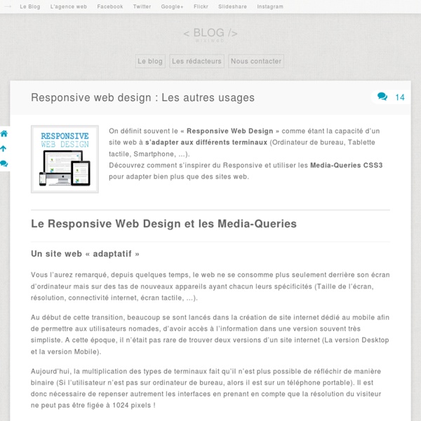
Qu’est-ce que le Responsive Web Design + 3 exemples | Agence Myriaweb En mai 2011, 3 millions de français déclaraient avoir déjà acheté depuis leur mobile ( Fevad, chiffre clés 2011 ). Ce chiffre, bien qu’encore loin des chiffres du e-commerce classique, cachent un phénomène plus révolutionnaire qu’il n’y parait: le web devient mobile. Et même si consulter un site internet depuis sont smartphone ne sera jamais aussi complet et confortable que depuis un écran 22″, il devient de plus en plus dangereux pour votre projet web d’être conçu sans intégrer les plateformes de diverses dimensions. C’est à cet enjeux que le Responsive Web Design (traduisez « Design Adaptable à toutes les résolutions ») se propose de répondre. Définition Le Responsive Web design est une méthodologie inventée par Ethan Marcotte, qui a également écrit un livre éponyme, aujourd’hui traduit en français: Responsive Web Design (Note: ce livre est plutôt destiné aux webdesigners et intégrateurs). A quoi ça ressemble? (sources: designmodo ) Teixido Splendid Five Simple Steps Combien ça coûte?
Developing your eye for design – Jonathan Z. White – Medium A simple strategy Here are some things that you can do to train your eye. Browse design inspiration Keep a folder and save designs that inspire you over the course of the week. At the end of the week, look through your folder and ask yourself some of these questions. What originally intrigued you about this design? For interface design you can look at sites like Dribbble, Behance, and Awwwards. Looking at only interface designs will put you in an insular design environment. Also consider studying the designs of other cultures. Practice looking While there are tons of directed exercises that you can do to train your eye, just spending a couple extra minutes a day observing and trying to understand the world around you goes a long way. Throughout the day, instead of staring at your phone — something that I’m guilty of doing — look at the design of things around you like the buildings you pass by, the signs that direct you, and nature. Figure out what catches your eye and why.
Essential considerations for crafting quality media queries CSS3 media queries are dead simple, in terms of their syntax. You’ve got an @media directive, a media type (which you already know from good ol’ CSS 2, like screen, print, all, etc.) and one or more media features (the characteristics we’re testing against). That’s it: @media screen and (max-width:500px) { } There are some additional little syntax details, but this is basically all you need to know to actually make a media query work. Designing web layouts with media queries is a process. This article is just as much for me as it is for you—it can be hard to keep track of all the different configuration variations you can use! How to include your media queries: embedded vs. external There are two ways to include media queries in your site: embed them within a style sheet or include them in a call to a separate, external sheet. Here’s what an embedded media query looks like (pretend that we’re inside a style sheet): @import url(narrow.css) only screen and (max-width:500px); The pros and cons
Why 2013 Is the Year of Responsive Web Design You may have noticed that Mashable got a new look recently. The design seems wider than usual, and when you shrink your browser, the content resizes to fit. The aim here isn't merely prettiness or technical trickery, however: Media companies like ours are seeing a major shift in the consumption habits of their audiences. Those organizations that don't act may find themselves behind the curve. The Post-PC Era 2012 has been a very unusual year in the PC market. So which devices are consumers buying? Tablet sales are expected to exceed 100 million this year. Tablet sales are expected to exceed 100 million this year. Meanwhile, the shift to mobile is happening at an extraordinary speed. Web or Apps? For those of us who create websites and services, all this leads to a singular conclusion: A million screens have bloomed, and we need to build for all of them. Building apps may seem like the obvious solution. Responsive Web Design 2013: A Responsive Year
Une méthodologie pour le responsive design Méthodologie présentée par Ethan Marcotte à la conférence « An Event Apart » à Boston. Concernant les sites d’informations Un journal papier comporte les informations relatives à une journée. Les trois ingrédients d’un graphisme adaptable sont : Une grille flexibleDes images/media flexiblesDes media queries Cependant ces trois éléments se rapportent à la structure ; la structure n’est constitue pas la conception. Comment peut on se pencher sur des sites adaptables ? Travailler adaptable Le travail de production se résume souvent à une succession de tâches. Pour le site du Boston Globe, la phase de conception a été ponctuée de nombreuses questions de la part des développeurs à propos de la manière de naviguer : à quoi ça sert ? En anglais dans le texte : Mobile First Mobile First Pourquoi le mobile avant tout ? Le trafic a exploséNouvelles manière de naviguerEcran étroit oblige à aller à l’essentiel La question de contexte de pose-t-elle vraiment ? Maquettage Vérifier le résultat de son travail..
Adaptative - Applications Les applications web adaptatives utilisent des technologies comme les media queries et viewport pour être sûre que leur interface convient avec tout les facteurs de forme: bureau, téléphone, tablette, ou peut importe ce qui viendra après. Guides Les fondations du design adaptatif Apprendre les bases du design adaptatif, un sujet essentiel pour l'affichage des applications web modernes. Mobile avant tout (Mobile first) Souvent lors de la création de l'affichage d'une application adaptative, il est judicieux de créer en premier le rendu sur téléphone mobile, et d'utiliser ce rendu comme base pour concevoir les écrans plus larges. Technologies Outils Modernizr Une bibliothèque d'outils de détection des fonctionnalités pour appliquer différents CSS ou JS en fonctions de comment les différentes fonctionnalités CSS/JS sont supportées. css3-mediaqueries-js Un polyfill en JavaScript pour assurer le support de media query aux anciennes versions de IE (5+.) Voir aussi Graphiques dans les sites adaptatifs
Responsive CSS Patterns without Media Queries Let me start by saying that despite the title, this article is not about doing away with media queries or media query bashing in any way. Media queries are incredibly useful and I use them all the time for all sorts of things. However, they don’t solve all our responsive design problems. It’s often desirable to effect changes to an arrangement of elements based on the dimensions of their container, rather than the viewport. Hopefully they will be one day, but in the meantime, I’ve presented here a few tricks and techniques you can use to address some of the problems container queries will one day solve. Flexbox with flex-wrap Flex-wrap can solve a multitude of problems when it comes to responding to container dimensions. No fancy tricks here, just flexbox with flex-wrap but it works a treat. <div class="container"><div class="img">... ‘The Fab Four Technique’ This works because when width is a percentage, it is a percentage of the element’s container width. Floated Image – Visible / Hidden
Responsive Web Design Cet article présente des problèmes multiples. Vous pouvez aider à l'améliorer ou bien discuter des problèmes sur sa page de discussion. Certaines informations devraient être mieux reliées aux sources mentionnées dans la bibliographie ou les liens externes. Améliorez sa vérifiabilité en les associant par des références. Dessin illustrant le principe du responsive design. Dessin illustrant le concept d'adaptive design. Principe[modifier | modifier le code] La notion de web adaptatif repense la manière de concevoir les parcours de navigation sur Internet, puisqu'il ne s'agit plus de concevoir autant de parcours qu'il y a de familles de terminaux mais de concevoir une seule interface auto-adaptable. Composants principaux[modifier | modifier le code] Technique[modifier | modifier le code] Le concept de RWD, tel que décrit par Ethan Marcotte[7], s'appuie sur les trois éléments techniques cités précédemment. Conception et approches[modifier | modifier le code] Déclinaisons[modifier | modifier le code]
Responsive Design : avantages et inconvénients Qu'est que le Responsive Design Les internautes se connectant de plus en plus souvent depuis leur téléphone ou leur tablette, les sites internet doivent savoir s'adapter aux nouvelles modalités de connexion. Tactilité ou lenteur du débit internet, chaque terminal a des caractéristiques et une résolution d'écran qui lui sont propres et qui font que le rendu soit différent au site de base. Cela implique de repenser l'approche de création d'un site Internet pour mieux anticiper les différentes contraintes liées à chaque support. Le Responsive Design est aujourd'hui une solution incontournable si l'on veut conserver sa présence sur internet et ce, quel que soit le support de navigation emprunté. Avantages du Responsive Design Les avantages du Responsive Design sont nombreux. Les colonnes et les images s'ajustent, se redimensionnent et se déplacent automatiquement selon que la résolution d'écran l'exige. Inconvénients du Responsive Design Responsive Design et le référencement Pour approfondir
In Search of the Ultimate User Experience - Marvel Blog Part I: Experience is everything The origin of imagination Around 70,000 years ago, Sapiens figuratively ate an apple from the Tree of Knowledge, and a mutation occurred that scientists still can’t explain to this day. According to Yuval Noah Harari, author of Sapiens: A Brief History of Humankind, between 70,000 and 30,000 years ago, new ways of thinking and communicating suddenly propelled Homo Sapiens to the top of the food chain. This ‘mutation’ led to the invention of boats, oil lamps, and the bow and arrow. The sewing needle enabled entire tribes to shed the fig leaf and stay warm during harsh winters. According to Harari, many archaeologists and researchers attribute these accomplishments to a revolution (or mutation) in Sapien’s cognitive abilities. That’s right. Sapien’s ‘creative gene’ kickstarted the collective imagination and led to the birth of storytelling, tools, weapons, and the formation of new social structures. Makers and users It’s simple. Take the wheel, for example.