
Leaflet - a JavaScript library for interactive maps. Attribution — CARTO. About Fusion Tables - Fusion Tables Help. Bust your data out of its silo!

Get more from data with Fusion Tables. Fusion Tables is an experimental data visualization web application to gather, visualize, and share data tables. Visualize bigger table data online Filter and summarize across hundreds of thousands of rows. Then try a chart, map, network graph, or custom layout and embed or share it. Two tables are better than one! Merge two or three tables to generate a single visualization that includes both sets of data. Make a map in minutes Host data online - and stay in control Viewers located anywhere can produce charts or maps from it. Visualize bigger table data online Import your own data Upload data tables from spreadsheets or CSV files, even KML. Visualize it instantly See the data on a map or as a chart immediately. Publish your visualization on other web properties Now that you've got that nice map or chart of your data, you can embed it in a web page or blog post.
Two tables are better than one! Make a map in minutes. SmartDraw Cloud. Fusion Tables (experimental) 20 superb data visualisation tools for web designers. It's often said that data is the new world currency, and the web is the exchange bureau through which it's traded.
As consumers, we're positively swimming in data; it's everywhere from labels on food packaging design to World Health Organisation reports. As a result, for the designer it's becoming increasingly difficult to present data in a way that stands out from the mass of competing data streams. Get Adobe Creative Cloud One of the best ways to get your message across is to use a visualization to quickly draw attention to the key messages, and by presenting data visually it's also possible to uncover surprising patterns and observations that wouldn't be apparent from looking at stats alone. And nowadays, there's plenty of free graphic design software to help you do just that. As author, data journalist and information designer David McCandless said in his TED talk: "By visualizing information, we turn it into a landscape that you can explore with your eyes, a sort of information map. Gallery · mbostock/d3 Wiki.
Wiki ▸ Gallery Welcome to the D3 gallery!
More examples are available for forking on Observable; see D3’s profile and the visualization collection. Please share your work on Observable, or tweet us a link! Visual Index Basic Charts Techniques, Interaction & Animation Maps Statistics. Make Your Images Interactive. Forms - create and analyze surveys, for free. JavaScript Charts, JavaScript Graphs for Web, Mobile & Apps - FusionCharts. Viur - Business Intelligence made easy. Simple and affordable BI tool. Free online speed reading software.
Graphviz - Graph Visualization Software. Free Website Builder. ColorBrewer: Color Advice for Maps. Tablaeu Public. Quadrigram - Create and publish data driven websites. 10 free tools for creating infographics. Done right, infographics can be a great way to make sense of complex data.
The best infographics transform complex information and data into graphics that are both easy to grasp and visually appealing. The only problem is, infographics that look like they were simple to make are often anything but. Exclusive offer: Save 15% on Adobe Creative Cloud now Here, we've selected our top free tools and apps for making infographics. Some of the options here are even suitable for non-designers, as templates and other features make them easy to use. Give these free tools a try and let us know which ones you get on best with on Facebook or Twitter. 01.
Visme promises to help you 'speak visually'. 02. Canva is a powerful and easy-to-use online tool that's suitable for all manner of design tasks, from brochures to presentations and much more besides. 03. Google's chart tools are powerful, simple to use, and free. 04. 05. 06. 07. 08. Related articles: Learning Visually. Infographics work in the classroom because they grab students and allow an entry point to learning — and because they sum up pages and pages, even chapters, of information that would take a reader hours to process.
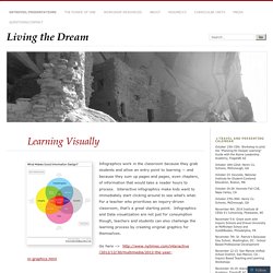
Interactive infographics make kids want to immediately start clicking around to see what’s what. For a teacher who prioritizes an inquiry-driven classroom, that’s a great starting point. Infographics and Data visualization are not just for consumption though, teachers and students can also challenge the learning process by creating original graphics for themselves. Go here –> Consuming the information is one portion of the equation when discussing data visualization. There are elements of design to evaluate as well as functionality/clarity of purpose. . … classroom examples of consumption graphics Places for Interactive Consumption: The previous list of sites takes you into the world of investigation of blogs and discussion of topics that are static (pretty much).
Like this: Create Easy Infographics, Reports, Presentations.