
Mobile UI Design Patterns and Screenshots. Push the minimalist approach one step further by hiding site navigation. By Flo Preynat Simple things are most of the time the most appealing ones.
It is so true in life, and this happens to be true (this is my opinion anyway) in web design. I often take peeks at minimalist web designs thinking “this web site has got nothing on, yet it looks wicked”. Now, this post is not about entering into a real debate on how one would qualify a site as being minimalist. We can use ‘plain and simple’ or ‘clean’ websites if the ‘minimalist’ term bothers you. Cut a long story short, I reckon simplicity, ie the removal of superfluous links/pictures/distractions and the look for simplicity on a web page often do the trick and bring so much more appeal to the eye,… and the brain. Pttrns — Mobile User Interface Patterns. Responsive Multi-Level Menu - Demo 5. PhoneGap.
Mobile development with HTML5. HTML5: the standard, the buzzword and the legend If you read blogs that are even slightly related to tech, you likely hear about HTML5 on a near-weekly basis.
Although the new web standard does not do your laundry, it has features that enable the creation of powerful applications—using only HTML, CSS and JavaScript (a Rails back-end can bring additional firepower to the table). This post will go over some key concepts and features of HTML5, setting the stage for more advanced subjects. Browser Compatibility Perhaps the biggest pain in developing a web-based application is ensuring that your application is compatible with the various browsers in use today. Viewport When you visit a website not designed for mobile browsers, it first appears very zoomed out. This sizes the viewport to the device's width, so the content does not initially appear zoomed out. Some sites currently hard-code the width of the viewport to 320. HTML5 Caching. Hammer.js - A javascript library for multi-touch gestures. UI Design Guidelines for Responsive Design. Some UI guidelines and tips to consider when designing a website to make it cross-device friendly and responsive.
The web development community has come up with endless solutions, best practices, and tools for coding a responsive design with ease. While the vast majority of websites can be made responsive now, it’s time to push the envelope further. Responsive Multi-Level Menu - Demo 1. The Ultimate UX Design of: Responsive Web Design Navigation. In this series Marcin Treder of UXPin – The UX Design App explains how to design the User Experience of the most important ingredients of web and mobile apps.
Step-by-step tutorials and examples from the most important services in the world will help you in your own, everyday practice. Responsive Web Design – Current state of affairs Three years have passed since Ethan Marcotte coined the term “Responsive Web Design”. Once a revolutionary fresh idea, has in the year 2013 been transformed into a commodity.
How to Make a Single Page Responsive Website with Flat UI Pro (Part 1) David East takes you step-by-step through the process of creating a simple website using Designmodo’s Flat UI Pro framework.
In this video tutorial, you will learn to create a simple, single-page responsive website using components from Flat UI Pro. East takes you through the process of using the kit and customization to create a website from start to finish, from creating simple navigation to adding specific fonts, colors and images. As an added bonus, this kit works with the Twitter Bootstrap framework, making it fully responsive. The tutorial will help you build the site, fix any issues that pop up between screen sizes and publish.
Skeleton: Beautiful Boilerplate for Responsive, Mobile-Friendly Development. iPhone Tutorials. Junior - A front-end framework for building HTML5 mobile apps with a native look and feel. A front-end framework for building HTML5 mobile apps with a native look and feel.
CSS3 Transitions optimized for mobile performance. Swipable carousels using flickable.js. Integration with backbone.js views and routers. Ratchet CSS UI components. Try loading this page on a mobile phone or try our "simulator" to the right. Installation Javascript Dependencies Each of these dependencies is included in the lib/javascripts directory. junior.js junior.js is included in the src/javascripts directory. Ratchet. Davist11/jQuery-One-Page-Nav. Stacktable.js. The purpose of stacktable.js is to give you an easy way of converting wide tables to a format that will work better on small screens.
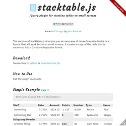
It creates a copy of the table that is converted into a 2-column key/value format. Download Source files on github or download the zip. How to Use Call the plugin on a table. Simple Example run » Adapt.js: More efficient responsive design. Difficult HTML, JavaScript, CSS grid page. Introduction to Storyboarding. Storyboarding was introduced in iOS 5 and it has been significantly enhanced in iOS 6.
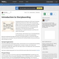
With storyboarding, Apple continues to push developers towards Interface Builder and it must be said that storyboarding does have several appealing features. Prototyping an iOS application is not only more intuitive with storyboarding, it is significantly faster as will become clear in this tutorial. In this tutorial, I will introduce you to storyboarding by discussing the basic concepts of storyboarding. Because storyboards leverage the power of Interface Builder, you will notice that the learning curve is not steep. If you are familiar with Interface Builder, then you will be up and running in no time. Sample Application As I am an advocate of learning by doing, I will introduce you to storyboards by building a small sample application. Feel free to follow along with me. Project Setup Create a new project in Xcode by selecting the Empty Application template from the list of templates. iPad Peek / iPhone Peek. Pttrns — Mobile User Interface Patterns.
jQuery Responsive Tabs. Use of Flat Design in Mobile App Interfaces, Best Examples. Emphasis on typography, roomy widgets, muted color palette, one-colored or blurred background, grid or horizontal stripe layout, inornate graphics, 2d illustrations – all these can be easily attributed to flat style, that recently got its second rebirth.
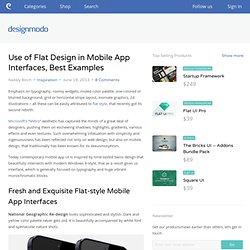
Microsoft’s “Metro” aesthetic has captured the minds of a great deal of designers, pushing them on eschewing shadows, highlights, gradients, various effects and even textures. Such overwhelming infatuation with simplicity and ingenuousness has been reflected not only on web design, but also on mobile design, that traditionally has been known for its skeuomorphism. The Ultimate UX Design of: Responsive Web Design Navigation.
Responsive Web Design Using Edge Reflow – Video Series. By Piotr Walczyszyn. Media Queries: HTML5 Resource of the Day. This post comes from Brent Schooley at the Infragistics blog.
When getting started with responsive web design, it can often be helpful to look at some examples of what is possible. Creating a wonderful responsive site takes a bit of imagination and planning. It can be good to get some inspiration from the designs of other sites. The best place on the web that I have found for exploring this is Media Queries. Responsive Screenshots With Casper. Capturing screenshots is annoying, but most of time it has to be done and usually it's you - The Developer - who has to do it. Taking a few screenshots isn't too bad, but lets say for example that now you are working on a website using Responsive Web Design and you have to take five times as many screenshots at various viewports. That one, two second annoying task has now started eating into your lunch time.
Intro Today I am going to run through writing a quick and simple script to take some screenshots of any site at various viewports and save the images to disc. This is something I first saw at mediaqueri.es and started implementing it into my build process. Responsive Web Design By Example. One Minute Bottom Line Review This is a well written book chock full of code examples and an abundance of linked resources that will keep you busy loading and saving websites as resources and references. The first thing I would recommend is a review of the Table of Contents where the intent of the author --Thoriq Firdaus-- is clearly expressed chapter after chapter. Performance Checklist for the Mobile Web. Quick Start Guide to PhoneGap+AngularJS. I’ve created a sample mobile application to help developers get started building mobile applications with PhoneGap and AngularJS quickly. The sample application includes view navigation, some standard user interface components and code to help avoid common pitfalls in mobile application development (click delays etc).
Below are a few screenshots showing parts of the application. It basically includes a header and a scrollable mobile list of different PhoneGap API samples to try out. Main App View showing Topcoat Navigation Bar and List. SwipeView. SwipeView is the super simple solution to endless seamlessly loopable carousels for the mobile browser. It’s memory conservative as it uses only three elements at any given time, it’s smooth as velvet since it takes advantage of hardware acceleration, it’s bandwidth friendly with its 1.5kb minified/gzipped footprint. Project info Last code update: 2012.08.25 – v1.0Device compatibility: Safari, Firefox, Opera, iPhone/Ipod touch >=4.x, iPad >=3.2, Android >=2.3QR Code opens demo page.
Support development If this script saved your day and you wish to support future developments you may consider sending some funds via PayPal or Flattr. Overview Due to memory constraints and limited resources, endless –or very long– carousels are problematic on the mobile browser. Hammer.js - A javascript library for multi-touch gestures. UI Design for iOS 7. Making the Transition to Responsive Web Design. Designing for Mobile Superpower. The world is almost entirely inhabited by mobile users, individuals who move through a multi-dimensional network of digital threads linking people and machines. Ben Taylor's Webosphere. Pttrns — Mobile User Interface Patterns. Screen resolution simulator. Simulate screen resolution. Responsive Web Design and Accessibility. By Janet M. Six Published: April 22, 2013 Send your questions to Ask UXmatters and get answers from some of the top professionals in UX. Mobile First Design: Why It’s Great and Why It Sucks. Web Page Screen Resolution Simulator.
PhoneGap. Content Choreography. State of the web: of apps, devices, and breakpoints. IN The ‘trouble’ with Android, Stephanie Rieger points out the ludicrous number of Android screen sizes on a typical UK client’s website and comes to this conclusion: Responsive Design Workflow: Mobilism 2012. BDConf: Stephen Hay presents Responsive Design Workflow.
Responsive Design Workflow by Stephen Hay. Is Responsive Web Design a Game Changer? The Boston Globe redesign is RWD’s first at bat in the big leagues. Responsive Design or Adjustable Content Flow? Dec 08, 12. Making the Transition to Responsive Web Design.