
MapTube. The Functional Art: An Introduction to Information Graphics and Visualization. The Functional Art: An Introduction to Information Graphics and Visualization. Infographic Website Offering Infographics and Data Visualization. VideoInfographs – Gain exposure. Go viral. Ghostweather R&D Blog. All Things Tagxedo - The Official Blog of Tagxedo - Tag Cloud with Styles. Tactical Technology Collective.
Oczekuje. Digital humanities. Periscopic: Do good with data. Periscopic: Do good with data. Amazing Resource for Design Freebies. Updated: visualising Data at the House of Commons. Updated: visualising Data at the House of Commons. Love Infographics - Submit & Share Infographics With The World! >Think>Draw>Make> Data Tools - Data Journalism Blog. 25+ Useful Infographics for Web Designers. Infographics can be a great way to quickly reference information.
Instead of pouring over figures and long reports to decipher data, an infographic can immediately make apparent exactly what a dataset actually means. Below are more than 25 infographics that can be useful to web designers. Some are incredibly practical, some provide information that might be of interest to designers and some just present data that might be interesting to those who design websites all day.
If you know of any good ones that we may have missed, please add them in the comments section below. Niceone.org. How and why you should do data journalism. Homepage. Infographics news. Chart Porn. Chartsnthings. 19 Sketches of Quarterback Timelines On Sunday Eli Manning started his 150th consecutive game for the Giants, the highest active streak in the NFL and the third-longest streak in NFL history.
(One of the other two people above him is his brother, Peyton.) The graphics department published an interactive graphic that put Eli’s streak in the context of about 2,000 streaks from about 500 pro quarterbacks. The graphic lets you explore the qbs and search for any quarterback or explore a team to go down memory lane for your team.
It’s not particularly important news, but the data provided by pro-football-reference is incredibly detailed and the concept lended itself to a variety of sketches. A couple bar charts in R. And percent of games started (the people are 100% are players like Andrew Luck or RGIII who just haven’t played a lot of seasons.) Ported to a browser, just using total starts: Data Visualization, Information Design and Infographics. Tutorials. How to Make a State Grid Map in R Something of a cross between a reference table and a map, the state grid provides equal space to each state and a semblance of the country to quickly pick out individual states.
How to Make Animated Line Charts in R Sometimes it's useful to animate the multiple lines instead of showing them all at once. How to Make a Multi-line Step Chart in R For the times your data represents immediate changes in value. Symbols-based Charts to Show Counts in R Add visual weight by using individual items to show counts. Introducing a Course for Mapping in R Mapping geographic data in R can be tricky, because there are so many ways to complete separate tasks. How to Edit R Charts in Adobe Illustrator. Neoformix - Discovering and Illustrating Patterns in Data.
[nytlabs] DJDESIGNERLAB - Find All Your Design Inspirations From This Laboratory. Tools on Datavisualization. A Carefully Selected List of Recommended Tools 07 May 2012 Tools Flash, JavaScript, Processing, R When I meet with people and talk about our work, I get asked a lot what technology we use to create interactive and dynamic data visualizations.
To help you get started, we have put together a selection of the tools we use the most and that we enjoy working with. Read more Pathline: Connecting Designers With Scientists 18 Apr 2012 Tools We recently attended an interdisciplinary visualization workshop that was all about creating a dialogue between scientists, technologists and designers. New Maps for the Web by Stamen 22 Mar 2012 Tools JavaScript, Mapping. Looking 4 data visualization.
Fast Thinking and Slow Thinking Visualisation. Last week I attended the Association of American Geographers Annual Conference and heard a talk by Robert Groves, Director of the US Census Bureau.
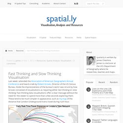
Aside the impressiveness of the bureau’s work I was struck by how Groves conceived of visualisations as requiring either fast thinking or slow thinking. Fast thinking data visualisations offer a clear message without the need for the viewer to spend more than a few seconds exploring them. These tend to be much simpler in appearance, such as my map of the distance that London Underground trains travel during rush hour. The explicit message of this map is that surprisingly large distances are covered across the network and that the Central Line rolling stock travels furthest. Data Visualization: Modern Approaches - Smashing Magazine. About The Author Vitaly Friedman loves beautiful content and doesn’t like to give in easily.
When he is not writing or speaking at a conference, he’s most probably running … More about Vitaly Friedman … Data presentation can be beautiful, elegant and descriptive. There is a variety of conventional ways to visualize data - tables, histograms, pie charts and bar graphs are being used every day, in every project and on every possible occasion. However, to convey a message to your readers effectively, sometimes you need more than just a simple pie chart of your results. SocialMedia & Web2.0 Resources - Blogging, SEO & Marketing Tips. Cartographies of Time. We Feel Fine / Movements. Movements We Feel Fine is divided into six discrete movements, each illuminating a different aspect of the chosen population.
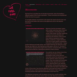
These movements are represented in the We Feel Fine applet. To navigate between movements in the applet, the viewer should scroll over the heart at the bottom left corner of the applet and click on the desired movement. Madness, the first movement, opens with a wildly swarming mass of around 1,500 particles, emanating from the center of the screen and then careening outwards, bouncing off walls and reacting to the behavior of the mouse.
Each particle represents a single feeling, posted by a single individual. Visualizing the ‘Power Struggle’ in Wikipedia. A new visualization Bruce Herr and I recently completed is being featured in this week’s New Scientist Magazine (the article is free online, minus the viz).
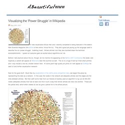
They did a good job jazzing up the language used to describe the viz–’power struggle’, ‘bubbling mass’, ‘blitzed articles’–but they also dumbed down the technical accomplishments. I guess not everyone gets as excited about algorithms as I do. Anwendungen und Mashups. 16 Awesome Data Visualization Tools. From navigating the Web in entirely new ways to seeing where in the world twitters are coming from, data visualization tools are changing the way we view content.

We found the following 16 apps both visually stunning and delightfully useful. Visualize Your Network with Fidg’tFidg’t is a desktop application that aims to let you visualize your network and its predisposition for different types of things like music and photos. Currently, the service has integrated with Flickr and last.fm, so for example, Fidg’t might show you if your network is attracted or repelled by Coldplay, or if it has a predisposition to taking photos of their weekend partying.
As the service expands to support other networks (they suggest integrations with Facebook, digg, del.icio.us, and several others are in the works), this one could become very interesting. Galerie de GDS Infographics. We Love Datavis. Infographics. A visual exploration on mapping complex networks. Cool Infographics - Blog.
Data Visualizations, Challenges, Community. Makes explanimations. Interactives » A blog about interactive infographics. اینفوگرافیک. #OccupyData NYC.