
Mapping technologies. France Population - Estimates - Pyramids. Netherlands - population stats. Australia Bureau of Stats - Population. 7B people & you: What's your number? Sources:
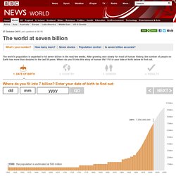
Interactive - NatGeoMag Population. The World of Seven Billion The map shows population density; the brightest points are the highest densities.
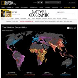
Each country is colored according to its average annual gross national income per capita, using categories established by the World Bank (see key below). Some nations— like economic powerhouses China and India—have an especially wide range of incomes. But as the two most populous countries, both are lower middle class when income is averaged per capita. How Did We Get to 7 Billion People So Fast? I love the cool infographic video from NPR. 7 Billion: How Did We Get So Big So Fast?
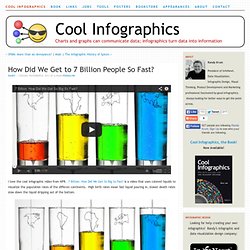
Is a video that uses colored liquids to visualize the population rates of the differen continents. High birth rates mean fast liquid pouring in, slower death rates slow down the liquid dripping out of the bottom. The U.N. estimates that the world’s population will pass the 7 billion mark on Monday. [Oct 31st]As NPR’s Adam Cole reports, it was just over two centuries ago that the global population was 1 billion — in 1804. But better medicine and improved agriculture resulted in higher life expectancy for children, dramatically increasing the world population. Gapminder. SHOW®/WORLD - A New Way To Look At The World.
Money Chart. McDonalds in USA jpg. Walmart Dwarfs Entire Industries And Nations. Walmart is always good for destroying your faith in humanity on Black Friday, and this year was no exception: By day’s end, reports emerged from stores across the country of biblical struggles over waffle makers, pepper-spraying, and even at least one shooting.

Maybe if shoppers took a closer look at Walmart’s business doings they wouldn’t be so willing to whip out legal airborne torture for a bargain Xbox. Or maybe they would, I don’t know. Still, what Frugal Dad has strung together in Weight of Walmart above, has to give even the most hardened Black Friday criminals pause. It takes what are by now well-worn statistics about Walmart--it’s America’s largest grocery store, and the world’s largest retailer, employer, and earner of corporate revenue--and puts them into context, comparing the company to other businesses, industries, and even countries, to demonstrate the astounding reach of a corporation that looks more like a superpower every day.
Timeline of Major Events & Trends on Datavisualization. Peter von Stackelberg designed this complex timeline of social, technological, economic and political events and trends from 1750 to 2100.
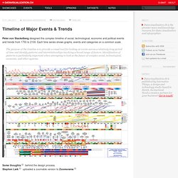
Each time series shows graphs, events and categories on a common scale. The purpose of the timeline is to provide a visual tool for looking at events across a relatively long period of time and identify patterns and interrelationships involving a broad range of factors. Identification of patterns is particularly important when attempting to look at the future of complex social, technological, economic, and other systems. Some thoughts behind the design process.Stephen Lark uploaded a zoomable version to Zoomorama. Worldmapper: The world as you've never seen it before. New Dream Mini-Views: Visualizing a Plenitude Economy. WebGL Globe. Migrations Map: Where are migrants coming from? Where have migrants left? OECD Better Life Initiative.
Average personal index for Germany, men, 15–24 How’s life?
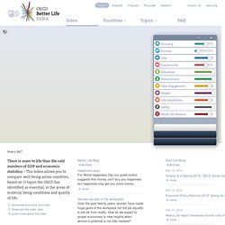
There is more to life than the cold numbers of GDP and economic statistics – This Index allows you to compare well-being across countries, based on 11 topics the OECD has identified as essential, in the areas of material living conditions and quality of life. Download executive summary Download the index data Learn more about the index Better Life BlogArchive Happiness pays For World Happiness Day our guest author suggests that money can't buy you happiness but happiness may get you more money. more ... Gender equality in the workplace Over the past twenty years, women have made huge gains in the workplace but full job equality is still far from reality. The Value of an Hour of Work (GDP) World's Best Countries.
Infographic Of The Day: Cellphone Calls Reveal The United States's Invisible Ties. The lines between states and even countries are pretty arbitrary: The ties you have with people 50 miles away aren't going to be too-much affected by some imaginary line drawn up 200 years ago.
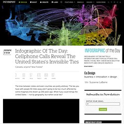
What if you could remap the United States -- not by geography, but rather social ties? MIT's Senseable City Lab has done just that, by analyzing mobile-phone calling patterns across the country. By looking at calls between cellphones, they've revealed states and cities that are closely connected -- and similarly, regions which aren't nearly as closely connected as you'd think. Here's their main result, color-coded by regional affiliation: You see all sorts of super-states emerge: Arizona and New Mexico are closely bound, as are Western Pennsylvania and West Virginia, The Carolinas, Louisiana and Mississippi, Alabama and Georgia, New York and New Jersey, and all of the New England states.
DataVisualizer from worldbank.org. Govpulse. Budget. World debt comparison: The global debt clock. US Gov XML. XML files. Top economists reveal their graphs of 2011.