
Pure Information. Pure Information. Wind Map. San Francisco Crimespotting. Notice anything different?

We’ve been working on the interface design, read more about it on the blog. San Francisco Crimespotting is an interactive map of crimes in San Francisco and a tool for understanding crime in cities. Inkatlas. Aerostate. Chatty Maps. MapHub · Create interactive maps. BatiParis : période de construction des immeubles parisiens. Petite cartographie des périodes de construction du bâti Parisien et des monuments historiques de la capitale.

Cette carte permet de naviguer dans les différentes strates du bâti Parisien. Grâce aux données de l'APUR, vous pouvez filtrer les immeubles de Paris suivants leurs date estimées de construction. En zoomant, vous pouvez également avoir accès à des informations (architecte, période de construction,...) sur les monuments historiques classés de la capitale. Les données sur les monuments historiques sont extraites de la base Mérimée gérée par Ministère de la Culture et de la Communication et elles ont été géolocalisée grâce à Wikimedia Commons.
Карта возрастов домов Москвы (beta)
The ArcGIS Book. Огромный архив старых карт городов России и зарубежья выложен в сеть: philologist. Картинки - Топографические карты начала-середины 20 века [JPG] torrent. Mapping Every Single Job in the United States. One of the best visualizations of race in America might be called pointillist.
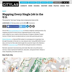
By mapping one dot for every Census-registered human in the country, color-coded for race, a team at the University of Virginia’s Weldon Cooper Center of Public Service rendered abstract social data painfully personal. Robert Manduca, a Harvard PhD student in sociology and a mapmaker, has brought the power of the dot to a new dataset: Jobs. Using 2010 LEHD Census data, and much of the code that brought the racial dot map to life, Manduca created an interactive map of one dot for every job location in America. Red dots represent manufacturing and trade. Blue dots are professional services. New York City. Thematic Cartography Guide. Welcome!
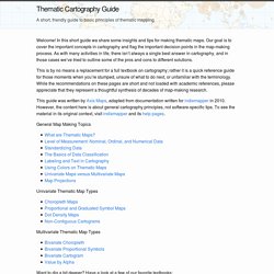
In this short guide we share some insights and tips for making thematic maps. Our goal is to cover the important concepts in cartography and flag the important decision points in the map-making process. Instant CAD files of any place in the world. Recording intersections between architecture, geology and politics. Американские армейские топографические карты Европейской России.1947-1955. Часть 3 - Записки скучного человека. Исторические фотографии (humus) Американские армейские топографические карты Европейской России.1947-1955. Часть 3 - Записки скучного человека. Исторические фотографии (humus) LabRatRevenge - Justin Palmer. Advanced GIS: Web GIS.
Note: The data presented here represents preliminary findings and should not be used without written permission from UCLA.

This is a student draft of the data and is not to be used. Overview Reducing greenhouse gas emissions by reducing electricity consumption is a priority of the state of California. In 2009, California implemented SB 375, which requires Metropolitan Planning Organizations (MPOs) to create Sustainable Community Strategies to address these goals. Our team, Take Electricity Seriously, Los Angeles (T.E.S.L.A.) is proud to announce the official public launch of an electricity consumption map for the City of Los Angeles (City) to give a more complete overview of where and how electricity is used. Website Development Our website went through many iterations. The Best Map Ever Made of America's Racial Segregation.
Last year, a pair of researchers from Duke University published a report with a bold title: “The End of the Segregated Century.”
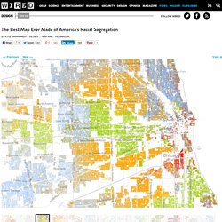
U.S. cities, the authors concluded, were less segregated in 2012 than they had been at any point since 1910. But less segregated does not necessarily mean integrated–something this incredible map makes clear in vivd color. The Racial Dot Map: One Dot Per Person for the Entire U.S. Terms of Use Add Map Labels Remove Color-Coding.
Estimated Total Annual Building Energy Consumption at the Block and Lot Level for New York City. Urban Layers. Explore the structure of Manhattan’s urban fabric. Graph Use the sliders to identify some of Manhattan's oldest buildings; to discover how the beginning of the 20th century marked the island's urban environment or to explore the distribution of building activity over the last decades.

Learn more. Data. NYC flight-taxi visualization. Sochi 2014 Interactive Map » From Fiasco Design. Инфографика, интерактивные карты, визуализация – 20+ лучших проектов, которые войдут в учебники. Start where you are. Старые карты Санкт-Петербурга и Ленинградской области - Это Место.ру. Importing a spreadsheet. If you've found yourself on this page, we're assuming you've Tip: Want to import a spreadsheet directly to Mapbox.com?
See the documentation for import CSV & other types of files directly into the editor. One of the many geo formats that TileMill supports is a spreadsheet, specifically a comma-separated values (CSV) file. How do I import files to my map? With a Basic account or higher, you can import up to 2000 features to your map by clicking the import link from your Data tab.
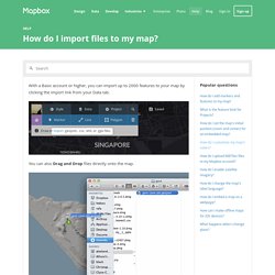
You can also Drag and Drop files directly onto the map. The following files are recognized file formats: GeoJSON: popular in use with web mapping and open source softwareKML: popular in Google software like Google MapsGPX: useful for sports data, like hiking, bicycling, or running tracks: you can export your Strava activities as GPXCSV: you can export CSV files from Microsoft Excel, Google Docs, and other spreadsheet software.
If latitude & longitude fields are present in the data, we’ll detect and use them. Enter the Mesmerizing World of Rainbow Coloured Maps with “Crayon the Grids” A new series of maps by California-based artist-scientist Stephen Von Worley give colour coding an entirely new meaning. 12 data maps that sum up London. Image copyright James Cheshire/Oliver Uberti. OpenAddresses. Mapping your moves (with Mapbox Studio!) Map: How Hollywood Has Destroyed America. Стрит-арт Нижнего Новгорода. Emergency and Disaster Information Service. Contagious Disease Surveillance.
Map: Vaccine-Preventable Outbreaks. This interactive map visually plots global outbreaks of measles, mumps, whooping cough, polio, rubella, and other diseases that are easily preventable by inexpensive and effective vaccines. Red triangles indicate attacks on vaccinators and healthcare workers, as well as announcements from both governments and non-state actors that have had an impact—either positive or negative—on the successful implementation of vaccination programs. The Global Health Program at the Council on Foreign Relations has been tracking reports by news media, governments, and the global health community on these outbreaks since the fall of 2008. This project aims to promote awareness of a global health problem that is easily preventable, and examine the factors that threaten the success of eradicating preventable illnesses such as polio.
Learn more about Global Health. Fruit City. Overpass turbo. USGS Geologic Atlas of the Moon. ACSA Atlas Project. One Mapping Service to Rule Them All. A map that shows the growth of New York City from 1626 to the present day tells a lot of stories about American history. How the Dutch colony of Nieuw Amsterdam became the English colony of New York, only to be recaptured and renamed Nieuw-Orange. How the great manors of New York were incorporated into cities. And how the cities of New York and Brooklyn (formerly Breucklyn) grew by annexation until they were consolidated as with Long Island, Queens, and Staten Island.
The graphic simplicity of MapStory's geographic history of New York City belies an incredible challenge. GeoCommons. Blog Archives - MORPHOCODE. GL. Darkhorse Analytics Blog. Human Data. USGS Geologic Atlas of the Moon. ACSA Atlas Project. Map creator online to make a map with multiple locations and regions. StatSilk. Kartograph.org. Wikimapia. House Street City Country World 30624872 places Distance Measure About Wikimapia, All countries, USA, Canada, UK, Australia, New Zealand, Germany, Switzerland, Italy, France, Spain, Russia, India, Brazil ... Polymaps.
GeoCommons. Mapbox.