
The importance of data visualisation is explored in the British Library's first science exhibition LONDON.- In an age of rapidly advancing technologies Beautiful Science, opening tomorrow in The Folio Society Gallery at the British Library, shows that the challenge of presenting big data in innovative ways is not a new one. From 17th century illustrated diagrams to contemporary interactive visualisations, the exhibition explores how advances in science alongside changes in technology have allowed us to visually interpret masses of information. Beautiful Science, sponsored by Winton Capital Management, explores the work of scientists and statisticians through the ages using the Library’s own vast science collections together with new and exciting technology, focusing on three key themes – public health, weather and evolution. Dr Johanna Kieniewicz, lead curator of Beautiful Science, says: “The British Library is home to the nation’s science collection and we’re thrilled to be opening up our fantastic collections in the Library’s first science exhibition.
10 outils web à connaitre pour booster vos présentations Vous cherchez à améliorer facilement vos présentations ou à être plus créatifs de manière générale ? Ces 10 outils web peuvent vous aider. Ils ont l’avantage de ne pas nécessiter d’installation et sont disponibles en ligne ! Colourlovers : - Cette communauté vous propose des palettes de couleurs et des motifs dont vous pouvez vous inspirer afin de garantir la cohérence graphique de votre présentation. Easel.ly : - Vous souhaitez créer facilement une infographie, afin de par exemple présenter de manière plus visuelle les résultats d’une enquête ? Moqups : - Un dessin vaut parfois mieux que de longs discours, surtout s’il s’agit d’expliquer à quoi pourrait ressembler une interface graphique. Pixl.r : - Pixl est un éditeur de photo en ligne extrêmement intuitif. Prezi : Vous en avez assez des présentations monotones sur PowerPoint ?
The Google Glass feature no one is talking about — Creative Good (Also: en français, en español, 简体中文, 繁體中文, На русском, in het nederlands, em Português) Google Glass might change your life, but not in the way you think. There’s something else Google Glass makes possible that no one – no one – has talked about yet, and so today I’m writing this blog post to describe it. To read the raving accounts of tech journalists who Google commissioned for demos, you’d think Glass was something between a jetpack and a magic wand: something so cool, so sleek, so irresistible that it must inevitably replace that fading, pitifully out-of-date device called the smartphone. Sergey Brin himself said as much yesterday, observing that it is “emasculating” to use a smartphone, “rubbing this featureless piece of glass.” His solution to that piece of glass, of course, is called Glass. Like every other shiny innovation these days, Google Glass will live or die solely on the experience it creates for people. The life bitstream will raise new and important issues.
The 10 Commandments of Visual Communication Visuals are everywhere. Since the last decade, the art of visual communication has boomed by leaps and bounds and is, to the date, on a marked rise. Today, one cannot imagine the internet without all the GIFs, infographics, and memes floating it. With visual data on the rise and most of us being immensely fond of it, everyone now seems to be creating their own versions of it. It outlines the various different aspects of visual communication and sums them all up to perform as a complete guide to the art of designing. Let us know how you like it! PS: Also snoop into our prequels to this infographic, “The 10 Commandments of Typography”, “The 10 Commandments of Color Theory” and “The 10 Commandments of Logo Design”. Embed in your site:
L'Art perdu du Dessin Animé éducatif Laissez-moi vous raconter une histoire... Croyez-le ou non, il fut un temps où la télévision pouvait servir à autre chose que de "vendre à Coca-Cola du temps de cerveau humain disponible ". Un temps où C'est Pas Sorcier n'avait pas encore à se soucier de son avenir, où Plus Belle la Vie n'avait pas atteint le statut de pinacle intellectuel du petit écran, et où Nabila elle-même n'avait pas de cheveux. Oui ça remonte. En ce temps-là vivait un petit garçon qui après l'école passait une quantité malsaine d'heures devant la télé. Son petit cerveau, avide de connaissances et de Pokémon, ne pouvait se lasser du flot continu d'informations que lui déversait le petit écran. 10 ans plus tard... Le voyage d'aujourd'hui ne vous conduira pas dans tout l'univers, mais plutôt dans le passé. Ordy - Les Grandes Découvertes (Kazuyoshi Yokota, 1989) Comment traiter objectivement une série qui a littéralement façonné votre façon de voir les choses? Pendant ce temps, sur Windows 98... RIP Clippy... ...
Going to Data Visualization School - World of Data With the never-ending expansion of online possibilities for quality learning, I got to the can’t-see-the-woods-for-trees phase quite a while ago and tend to forget about some of the high quality stuff out there. Hence, I wanted to get some sort of overview of the possibilities I needed to look into. That used to be an Evernote note. By now I have attended a few of the courses, but there is still plenty out there I should be able to combine with a busy work schedule. Aggregator I have only come across one aggregator of university level courses, and that is Class Central. Coursera have so many great courses that I can’t exactly say that I have checked them all. Data Visualization Alberto Cairo’s course “Introduction to Infographics and Data Visualization” from the Knight Center for Journalism in the Americas is absolutely top class. Katy Börner at Indiana University will run a Information Visualization MOOC very soon (starts 22 January). Visualization by Code Visualization Without Code
16 illustrations vectorielles | Pascale Boudeville 18 janvier 2011 - illustration - 1 462 views Cet article fait partie d’une série d’articles dans lesquels vous trouverez les images du web les plus inspirantes pour vos illustrations. IBM unveils computing architecture based on the brain | Cutting Edge IBM scientists unveiled an all-new computing architecture on Wednesday that's based on the human brain. In an announcement tonight, IBM Research said that its new software ecosystem was built to program silicon chips whose architecture is directly inspired by the brain's size, function, and minimal use of power. The company hopes that its breakthrough may support a next generation of applications that could mirror what the brain can achieve in perception, cognition, and action. "We are working to create a Fortran for neurosynaptic chips," IBM principal investigator and senior manager Dharmendra Modha said in a release. As such, IBM created a multi-threaded, massively parallel and what it said is a highly-scalable software simulator of the kind of cognitive architecture it imagines and which comprises a network of neurosynaptic cores.
The Collection Avengers, Avatar... quel film a la palme de l'aberration scientifique ? L'un des Avengers les plus emblématiques et peut-être aussi le plus réaliste du point de vue de la technologie, Iron Man. © Marvel Avengers, Avatar... quel film a la palme de l'aberration scientifique ? - 2 Photos Avengers a dépassé le milliard de dollars de recettes dans le monde et il marche sur les traces d'Avatar. © Marvel Pour élire la palme de l'aberration scientifique 2012 pour un film, comme on vous le proposait déjà avec la palme 2011, découvrez notre sélection, lisez les commentaires et votez ! Mais qu'il soit bien entendu qu'il ne s'agit nullement de dénigrer ces films sous prétexte qu'ils contiennent parfois des invraisemblances scientifiques. 1. Une bande annonce de Captain America : First Avenger. © Marvel Studios Paramount Pictures-YouTube 2. Iron Man, la bande-annonce. © Jon Favreau/Super Beri, YouTube 3. Une bande annonce du film Thor. © cinecomics-YouTube 4. Bande annonce du film Avengers. © marvelfr-YouTube 5. 6. A voir aussi sur Internet Sur le même sujet
A Pretty Data Viz From Geneva Switzerland If you are interested in beautiful data visualizations, you can't get much better than this one from Geneva that shows you the ebb and flow of people in that wonderful city. I am not sure how it was created, but the soft lines that swirl around and across the lake will leave you entranced and you'll probably want to replay it a few times just to catch all the movements. As the site states, the visualization will "allow you to explore these streams of connected people around the city, in their everyday life." Interestingly, the site's name means "city living" in French. Here is the animated video done by Interactive Things that is posted on the site. Switzerland had more cell phones than people, around 10 million. Swisscom's visualization shows us the way Genevans interact with their city, how they move about the region, go from one side of the lake to the other, and work and play in their city.
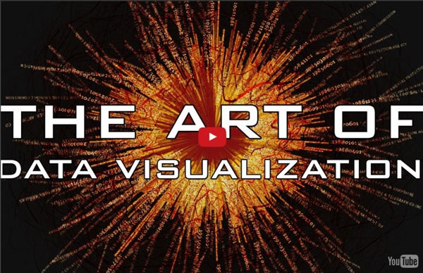
The Art of Data Visualization | Off Book | PBS Digital Studios
Publiée par PBSoffbook
sur YOUTUBE le 9 mai 2013 by epc Aug 19