
Graphics Info. Sensory Maps. Mark Lombardi. Mark Lombardi (March 23, 1951 – March 22, 2000) was an American neo-conceptual artist who specialized in drawings that document alleged financial and political frauds by power brokers, and in general "the uses and abuses of power".[1][2][3] Education and early career[edit] Late career[edit] Six years before his death, Lombardi switched to link analysis pencil diagrams of crime and conspiracy networks that he would become best known for.
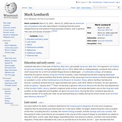
In the early 1990s, he began researching the many scandals of the time, including the BCCI scandal, the Harken Energy scandal, and the Savings and Loan scandal. The thousands of index cards that he accumulated in the course of this research began to overwhelm his ability to deal with them, and to cope, Mark began assembling them into physical outlines, and then into hand-written diagrams. A visual exploration on mapping complex networks. Heretics - Marius Roosendaal. Scientific Visualization and Computer Graphics - KDEEB.
Edge bundling is a recent, increasingly promising, technique which generates graph layouts of limited clutter.
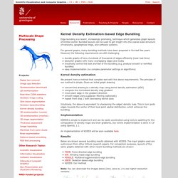
Bundled layouts can be used to get insight into the coarse-scale structure of networks, geographical maps, and software systems. For general graphs, many bundling methods have been proposed in the last few years. However, the following requirements are still challenging bundle graphs of tens..hundreds of thousands of edges efficiently (near-real-time) declutter graphs with many overlapping edges and nodes intuitively control the look and feel of the bundling (e.g. produce smooth or ramified bundles) easy implementation (no complex parameter settings or algorithms) Kernel density estimation We present here a method that complies well with the above requirements. Intuitively, the above is equivalent to sharpening the edges' density map. Implementation An implementation of KDEEB will be soon available here. Results Below are shown several bundling results obtained with KDEEB.
People Maps. Data Visualizations, Challenges, Community. Earthquakes per hour in Costa Rica. I.ngen.io » Trabajos. Density Design. Calm The Ham. The Big Picture. Industry Leaderboard. The industries The 55 industries surveyed in the Bloomberg Industries Leaderboard were chosen on the basis of size, investor interest, and coverage by Bloomberg Industries (BI).
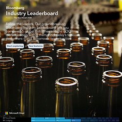
Industry revenue Revenue (size) is derived by aggregating public company annual revenues generated from an industry and available as of Aug. 30. Revenues were estimated by BI for the following: Coal Mining-Global, Electrical Equipment- Global, Express & Courier Services-Global, Investment Banking- Global, Life Insurance-Global, Property & Casualty-Global, Pharma-Global, Rail Freight Transportation-North America, Renewable Energy-Global, Steel Producers- Global, Utilities- Europe. Revenues for Life Insurance, Property & Casualty Insurance, and Managed Care are based on premium revenue. Industry market leaders Within each of the 55 industries, from four to 16 market leaders were selected based on their share of revenue in a given industry.
Key industry metrics Industry median Machinery industry Company market share. DataVis.ca. The Best Resources For Creating Infographics. Infographics are visual representations of data design to help communicate information clearly.
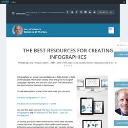
They are great for English Language Learners, and the rest of us, too! The information can also be either serious or humorous. To see examples of some of the best ones, you can visit: The Best Infographics — 2010 The Best Interactive Infographics — 2009 You can find even more at The Best Sources For Interactive Infographics and A Collection Of “The Best…” Lists On Infographics. Of course, you don’t need online resources to have students create their own infographics that can be used towards achieving numerous learning outcomes, as I recently posted about at What A Great Infographic To Use As A Model For Students.
Moz: Inbound Marketing and SEO Software, Made Easy. SIMILE Widgets. DataVis.ca.
Apps/Dia. Welcome to Dia's homepage.
Dia is a GTK+ based diagram creation program for GNU/Linux, MacOS X, Unix, and Windows, and is released under the GPL license. Dia is roughly inspired by the commercial Windows program 'Visio,' though more geared towards informal diagrams for casual use. It can be used to draw many different kinds of diagrams. Overview. The 36 best tools for data visualization. It's often said that data is the new world currency, and the web is the exchange bureau through which it's traded.
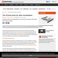
As consumers, we're positively swimming in data; it's everywhere from labels on food packaging design to World Health Organisation reports. As a result, for the designer it's becoming increasingly difficult to present data in a way that stands out from the mass of competing data streams. Get Adobe Creative Cloud One of the best ways to get your message across is to use a visualization to quickly draw attention to the key messages, and by presenting data visually it's also possible to uncover surprising patterns and observations that wouldn't be apparent from looking at stats alone.
By connectedness : culturegraphy - culture - memes - visualization. Links to Infographic Sites, Visual Designers and C - Cool Infographics. Randy's infographic design consultancy to Visualize Business Intelligence Jacob O'Neal's site focused on designing animated GIF infographics Company that helps visualize business data Rose Zgodzinski's site to help client find visual solutions Consulting, Design and Social + PR Brian Cragin is an infographic designer in San Diego A masterfully constructed infographic campaign can work wonders for your business Dashboard Design: Data Driven helps your clients better understand and act upon your information Dejure Design provides interactive and visual design services to social justice organizations seeking to make their legal work more accessible and engaging.
Legislative Explorer. Digital Resources for Net Professionals. Wizualizacje. Welcome to the Visually Marketplace. Ciudades a escala humana. Blprnt.blg. Aaron Koblin. Moritz.stefaner.eu - / Data Visualization, Infographics, and Statistics.