
ARC Centre of Excellence for Mathematical and Statistical Frontiers. Data Science and Machine Learning: Mathematical and Statistical Methods By D.P.
Kroese, Z.I. 100+ Free Machine Learning Books (Updated 2021 List) Hi Everyone!
Today we're gonna list out 100+ Free Machine Learning Books and Free Artificial Intelligence Books. We have researched a lot on the internet and collected a huge list of free AI and ML books for you guys. 20 Cheat Sheets: Python, ML, Data Science, R, and More. Definitive Guides to Data Science and Analytics Things. 15 Free Data Science, Machine Learning & Statistics eBooks for 2021.
At KDnuggets, we have brought a number of free eBooks to our readers this past year.
Among other articles highlighting such materials, I have written a series of posts since the pandemic erupted, in the case that more people spending more time at home may result in more time for reading. Of course, a packed reading schedule is obviously not what the past nine months has had in store for everyone, but for those who could spare a moment here or there, we hope that some of the eBooks we have shared during this tough time may have been useful. As I go back through those books of which I wrote reviews in 2020, I have decided to close out the year by compiling a list of 15 in a single place. If you originally missed out on a few or all of them in totality, this is your chance to catch up on some reading. With this we randomly present (again) 15 top notch free eBooks to start 2021 with, alongside a text selection from my original review.
The book is unusual in that it's taught "top down". Large Collection of Neural Nets, Numpy, Pandas, Matplotlib, Scikit and ML Cheat Sheets.
Intro Data Analytics. Poor numerical literacy linked to greater susceptibility to Covid-19 fake news. People with poor numerical literacy are more likely to believe Covid-19 misinformation, according to a survey conducted in five countries.
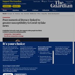
Researchers at Cambridge University said the findings suggested improving people’s analytical skills could help turn the tide against an epidemic of “fake news” surrounding the health crisis. Five national surveys – reflecting national quotas for age and gender – were conducted this year to evaluate susceptibility to coronavirus-related misinformation and its influence on key health-related behaviours. The study found the most consistent predictor of decreased susceptibility to misinformation about Covid-19 was numerical literacy – the ability to digest and apply quantitative information broadly.
People in Ireland, Spain, Mexico, the US and the UK took part in the study. Their numerical literacy levels were calculated on the basis of three different numeracy tests. “My take is that both are relevant. “Alright, Mr. Tableau, I’m Ready for my Close-up” Redes sociales y pánico moral. El gran hackeo (2019), el documental de Netflix sobre Cambridge Analytica, comienza con una sentencia interesante.
David Carroll, profesor asociado en la Parsons School of Design de Nueva York, está sentado frente a un pequeño grupo de estudiantes y pregunta: —¿Quién no ha visto un anuncio que le haya hecho pensar que su micrófono está escuchando sus conversaciones? Entonces, se escuchan las risas incómodas de los alumnos. Y Carroll afirma: —Nos cuesta imaginar cómo funciona (...). La respuesta de Carroll plantea interrogantes que no han perdido vigencia. El documental también pone el foco en el escándalo de Cambridge Analytica, los problemas de privacidad de Facebook, las fake news y la consecuente «manipulación de las personas» y toma como casos de análisis el Brexit y la campaña presidencial de Donald Trump de 2016. Sin embargo, el documental da por sentados hechos que vale la pena poner en tela de juicio. Work with data like you work with code.
Exploring Soviet Isotypes: Digitizing “The Struggle for Five Years in Four” Isotype. IZOSTAT. IZOSTAT (ИЗОСТАТ) (Russian: Всесоюзный институт изобразительной статистики советского строительства и хозяйства) was the 'All-union institute of pictorial statistics of Soviet construction and economy'.
Otto Neurath was invited to Moscow to set up the institute in 1931. The institute was located in 9 Bol'shoi Komsomol'sky pereulok.[1] Neurath's collegus Gerd Arntz and Peter Alma also spent time working at IZOSTAT between 1931 and 1934.[2] Dataism - Cerca amb Google. The Difference Between Teaching and Doing Data Visualization—and Why One Helps the Other. Information Design and Visualization, MS < Northeastern University. Data Analytics and Visualization (M.S.) Transform raw data into meaningful information through a combination of statistics, technology, research, and design.
Data Visualization (MS) Parsons’ Master of Science in Data Visualization is a multidisciplinary program in which students develop skills bringing together visual design, computer science, statistical analysis, and ethical considerations of data analysis and representation.
The presentation of data plays a critical role in the shaping of opinion, policy, and decision making in today’s increasingly global society. Giving students a competitive edge as they enter the field, the MS program responds to the increased demand for experts who can turn data into insight. This program is STEM-designated. This means that after graduating, eligible F-1 international students in this program can apply for an additional 24 months of Optional Practical Training at the end of their Post-Completion OPT. Gartner?domain=estadisticas.
3 Data visualisation. Introduction “The simple graph has brought more information to the data analyst’s mind than any other device.” — John Tukey This chapter will teach you how to visualise your data using ggplot2.
Data Visualization with R. How Great TED Speakers Distill 40 Years of Experience Into 18 Minutes. A great speaker can condense decades of experience into a presentation that lasts no longer than 18 minutes.
It's a tactic you must master to become a great communicator. In a recent article for Fast Company, TED coaches offer tips for landing a speaking slot at a TED Conference. One suggestion: Your idea must be specific, digestible, and bite-size. According to the coaches, however, "many experts don't feel they can distill 40 years' worth of expertise in their field into a snappy, 20-minute talk.
" The solution is a tip that I recommend to entrepreneurs pitching an investor or CEOs taking their companies public. Focus on one big idea that you can articulate in one short sentence. Dataviz: Making Smarter, More Persuasive Data Visualizations. Crimes of Fashion — Alyssa Fowers. RAWGraphs. The carbon map. Data Visualization & Storytelling. Infographics Design and Data Visualization Agency.
The Truth, The Whole Truth, and Nothing But the Truth...in Data Storytelling and Visualization. The 3 Missing Roles that every Data Science Team needs to Hire. In a mad rush to hire Data Scientists, most companies overlook three key roles and this often leads to failure of projects Many companies falsely assume that ramping up analytics is a matter of hiring enough data scientists. Maybe that’s why job postings for this role have increased by over 250 percent since 2013. McKinsey cites the example of one large financial services firm, where the CEO was an enthusiastic supporter of advanced analytics.
5 secrets of master storytellers. How to Pump Yourself Up Before a Presentation (or Calm Yourself Down) - Duarte. 15 Stunning Data Visualizations (And What You Can Learn From Them) We’re literally drowning in data. Everyday, 2.5 quintillion bytes of data are created. This is the equivalent of 90% of the world’s information--created in the last two years alone. Data Visulization Course Materials. This resource page features course content from the Knight Center for Journalism in the America's massive open online course (MOOC), titled "Data Visualization for Storytelling and Discovery. " The four-week course, which was powered by Google, took place from June 11 to July 8, 2018.
We are now making the content free and available to students who took the course and anyone else who is interested in learning how to create data visualizations to improve their reporting and storytelling. The course was taught by Alberto Cairo, He created and curated the content for the course, which includes video classes and tutorials, readings, exercises, and more. The course materials are broken up into four modules: Dashboards?domain=estadisticas. Skip to main content Webinar Series Building dashboards that persuade, inform, and inspire A good business dashboard informs with a glance. A great business dashboard combines high performance and ease of use to empower people with data-informed insights.