
Population pyramids with ggplot2. 15 Questions All R Users Have About Plots. R allows you to create different plot types, ranging from the basic graph types like density plots, dot plots, bar charts, line charts, pie charts, boxplots and scatter plots, to the more statistically complex types of graphs such as probability plots, mosaic plots and correlograms.
In addition, R is pretty known for its data visualization capabilities: it allows you to go from producing basic graphs with little customization to plotting advanced graphs with full-blown customization in combination with interactive graphics. Nevertheless, not always do we get the results that we want for our R plots: Stack Overflow is flooded with our questions on plots, with many recurring questions. This is why DataCamp decided to put all the frequently asked questions and their top rated answers together in a blog post, completed with additional, short explanations that could be of use for R beginners. 1. How To Draw An Empty R Plot? How To Open A New Plot Frame plot.new() 2. 3. 2. 4. 5. 2. Adventures in Analytics and Visualization: Animated choropleths using animation, ggplot2, rCharts, googleVis and Shiny to visualize violent crime rates in different US States across 5 decades.
Visualization in R with ggplot2. Aim of Course: In this online course, “Visualization in R with ggplot2,” participants will learn how to use the ggplot R Project to make, format, label and adjust graphs using R.

The ggplot2 Project, created by Hadley Wickham, is named after the term "Grammar of Graphics," which was coined by Leland Wilkinson (creator of Systat) and won the 2006 John Chambers Award for Statistical Computing. This "grammar of graphics" is a system of describing and organizing the fundamental components of a graph and the process of creating a graph. Using ggplot2, participants will learn how to design and implement graphs in an efficient, elegant and systematic manner, following principles of general good graphing practice.
Ggplot2 Choropleth of Supreme Court Decisions: A Tutorial. Creating a Leaflet choropleth map with a pop-up in R. This document will show how to create a choropleth map with pop-ups using RStudio’s Leaflet package for R.
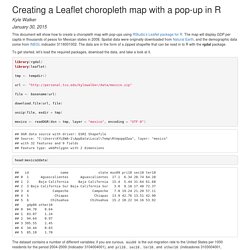
The map will display GDP per capita in thousands of pesos for Mexican states in 2008. Spatial data were originally downloaded from Natural Earth, and the demographic data come from INEGI, indicador 3116001002. The data are in the form of a zipped shapefile that can be read in to R with the rgdal package. To get started, let’s load the required packages, download the data, and take a look at it. library(rgdal)library(leaflet) tmp <- tempdir() url <- " file <- basename(url) download.file(url, file) unzip(file, exdir = tmp) mexico <- readOGR(dsn = tmp, layer = "mexico", encoding = "UTF-8") How to make choropleth maps with R. Creating a Business Dashboard in R. Business dashboards are available in many shapes and sizes.

Business dashboards are useful to create an overview of key performance indicators (KPIs) important for the business strategy and/or operations. There are many flavours of dashboard frameworks and apps available, ranging in price from thousands of dollars to open-source implementations. Simple, communicates easilyMinimum distractions…it could cause confusionSupports organized business with meaning and useful dataApplies human visual perception to visual presentation of information As the title already indicates, this post is about using R to create simple, cheap and practical business dashboards. Basically we will generate a simple HTML which visualizes the selected KPIs. What do you need? Visualization - What do you use to generate a dashboard in R? - Data Science Stack Exchange.
Shiny is a framework for generating HTML-based apps that execute R code dynamically.
Shiny apps can stand alone or be built into Markdown documents with knitr, and Shiny development is fully integrated into RStudio. There's even a free service called shinyapps.io for hosting Shiny apps, the shiny package has functions for deploying Shiny apps directly from R, and RStudio has a GUI interface for calling those functions. There's plenty more info in the Tutorial section of the site. Since it essentially "compiles" the whole thing to JavaScript and HTML, you can use CSS to freely change the formatting and layout, although Shiny has decent wrapper functionality for this.
But it just so happens that their default color scheme is similar to the one in the screenshot you posted. edit: I just realized you don't need them to be dynamic. Mapping Flows in R. Last year I published the above graphic, which then got converted into the below for the book London: The Information Capital.

I have had many requests for the code I used to create the plot so here it is! The data shown is the Office for National Statistics flow data. See here for the latest version. The file I used for the above can be downloaded here (it is >109 mb uncompressed so you need a decent computer to load/plot it all at once in R). You will also need this file of area (MSOA) codes and their co-ordinates. Load the flow data required – origin and destination points are needed. The UK Census file above didn't have coordinates just area codes. How to plot a map with ggplot2? R ggplot2 maps visualization « uchicagoconsulting. In one recent project I needed to draw several maps and visualize different kinds of geographical data on it.
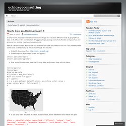
I found the combination of R/ggplot/maps package extremely flexible and powerful, and produce nice looking map based visualizations. Here is a short tutorial, monospace font indicates the code you need to run in R. You probably need some basic understanding of R to work through this tutorial. install.packages("maps") install.packages("ggplot2") Now import the libraries, load the US map data, and draw a map with all states. Nice ggplot intro tutorial. Just run the commands, about 6 pages… Nice ggplot intro tutorial.

Just run the commands, about 6 pages = flexible 1-3 hours of learning, depending how much reading you want to pair it with by Ramon Saccilotto To leave a comment for the author, please follow the link and comment on his blog: isomorphismes.