
Why You Should Think About Branding like a Fashion Designer. Building Your Brand on a Shoestring Budget 10 big ideas that will help your brand grow and grow Attract New Customers with Automated Local Citations.

Think Like a Designer: 3 Tips to Help You Build a Better Website. Building Your Brand on a Shoestring Budget 10 big ideas that will help your brand grow and grow Attract New Customers with Automated Local Citations Make technology work for you and go focus on what matters most.

The 4 Basic Principles of Presentation Design. “Good design is thorough down to the last detail.” – Dieter Rams Creating a beautiful presentation requires a symphony of visual elements to work together for a “big picture.”
Designers seek to make the entire vision work together in terms of how each part interacts. This includes layout, typography, and imagery, which all add up to a cohesive set of design elements. So, how can you orchestrate the chaos of design in your next presentation? Use the principles below to guide your way. 1. 26 Beautiful Retro Fonts. Best Free Fonts of 2011.
With only a month and a half left in 2011, it’s hard to believe another year is drawing to a close.
If you’re a long time reader of WDL, you probably know that at the end of each year we publish a series of posts that highlight our favorite freebies and resources from that year. It’s an excellent way to show you what you might have missed, and to give the designers and creators some well deserved recognition. To kick it off, here are the best free fonts of 2011. Responsive Typography: The Basics. By Oliver Reichenstein When we built websites we usually started by defining the body text.
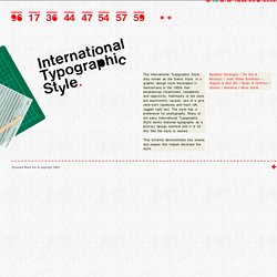
The body text definition dictates how wide your main column is, the rest used to follow almost by itself. Used to. Until recently, screen resolution was more or less homogenous. The International Typographic Style Timeline. Graphis #1 Graphis, The International Journal of Visual Communication, was first published in 1944 by Walter Herdeg in Zurich, Switzerland.
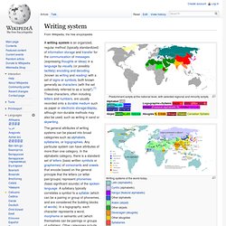
Graphis Inc. is the international publisher of books and magazines on communication design, advertising, photography, annual reports, posters, logos, packaging, book design, brochures, corporate identity, letterhead, interactive design and other design associated with graphic arts. Graphis was (and still is) one of the most important and influential European graphic design publication. Over 350 issues of Graphis magazine have been published. Graphis also publishes hardback annuals including: Graphis Design Annual, Graphis Advertising Annual, Graphis Photography Annual, Graphis Annual Reports Annual, and Graphis Poster Annual. Max Bill. Writing system. Writing systems of the world today.
LetterCult — Custom Letter Culture. Writing Systems. A writing system as a set of visible or tactile signs used to represent units of language in a systematic way.
This simple explanation encompasses a large spectrum of writing systems with vastly different stylistic and structural characteristics spanning across the many regions of the globe. Writing provides a way of extending human memory by imprinting information into media less fickle than the human brain. However, many early philosophers, such as Plato, have branded writing as a detriment to the human intellect. They argued that it makes the brain lazy and decreases the capacity of memory. It is true that many non-writing cultures often pass long poems and proses from generation to generation without any change, and writing cultures can't seem to do that. The Emergence of Print Culture in the West. Helvetica vs Helvetica. Trois des éditeurs présentent des a presque identiques, avec une contreforme en forme de goutte en haut à droite.
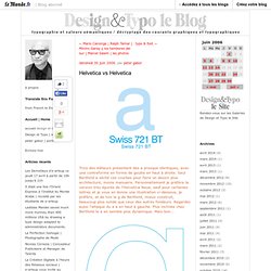
Seul Berthold a séché ces courbes pour faire un dessin plus architecturé, moins manuaire. Personnellement je préfère la version très épurée de l'Helvetica Neue, sauf pour certaines lettres et je vous en donne une illustration ci-dessous, je préfère, et de loin le g de Berthold, mieux construit, beaucoup plus solide que ceux des autres fondeurs. 28 Fonts For Web Designers. InShare26 It is obvious that Web designers do their best to make their sites better and more attractive to the visitors.
Online resources on typefaces and typography. The Psychology of Fonts - Infographic. Choosing the right fonts is one of the most important decisions when it comes to anything relating to design, whether it be a printed graphic or a website. Knowing the psychology behind choosing the correct font will give you the upper hand when it comes to designing. Weemss took the time to layout this Infographic on the psychology of fonts displaying the top 5 in each group, and what type of events they are best used for. Shortlink: About the Author. Typography guide. The Psychology of Fonts. Font is just one of the many factors that must be considered when making web design decisions. Tens of thousands of fonts are available for use by web designers and developers, and it doesn’t take a master’s degree to see that more are created each day.
Choosing a font may seem like an arbitrary decision, but more than just personal preference should be considered when choosing one - font psychology plays a big role in the efficacy of our websites. Fonts have been shown to influence readability. Two key categories exist in the font world: serif (those fonts that include tails at the tops and bottoms of the letters) and sans serif (fonts that do not include the tails seen in serifs). Sans serif fonts are often used in websites, but designers should consider the implications of choosing one over the other. Your Resume & The Psychology of Fonts. The Evolution of Typography. 25 Beautiful Typographic Designs. FontLab - Kerning Classes HD (follow-up) Best Practices of Combining Typefaces.
Advertisement Creating great typeface combinations is an art, not a science. Indeed, the beauty of typography has no borders. While there are no absolute rules to follow, it is crucial that you understand and apply some best practices when combining fonts in a design. When used with diligence and attention, these principles will always yield suitable results. Today we will take a close look at some the best practices for combining typefaces — as well as some blunders to avoid. Combine a Sans Serif with a Serif By far the most popular principle for creating typeface combinations is to pair a sans serif header typeface with a serif body typeface. In the example below — a typical article layout — we have Trade Gothic Bold No.2 paired with Bell Gothic on the left side. Typefaces Catalog on Typography Served. The history of printing.