
Where America’s newest citizens come from, by state. As America becomes more diverse, that is being reflected in the home countries of those choosing to become American citizens.
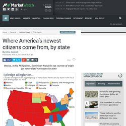
Nearly 800,000 people decided to become American citizens in the 12 months that ended Sept. 30, 2013 — and more than a third of them came from Asia. Asians comprised the biggest group of new Americans by region, according to recent data from the Department of Homeland Security, edging out those from North America, in which DHS includes those from Central America and the Caribbean. Mexicans remain the single largest group of foreigners who were naturalized as citizens. But by state they are the biggest group in only 24. Among the remaining 26 states plus the District of Columbia, 10 other nationalities claim the top spot, as this map shows.
Las 13 disputas territoriales más chungas del mundo. Todos los mapas que conoces están mal. Where the world buys its weapons - Business Insider. Where the world's migrants go, in one map. Most popular migrant destinations around the world (DMan9797) This map, put together by Devinn Jani, also known as Reddit user DMan9797, uses 2013 United Nations data to show migration flows around the world.
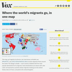
The design is simple — each country is labeled with the most popular destination for its migrants. Some destinations are shown with color code: red represents countries whose migrants mostly go to the United States, blue to France, and pink to the United Kingdom. Just a quick glance tells you that America is the most popular destination for migrants from most of the Western Hemisphere and some surprisingly far-flung nations; it's the top pick for countries as far apart as Iran and Japan, Nigeria and Germany. There are a few other interesting and surprising things it can tell us, too: Maps show the size of countries - Business Insider.
This map shows which export makes your country the most money. Editor's note: This story was originally published in May 2014.

Using data from the CIA World Factbook, we labeled every country in the world by its highest valued export, aka the commodity that makes the country the most money in the global market. Unsurprisingly, much of the world runs on oil, particularly the Middle East and Central Asia. Europe is the world's workshop, where most of the machinery and motor vehicles are made, from optical instruments to BMWs. Latin America brings a blend of food products and oil to the trading table. Asia is the world's manufacturing center, where the world's clothing, wood products, and semiconductors are made. Climate Change Infographic - Business Insider. These maps show where all the world's cattle, chickens, and pigs are. The Earth currently has about 19.6 billion chickens, 1.4 billion cattle, and 980 million pigs being raised as livestock.
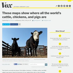
If you added them all up, they'd weigh more than humans and all other wild animals combined. There are 19.6 billion chickens, 1.4 billion cattle, and 980 million pigs So where do those chickens, cattle, and pigs actually live? Glad you asked! See how much of your state is owned by the federal government. This map shows federally owned land by state.
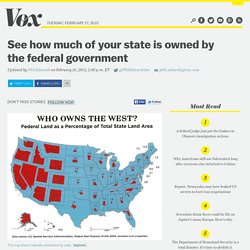
(Bigthink) If you want to understand the American West, you need to understand federal ownership. Basically, the government owns your tumbleweeds. This map, created by Stanford's alumni magazine and republished by Bigthink, shows just how much federal ownership dominates the West.