
What is the DOM? A reader recently wrote in asking me what the DOM was.
They said they've heard it mentioned and alluded to, but aren't sure they really understand it. We can fix that. But the HTML you write is parsed by the browser and turned into the DOM. View Source just shows you the HTML that makes up that page. It's probably the exact HTML that you wrote. Nouveau Sondage: Est-ce que Offscreen / tiroir Nav Work for Desktop Too? A reader wrote in with this question: We know that slide out menus are good for mobile (Facebook, Gmail, etc) But do you think they are appropriate for desktop web applications?
Good question. You know the type: Website Deployment: Let Us Count The Ways! Deployment is moving a website from a local environment to live servers.
What seems like a simple thing can actually be quite complex. There are absolutely loads of ways to go about it. They range from user friendly software and services, to more complex command line tools, to full blown systems with lots of moving parts. I'm not an expert in all this, but I've set up a few different deployment systems in my day as well as worked with a number of different ones. I thought we could try and round up and break down as much as we can here. Going Commando If you edit files right on your server directly, you essentially have no deployment step at all. All About Floats. What is "Float"?
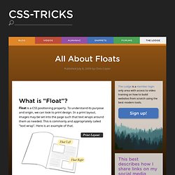
Float is a CSS positioning property. To understand its purpose and origin, we can look to print design. In a print layout, images may be set into the page such that text wraps around them as needed. This is commonly and appropriately called "text wrap". Sass Style Guide - CSS-Tricks - ann.ducros - Gmail. When (and when not to) use an anchor tag? Box-sizing. The box-sizing property in CSS controls how the box model is handled for the element it applies to.
One of the more common ways to use it is to apply it to all elements on the page, pseudo elements included: This is often called "universal box-sizing", and it's a good way to work! The (literal) width you set is the width you get, without having to perform mental math and manage the complexity that comes from widths that come from multiple properties. We even have a box-sizing awareness day around here. Values content-box: the default. Box Dimensionnement. The "box model" in CSS works like this: width + padding + border = actual visible/rendered width of box height + padding + border = actual visible/rendered height of box It's a little weird, but you get used to it.
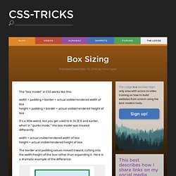
In IE 6 and earlier, when in "quirks mode," the box model was treated differently. width = actual visible/rendered width of box height = actual visible/rendered height of box The border and padding values moved inward, cutting into the width/height of the box rather than expanding it. Slide In (as you scroll down) Boxes - CSS-Tricks - ann.ducros - Gmail. Naming Media Queries. It would be pretty cool if we could do this someday in CSS.
The best idea for it that I've come across is to define it in a <meta> tag in the <head>. That way (perhaps) CSS could use it and JS could use it. Like window.matchMedia(nameOfMyMediaQuery) or @media (nameOfMyMediaQuery) { }. But since we can't, Sass has our back. Gradient Borders. Search Results. Line-On-Sides Headers. The CSS Overflow Property. Every single element on a page is a rectangular box.
The sizing, positioning, and behavior of these boxes can all be controlled via CSS. By behavior, I mean how the box handles it when the content inside and around it changes. For example, if you don't set the height of a box, the height of that box will grow as large as it needs to be to accommodate the content. But what happens when you do set a specific height or width on a box, and the content inside cannot fit? That is where the CSS overflow property comes in, allowing you to specify how you would like that handled. There are four values for the overflow property: visible (default), hidden, scroll, and auto. Icône de police HTML pour utilisation. Where are we at right now in terms of the best markup for using icon fonts?
Let's cover some options I think are currently the best. You want the icon to enhance a wordYou want the icon to stand alone but still be functional or informational And our major goals here are: As good of semantics as we can getAs little awkwardness for screen readers as possible This ground has been treaded before, but I think the following techniques are a small step forward. Enhancing a word. Nine Ways to Improve User Experience in Mobile Design. The following is a guest post by Ben Terrill.
Ben works for Mobify and leads the team that helps their huge customers (like Starbucks and Threadless) have excellent mobile and tablet experiences. Ben is co-author of the e-book 50 Ways to Please Your Customers: A guide to mobile web design best practices. Julie Szabo from Mobify wrote to me to help promote the book a bit. Ya'll know I rarely do that - so just to be clear: this isn't a sponsored post, no money changed hands, and the book is good and free.
I suggested they write up some stuff as a guest post and they obliged with some "best of" excerpts from the book. At Mobify, we recently analyzed data from more than 200 million visitors to our e-commerce customers’ sites, and found that 27% of site visits came from people shopping on smartphones and tablets. Body Border, Rounded Inside. Reader Arun wrote in with a question on how to make a body border that was rounded where the edges met on the inside. Like this. There’s more to the CSS rem unit than font sizing. The following is a guest post by Roman Rudenko, a mad scientist at Mobify where he’s tasked with understanding why browsers misbehave and with cajoling them into playing nice. When he’s not coding, Roman is learning to ride a motorbike without crashing into too many solid objects. Many web designers and developers are familiar with the CSS rem length unit. But, you may not know that it has a couple of handy alternate uses. In this post, I’ll describe how to use the CSS rem unit to scale specific page elements while leaving others unaffected.
AnythingSlider jQuery Plugin. Just what the world needs, another jQuery slider. YAWN. I know, check this one out though, it's got lots of cool features. Here on CSS-Tricks, I've created a number of different sliders. Three, in fact. A "featured content" slider, a "start/stop slider", and "moving boxes". This new AnythingSlider is an attempt at bringing together the functionality of all of those previous sliders and adding new features. View Demo Download Files The demo page has the current version, complete usage, and up-to-date changelog. Features Customization Adding/Removing Slides Just add or remove more <li> items from the list inside <div class="wrapper">, everything else happens automatically. Adjusting Size.