Type Connection. 29 principles for making great font combinations. By Douglas Bonneville on August 11, 2010 When it comes to making font combinations, there are principles and methods, but no absolutes.
You can’t apply all the principles or ideas listed here at the same time. Just peruse this list of ideas and see what strikes you as interesting, and then pursue creating your own interesting typeface pairs! BTW: The Big Book of Font Combinations wants you to stop by and check out its samples. So many fonts, so little time... In no particular order of importance… Combine a serif and a sans serif to give “contrast” and not “concord”. Ask H&FJ: Four Ways to Mix Fonts. Best Practices of Combining Typefaces. Advertisement Creating great typeface combinations is an art, not a science.
Indeed, the beauty of typography has no borders. While there are no absolute rules to follow, it is crucial that you understand and apply some best practices when combining fonts in a design. When used with diligence and attention, these principles will always yield suitable results. Today we will take a close look at some the best practices for combining typefaces — as well as some blunders to avoid.
Combine a Sans Serif with a Serif By far the most popular principle for creating typeface combinations is to pair a sans serif header typeface with a serif body typeface. In the example below — a typical article layout — we have Trade Gothic Bold No.2 paired with Bell Gothic on the left side. Putting these two together creates an unwanted conflict in the design. Now let’s look at the example on the right. Avoid Similar Classifications Now notice the example on the right side.
Responsive Typography: The Basics. By Oliver Reichenstein When we built websites we usually started by defining the body text.
The body text definition dictates how wide your main column is, the rest used to follow almost by itself. Used to. Until recently, screen resolution was more or less homogenous. Today we deal with a variation of screen sizes and resolutions. In the heat of the relaunch I wrote a quick blog post on responsive typography, focussing solely on the aspect of our latest experiment: responsive typefaces. To avoid designing different layouts for every possible screen size, many web designers have adopted the concept of Responsive Web Design. Adaptive layouts: adjusting the layout in steps to a limited number of sizes Liquid layouts: adjusting the layout continuously to every possible width Note: Responsive design already incorporates a lot of macro typographic issues (type size, line height, columns width).
Choosing a typeface The right tone Serif or sans serif? What size? Line height and contrast.
Our Favorite Typefaces of 2012. I’ll be honest.
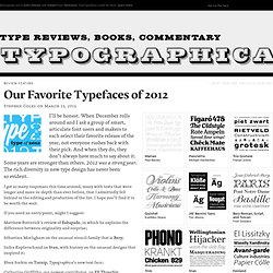
When December rolls around and I ask a group of smart, articulate font users and makers to each select their favorite release of the year, not everyone rushes back with their pick. And when they do, they don’t always have much to say about it. Some years are stronger than others. 2012 was a strong year. The rich diversity in new type design has never been so evident. I got so many responses this time around, many with texts that were longer and more in-depth than ever before, that I admittedly fell behind in the editing and production of the list. If you need an entry point, might I suggest: Matthew Butterick’s review of Eskapade, in which he explains the difference between originality and surprise; Sébastien Morlighem on the unusual stencil family that is Bery; Indra Kupferschmid on Stan, with history on the unusual designs that inspired it; Special Offers. The International Typographic Style Timeline.
Graphis #1 Graphis, The International Journal of Visual Communication, was first published in 1944 by Walter Herdeg in Zurich, Switzerland.
Graphis Inc. is the international publisher of books and magazines on communication design, advertising, photography, annual reports, posters, logos, packaging, book design, brochures, corporate identity, letterhead, interactive design and other design associated with graphic arts. Graphis was (and still is) one of the most important and influential European graphic design publication. Over 350 issues of Graphis magazine have been published. Swiss typefaces. Swiss type design. Hipster Hummingbirds. The week in type Let’s start with some fantastic news: Issue #2 of Codex magazine is now available for pre-order.
What’s more, you can now purchase a subscription. The second issue is rather special — A new Editor in Chief (Paul Shaw), a complete redesign (Linda Florio), more pages, more of the very, very best content. Spread the word. Inspiration More Luca Barcellona in action in Firenze: Erik Spiekermann talks about Type on Screens at Creative Mornings Berlin: I posted this Ampersand Balloon project by Conor & David months ago. Beautiful Bitmaps, a project from Uppercase mag. Each letter of the alphabet is available as a print from the Uppercase store.
Great idea from Tim Brown: Type Set Match hosted on Dribbble. Twenty Swedish Posters for 1930s Hollywood: HT: @tealtan Books. On snot and fonts. Africa: ⦿ Africa ⦿ Berber ⦿ Coptic ⦿ Egypt ⦿ Hieroglyphics ⦿ Mauritius ⦿ Morocco ⦿ Other ⦿ South-Africa ⦿ Tunisia.