
Type Glossary - Typography Deconstructed Ampersand A stylized character of the Latin et used to represent the word and. Definition: The typographic symbol used to designate the word and (& ) is the Latin symbol for et which means and. The name, ampersand , is believed to be derived from the phrase “and per se and.” On a standard English layout... Aperture The partially enclosed, somewhat rounded negative space in some characters. Apex A point at the top of a character where two strokes meet. Arc of Stem A curved stroke that is continuous with a straight stem. Arm A horizontal or upward, sloping stroke that does not connect to a stroke or stem on one or both ends. Ascender An upward vertical stroke found on the part of lowercase letters that extends above the typeface’s x-height. Ascender Line The invisible line marking the height of ascenders in a font. Ascent Line The invisible line marking the farthest distance between the baseline and the top of the glyph. Axis Ball Terminal A circular form at the end of the arm in letters. Bar Baseline
50 Helpful Typography Tools And Resources Advertisement We love beautiful typography, and we appreciate the efforts of designers who come up with great typographic techniques and tools or who just share their knowledge with fellow designers. We are always looking for such resources. To help you improve the typography in your designs, we’re presenting here useful new articles, tools and resources related to typography. You may be interested in the following related posts: Typography: References and Useful Resources The Taxonomy of TypeThis article’s purpose is to help us as designers to distinguish basic properties of types. Typedia: A Shared Encyclopedia of TypefacesTypedia is a resource to classify, categorize, and connect typefaces. Typeface Anatomy and GlossaryMany fonts have abbreviations in their names. Typographic Marks UnknownThere are many typographic marks which are familiar to most, but understood by few. Periodic Table of TypefacesA reference table for most popular typefaces and their classifications. Combining Type
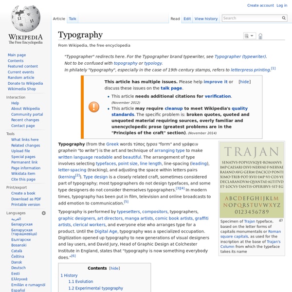
Graphic design Graphic design is the methodology of visual communication, and problem-solving through the use of type, space and image. The field is considered a subset of visual communication and communication design, but sometimes the term "graphic design" is used interchangeably with these due to overlapping skills involved. Graphic designers use various methods to create and combine words, symbols, and images to create a visual representation of ideas and messages. A graphic designer may use a combination of typography, visual arts and page layout techniques to produce a final result. History[edit] Page from the Book of Kells: Folio 114v, Decorated text. While Graphic Design as a discipline has a relatively recent history, first coined by William Addison Dwiggins in 1922,[2] graphic design-like activities span the history of humankind: from the caves of Lascaux, to Rome's Trajan's Column to the illuminated manuscripts of the Middle Ages, to the dazzling neons of Ginza. The advent of printing[edit]
Typography Cheat Sheet: The 6 Big Mistakes To Avoid Typography is one of those strange skills — too mathematical to be pure art, but a touch too intangible to be pure science. Our modern life is awash with text, so all front-end devs really need to have a thorough working knowledge of the “art of arranging type”. So, let’s run through a quick-fire cheat sheet of some of the most common typography mistakes — and ways to avoid them. Mis-judged Text Line Lengths Many designers tend to not pay enough attention to the number of characters in an average line of their text and adversely affect the readability of the text. Happily, this is an easy mistake to avoid, as the optimal length has long been identified. The great Swiss typographer, Emil Ruder did a lot of work on this topic in the 1950′s. In his seminal essay, “Typographie: A Manual of Design”, he concluded that the ‘sweet spot’ for line length was around 50 or 60 characters. Shorter line lengths slows comprehension as the eye spends more time tracking back to the next line. Badly Paired Fonts
A Beginner's Guide to Pairing Fonts – Web Design – Tuts+ Tutorials Pairing fonts can be a challenge. Selecting two or more fonts which work well is one thing - selecting two which work together to achieve your typographic aims may have you reaching for the aspirin. Let's see if we can alleviate any headaches. Luckily, typography has been around a lo-oong time. Here's a quick breakdown of what we'll cover in this guide: Your Aim Keep the essentials in mind. How Many Fonts Should I Use? How many fonts you throw into the mix is entirely up to you, but bear in mind the overall effect you're trying to achieve. Make sure that there is some charisma in the group though; eight people with little to say just results in a toe-curling wait for the speeches.. It's no longer around, but the Fusion Ads 2011 bundle site sicks in my mind as a great example of successful stack-em-high font use. There are no rules to say you should or shouldn't use a specific number of fonts on a page layout. To Buy or Not to Buy? Quality. Compare these two similar fonts.. Originality.
Industrial design An iPod, an industrially designed product. KitchenAid 5 qt. Stand Mixer, designed in 1937 by Egmont Arens, remains very successful today Western Electric Model 302 telephone, found throughout the United States from 1937 until the introduction of touch-tone dialing.[1] Calculator Olivetti Divisumma 24 designed in 1956 by Marcello Nizzoli All industrial products are the result of a design process, but the nature of this process can take many forms: it can be conducted by an individual or a large team; it can emphasise intuitive creativity or calculated scientific decision-making; and it can be influenced by factors as varied as materials, production processes, business strategy and prevailing social, commercial or aesthetic attitudes. History[edit] Precursors[edit] The division of labour that underlies the practice of industrial design did have precedents in the pre-industrial era. Birth of industrial design[edit] Education[edit] University and Institutions[edit] Design process[edit] Notes[edit]
Just don't do it: 14 type crimes to stop committing Getting your typography correct is not an easy thing to do. Like graphic design as a whole, is has to be both aesthetically pleasing and functional. Just like you do in a logo, when you’re working with big blocks of text in a print or web design, you have to put a lot of thought into how the type is working. We’ve assembled 13 crimes against type you need to avoid. An example of creative management for a lot of text, by Atelier Martino&Jaña for the European Capital of Culture. 1. Yes, this one is subjective. Comic Sans is almost always disdained, and Helvetica is so frequently a top choice, that it’s overused in popular culture. When making your design put thought into the font you choose. 2. There are SO MANY font faces out there. You only need 2 or 3 — one for the title (maybe subtitle), and one for the body. 3. There are typefaces meant for titles, and typefaces meant for body. 4. 5. Fonts are created with love and joy, and it takes a lot of work to make them work. 6. 7. 8. 9. 10. 11.
Web Typography: Educational Resources, Tools and Techniques Engineering The American Engineers' Council for Professional Development (ECPD, the predecessor of ABET)[1] has defined "engineering" as: The creative application of scientific principles to design or develop structures, machines, apparatus, or manufacturing processes, or works utilizing them singly or in combination; or to construct or operate the same with full cognizance of their design; or to forecast their behavior under specific operating conditions; all as respects an intended function, economics of operation or safety to life and property.[2][3] One who practices engineering is called an engineer, and those licensed to do so may have more formal designations such as Professional Engineer, Designated Engineering Representative, Chartered Engineer, Incorporated Engineer, Ingenieur or European Engineer. History[edit] Engineering has existed since ancient times as humans devised fundamental inventions such as the pulley, lever, and wheel. Ancient era[edit] Renaissance era[edit] Modern era[edit]
Type Classification Type Classification There are thousands of different typefaces and fonts available to designers, printers, publishers, artists and writers (as well as the general public) today. There are all types of display and text typefaces and everything in between. Most are available in a digital format from a variety of type foundries and can easily be used, and exploited, with modern computer technology. The vast amount of type available makes specific classification of every one nearly impossible and somewhat frivolous. However, it is important to have an understanding of the basic styles of typefaces to help narrow down the research and selection of the correct typeface. Calligraphic Letters associated with the art of calligraphy and the fonts developed from their production can be classified as calligraphic. Example: Blackletter Examples: Serif Serifed typefaces were popular much earlier than sans-serif typefaces and include semi-structural details on many of the letters. Old Style Transitional Pixel