
50 fantastic tools for responsive web design. Fontomas - easy iconic fonts composer. Fighting the Space Between Inline Block Elements. I've seen this come up a couple of times lately on Twitter and then an interesting Dabblet so I figured it would be an important thing to document.
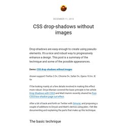
Here's the deal: a series of inline-block elements formatted like you normally format HTML will have spaces in between them. In other words: <nav><a href="#">One</a><a href="#">Two</a><a href="#">Three</a></nav> Will result in: We often want the elements to butt up against each other. This isn't a "bug" (I don't think). Here's some ways to fight the gap and get inline-block elements sitting directly next to each other. Remove the spaces The reason you get the spaces is because, well, you have spaces between the elements (a line break and a few tabs counts as a space, just to be clear). Online usability testing. Magic 3D Photoshop Action. Slicebox - A fresh 3D image slider with graceful fallback. Slicebox is a jQuery 3D image slider plugin that makes use of CSS 3D Transforms and provides a graceful fallback for older browsers that don't support the new properties.
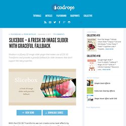
View demo Download source With the CSS 3D Transforms we can create some neat effects by transforming elements in three-dimensional space. Slicebox makes use of the 3D transforms properties and allows different kind of effects. The main idea is to create three-dimensional image slices that will rotate and reveal the next image as another side of the 3D object. In case the browser does not support 3D transforms, a simple slider will be used as fallback. Please note that you can only see the cool 3D effect of Slicebox in a browser that supports those CSS3 properties.
The images used in the demos are by ND Strupler. Usage. Top 50 web designers to follow on Twitter. The Wall - A Javascript plugin for Mootools. Sprite Cow - Generate CSS for sprite sheets. High quality patterns for your next web project.
Nothing like a field of beautiful flowers. Download Download These lovely water-colorful dots will make your designs pop. Download More leaves from another angle. Download Download. InfoGrid. Superman View Image Super Power Consectetur adipisicing elit, sed do eiusmod tempor incididunt ut labore et dolore magna aliqua.
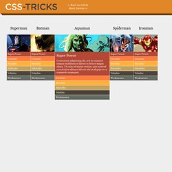
Ut enim ad minim veniam, quis nostrud exercitation ullamco laboris nisi ut aliquip ex ea commodo consequat. Costume. Custom Scrollbars in WebKit. Way back in the day, you could customize scrollbars in IE (5.5) with non-standard CSS properties like scrollbar-base-color which you would use on the element that scrolls (like the <body>) and do totally rad things.
IE dropped that. FFFFALLBACK - A simple tool for bulletproof web typography. Skitter - Slideshow for anytime! Mega Web Buttons Pack #1. Today we want to share our first set of easy-to-implement buttons called ‘Mega Web Buttons Pack’.
In this set you will find 42 buttons which you can use easily on your website. We are using the WooFunction icon set released under the GNU General Public License. CSS drop-shadows without images. Drop-shadows are easy enough to create using pseudo-elements.
It’s a nice and robust way to progressively enhance a design. This post is a summary of the technique and some of the possible appearances. The Top 8 Placeholder Services for Web Designers. Circular Discography Template with jQuery. Today we want to share a simple website template with you.
The template will show some discography or music albums in a rounded fashion, rotating the albums when clicking on next or previous. When clicking on an album, we will open the album details view which contains a music player (jPlayer) and […] View demoDownload source. The Perfect Fanpage Profile Picture (+ FREE PSD) - WP4FB. [message_box type="note" icon="yes" close="Hide"]When this post was post was published, WP4FB was only a simple WordPress theme that is not comparable to the current WP4FB WordPress plugin. The current plugin is a completely new product with many new features.
Therefore, this post may be outdated. [/message_box]I don’t have to tell you how extremely powerful Facebook Fan Pages can be. CSS Pattern Generator. WhatFont Bookmarklet « Chengyin Liu. ← Back to Chengyin's main page What is the easiest way to find out the fonts used in a webpage?
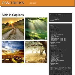
Firebug or Webkit Inspector? No, that's too complicated. It should be just a click away. Hence I wrote WhatFont, with which you can easily get font information about the text you are hovering on. To embrace the new web font era, WhatFont also detects services used for serving the font. Font name? Slide in Captions. <figure class="cap-left"><img src="yay.jpg" alt=""><figcaption> yay!!!
Griddle.it - Web page alignment made easy. The Cicada Principle and Why It Matters to Web Designers » HTML & CSS, Layout » Design Festival. 978 Grid System for Web Design. Image-less CSS3 Glowing Form Implementation. Toolkit. Your Free and Easy Online Portfolio. Android Interaction Design Patterns. CamanJS - Image Manipulation in Javascript. 21 essential resource sites for web designers. A masterclass in CSS animations. A crossplatform framework for creating NUI applications.
The Cicada Principle and Why It Matters to Web Designers » HTML & CSS, Layout » Design Festival. 3D Ribbon Generator - CSS3d.net. Convert PSD to Wordpress with Divine. Convert Photoshop to Wordpress theme. Pixel Proliferation: A Toolset For Managing Screen Resolutions. In the digital world, change is constant.

The device landscape is always changing and the device types are proliferating. With the increasing demand for more fluid and responsive experiences, it is becoming an even more arduous task to keep all of the device resolutions and screen sizes straight. So we have packaged up our set of tools that help us stay current and we are offering it for download. The device landscape is diverse, bordering on splintered. Screens vary in physical size and aspect ratio. Of course, it is important to remember, this is a tool, and only a tool. Our work demands we have elegant ways of presenting the resulting design concepts. We hope this toolset lets you acclimate to new devices and resolutions quickly, and let you spend more time addressing the opportunities they present. 1. 2.
Isotope. Webbyrå Norrköping Angry Creative. Brad Colbow - Independent Web Designer, Illustrator - The Brads - How to build a corporate website. Little Big Details. Cool Font Pairings. Webdesign. The Elements of Retro Web Design. The vintage and retro style is becoming more and more popular in today’s digital artwork. The use of retro and vintage themes in design is probably one of the most pervasive trends since the industry went almost completely digital. In today’s post, we’ll look at examples of work sourced from the wonderful Dribbble, which helps us focus on snippets of a piece, rather than the entire design or illustration.
From here, it’s possible to identify what techniques have been used and to describe how they impact the overall design. You will become familiar with these design trends and be able to replicate them. To help you, short tutorials are scattered throughout the article. 1. Simple shapes are commonly used in vintage design. P. CSS Quick Tip: CSS Arrows and Shapes Without Markup. Nate Cavanaugh is the Director of User Interface Engineering for Liferay Inc., in which he helps guide not only the interface for end user products, but also the interface for different development methodologies. Nate currently heads up Liferay’s AlloyUI project, which is built on top of YUI3. With an extensive history in UI design and development, he is constantly looking for ways to simplify the user and developer experience alike.
While responsible day-to-day for everything from UI design and Javascript development to Java integration and code refactoring, in his off time he enjoys drawing, reading, watching movies and hanging out with his wife and two dogs. He sporadically tweets under the guise of @natecavanaugh. Often it’s useful to show an arrow or some sort of contextual indication of what element something is related to. Today I’m going to show you a way to add in these visual hints without having to create any markup. I’ll quickly cover the concept of what we’ll be doing.