
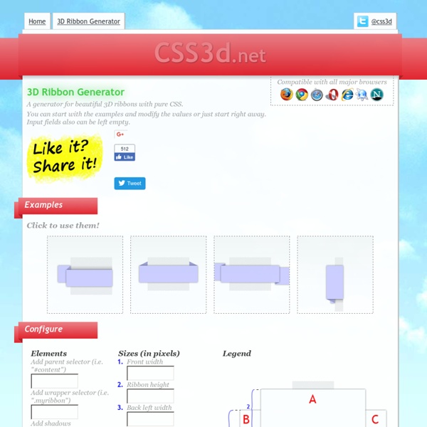
http://www.css3d.net/ribbon-generator/
Pixel Proliferation: A Toolset For Managing Screen Resolutions In the digital world, change is constant. The device landscape is always changing and the device types are proliferating. With the increasing demand for more fluid and responsive experiences, it is becoming an even more arduous task to keep all of the device resolutions and screen sizes straight.
Responsive images using CSS3 Future CSS implementations should allow for some form of responsive images via CSS alone. This is an early idea for how that might be done. However, a significant drawback is that it would not prevent both “mobile optimised” and larger size images from being requested at larger screen resolutions. Note that the CSS presented here is not supported in any browsers at the time of writing. This method relies on the use of @media queries, CSS3 generated content, and the CSS3 extension to the attr() function.
CSS3 Solutions for Internet Explorer Advertisement Experienced developers understand that CSS3 can be added to new projects with progressive enhancement in mind. This ensures that content is accessible while non-supportive browsers fall back to a less-enhanced experience for the user. But developers could face a situation where a client insists that the enhancements work cross-browser, demanding support even for IE6.
Slide in Captions <figure class="cap-left"><img src="yay.jpg" alt=""><figcaption> yay!!! </figcaption></figure> 12 Excellent CSS3 Button and Menu Techniques 1139 shares 20 Fresh CSS3 Tutorials The design industry is probably one of the fastest changing and growing. Designers have to keep their eyes on everything, including new trends in visual design, as well as interaction technologies like jQuery, HTML5, and CSS3. Designers are using these technologies to express more creativity in design production and make user experience richer. In this…
CSS3 Responsive Slider / Carousel Using Radio Buttons Select catcher Created by Ian Hansson (@teapoted) Art from Brendan Zabarauskas (@bjzaba_). Icons from the iconSweets set. Browser Support: Best In Test: Firefox (transition performance) Full Support: Chrome, Firefox, Opera, Safari (latest versions of all browsers) Partial Support: IE9 (Functional, but does not support transitions) WhatFont Bookmarklet « Chengyin Liu ← Back to Chengyin's main page What is the easiest way to find out the fonts used in a webpage? Firebug or Webkit Inspector? No, that's too complicated. It should be just a click away.
Fluid CSS3 Slideshow with Parallax Effect In this tutorial we will create a slideshow with a parallax effect using several CSS3 properties. The idea is to move the background positions of two backgrounds while sliding the container of the slides. View demo Download source Circular Discography Template with jQuery Today we want to share a simple website template with you. The template will show some discography or music albums in a rounded fashion, rotating the albums when clicking on next or previous. When clicking on an album, we will open the album details view which contains a music player (jPlayer) and […] View demoDownload source Today we want to share a simple website template with you. The template will show some discography or music albums in a rounded fashion, rotating the albums when clicking on next or previous.
Learn CSS Positioning in Ten Steps: position static relative absolute float 1. position:static The default positioning for all elements is position:static, which means the element is not positioned and occurs where it normally would in the document. Normally you wouldn't specify this unless you needed to override a positioning that had been previously set. 2. position:relative If you specify position:relative, then you can use top or bottom, and left or right to move the element relative to where it would normally occur in the document. The Top 8 Placeholder Services for Web Designers In the last year, there's been a wave of helpful placeholder services. What's a placeholder? Well, when you're working on a new website, isn't it a waste of time to use stock images, cropped to the right dimensions? A placeholder service allows you to automatically use a random image at the desired dimensions with minimal effort. In the last week, I've compiled a list - in no particular order - of what I consider to be the most useful and flexible placeholder services on the web.