
Tools We Like v1. Between client projects and personal ventures, IDEO interaction designers and software engineers across our global offices spend a significant amount of time designing and building apps for iPhones and iPads.
We’re part of the thousands of iOS developers worldwide beholden to the operating system’s wild popularity and sound frameworks. While we focus on the design and code, we rely on the latest tools to help us create clean prototypes and iterate more quickly, saving us time and countless emails. Here are some of our favorite tools, as of late. Proto.io Robust features and advanced control for creating rich prototypes—Junu Yang, Interaction Designer, New York. Bootstrap. Start Bootstrap - Free HTML Templates for Bootstrap 3.
Strikingly - Simple, Beautiful Mobile Sites In Minutes. FROONT - Responsive Web Design Tool. Responsive Navigation Patterns. Update: I’ve also written about complex navigation patterns for responsive design.

Top and left navigations are typical on large screens, but lack of screen real estate on small screens makes for an interesting challenge. As responsive design becomes more popular, it’s worth looking at the various ways of handling navigation for small screen sizes. Mobile web navigation must strike a balance between quick access to a site’s information and unobtrusiveness. Here’s some of the more popular techniques for handling navigation in responsive designs: There are of course advantages and disadvantages of each method and definitely some things to look out for when choosing what method’s right for your project.
Top Nav or “Do Nothing” Approach One of the easiest-to-implement solutions for navigation is to simply keep it at the top. Pros Cons Height issues- Height matters in mobile. Responsive navigation breaking to multiple lines on small screens. Tips, Resources and Patterns for Responsive Web Design. Responsive Design Workflow: Mobilism 2012. Responsive Web Design Testing Tool. Media Queries. Patterns : Designing Interfaces. Selected patterns from the book are featured here on the website, in their entirety.
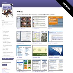
Here are all of the patterns in the second edition of the book, sorted by chapter. Design Patterns on CodePen. UI-Patterns.com. Tutorials Archives. Text Input Effects. Mockups To Go - All Projects. IxEdit. I ♥ wireframes - The ultimate source of inspiration and collection of resources for wireframes. Design Better And Faster With Rapid Prototyping. Advertisement The old adage, “a picture speaks a thousand words” captures what user interface prototyping is all about: using visuals to describe thousands of words’ worth of design and development specifications that detail how a system should behave and look.
In an iterative approach to user interface design, rapid prototyping is the process of quickly mocking up the future state of a system, be it a website or application, and validating it with a broader team of users, stakeholders, developers and designers. Doing this rapidly and iteratively generates feedback early and often in the process, improving the final design and reducing the need for changes during development. Prototypes range from rough paper sketches to interactive simulations that look and function like the final product. The keys to successful rapid prototyping are revising quickly based on feedback and using the appropriate prototyping approach.
The Rapid Prototyping Process Scoping A Prototype Find the Story. Framer - Prototype Interaction and Animation. Material UI - Material Design React Components. Don't Overthink It Grids. The vast majority of websites out there use a grid.
They may not explicitly have a grid system in place, but if they have a "main content area" floated to the left a "sidebar" floated to the right, it's a simple grid. If a more complex layout presents itself, people often reach for a grid framework. They assume grids are these super difficult things best left to super CSS nerds. Modular Scale. Free textures for your next web project. Nothing like a field of beautiful flowers. Download Download These lovely water-colorful dots will make your designs pop. Download More leaves from another angle. Download Download. 53+ Free Image Sources For Your Blog and Social Media Posts In social media, we're all increasingly thinking about visual content.
At Buffer, we've shared our own study on the importance of images in Twitter posts for more social sharing. We've explored tools that help anyone create visual content. Color Theory For Designers: Creating Your Own Color Palettes. Advertisement In the previous two parts of this series on color theory, we talked mostly about the meanings behind colors1 and color terminology2.
While this information is important, I’m sure a lot of people were wondering when we were going to get into the nitty-gritty of actually creating some color schemes. Well, that’s where Part 3 comes in. Color Wheel - Color Calculator. The color wheel is a chart representing the relationships between colors.
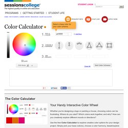
Based on a circle showing the colors of the spectrum originally fashioned by Sir Isaac Newton in 1666, the colour wheel he created serves many purposes today. Painters use it to identify colors to mix and designers use it to choose colors that go well together. The classic color wheel shows hues arranged in a circle, connected by lines or shapes. The colors include primary colors (red, yellow, and blue), secondary colors (orange, green, and violet), and tertiary colors (yellow green, blue green, blue violet, red violet, red orange, and yellow orange).
Secondary colors are created by mixing primary colors. 10 Tools for Creating Brilliant Color Schemes. 9 places to get inspiration for your website's color palette. Color, one of the seven elements of art, is an important aspect of every design. It is so impactful that designers often neglect other elements, such as form and value, to the detriment of their work. Since color has a massive impact on your viewers, it is important know your theory and even a little psychology. Warm colors give off a fiery message, while cool colors have a calming affect. Analogous color schemes, often found in nature, are pleasing to the eye, while complementary color schemes have a more energetic feel. No matter what color palette you decide on, it should reflect your intentions, and capture the perfect feeling you’re going for. Wear Palettes Looking outside your area of expertise helps you discover different ways of tackling the same problem.
. ➤ Wear Palettes. The Era of Symbol Fonts. Improving performance is a constant process.
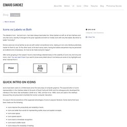
First we ditched tables, spacer gifs, and inline markup such as the <font> element in favor of CSS, reducing page sizes, and separating style from layout. Then we became aware of all our DNS requests, caching, and the total number of files and started using CSS sprites, moving many small images out of the HTML and into a single background image. Now it’s time we embrace the third epoch in performance optimization: symbol fonts. Icons vs Labels vs Both. The debate of icon / text and icon + text label always fascinated me.
7 Gorgeous Icon Fonts for Web Designers. TNW first covered the growing popularity of icon fonts back in January, and since then the Web has practically exploded with impressive icon fonts for use in Web design. For those that are out of the loop, you can think of an icon font as a grown-up version of dingbats…with an actual use-case. The core idea is to take a set of icons or pictograms that would normally be implemented as an image or vector file and then convert it into a font. There are many reasons to do this too, according to Pictonic, as an icon font can load as much as 14% faster than images and can to be as much as 90% smaller than SVG files. Now that a ton of options have emerged as popular choices among Web designers, we’ve made this brief list of 7 typefaces to point you in the right direction. If we missed your favorite, please share it with us in the comments below! Free Flat Icons and Creative Stuff. The Big List: 40 Rock Solid Design & Prototyping Resources « Thoughts on users, experience, and design from the folks at InVision.
Updated 7/12/2016: We’ve added even more resources to this post. The Toolbox: a directory of the best time-saving apps and tools. Web Design. Introduces the First Browser Built For Developers: Firefox Developer Edition. Developers are critical to the continued success of the Web. The content and apps they create compel us to come back to the Web every day, whether on a computer or mobile phone. In celebration of the 10th anniversary of Firefox, we’re excited to unveil Firefox Developer Edition, the first browser created specifically for developers. Ten years ago, we built Firefox for early adopters and developers to give them more choice and control. Firefox integrated WebAPIs and Add-ons to enable people to get the most out of the Web.
Now we’re giving developers the whole browser as a hard-hat area, allowing us to bring front and center the features most relevant to them.