
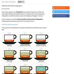
Free inforgraphic Elements Vector. Infografía - What Ronronia wants. Cómo hacer una infografía: guía y herramientas gratis para diseñarla. La infografía es una representación gráfica que incluye mapas, tablas, gráficas y diagramas, que permite comunicar de manera simple conceptos complejos.
Los pasos para crear una infografía son: 1. Elija el tema de la infografía El primer paso para hacer una infografía es elegir el tema de la infografía. Algunos ejemplos generales de temas para hacer infografías son: La explicación de un conceptoLa explicación de una tecnologíaDatos estadísticosResumen de un documento Es ideal que la idea sea popular en Internet y en especial en las redes sociales ya que esto facilitará la viralidad de la infografía cuando esté concluida. 2. Se debe realizar un proceso de recolección de datos del tema a abordar. Mujeres confían más en Pinterest y en los blogs. En términos de fiabilidad, las plataformas 2.0 más confiables para las mujeres son Pinterest (81%) y los blogs (81%).
Infographic Of The Day: Picture Bios Of Jesus, Darth Vader, Hitler. INFOGRAPHIC : Software Piracy – The Untold Tales. Piracy and illegal file sharing is a curse for any developer and software company.
As soon as the new version of a popular piece of software hits the streets, it is pretty much being pirated before you can say “o-arrr!”. Same with games, music and movies. For every person who buys something legally, there’s probably 10 who are taking the risk of stealing it. Our infographic this week is on this very subject and comes courtesy of Starmedia. How to Build a Work Wardrobe From Scratch. Visualizing Regulations To Prevent You From Being Snookered By Greenwashing.
With consumers becoming more and more focused on the planet-friendly bona fides of their products, companies today can't help but give the people what they want: products that tout their sustainability, recyclability, and general cleanliness.
But this is capitalism, so wherever the market can bear, you expect to see companies also trying to cut corners and get the credit for making progress that they haven't actually made. What's a person to do to avoid this greenwashing? To avoid some of this confusion, the government is trying to help, with the FTC issuing rules about what claims companies can and can't make about their products. This infographic, made by Column Five for Ethical Ocean, shows some of what goes into defining government regulations, and how those claims are affecting consumers.
The Six Biggest Websites On The Internet Compared [Infographic] How Are People Using Twitter? [INFOGRAPHIC] The Hierarchy Of Digital Distractions: Pics, Videos, Links, News. The Social Travel Revolution Social media can shape the way that we make our decisions on a day-to-day basis and this is seen very much in the travel industry.
This great infographic from Swedish social travel startup Tripl demonstrates how interactions through social media are effecting this industry. A few key points of interest for me are: Right left, right: how political shifts have altered the map of Europe. Technology-Enhances-Learning-Infographic.jpg (JPEG Image, 1500x938 pixels) - Scaled (67%) A visual exploration on mapping complex networks. 50 Informative and Well-Designed Infographics. Is Twitter a Waste of Time? The World Map of Useless Stereotypes. Infographic: Meet the Tweeters. Guía para hacer tus propias infografias #infografia #infographic #design « TICs y Formación. Infographics. Infographics.
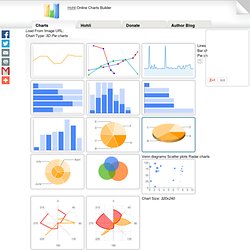
Socialcast Infographic: Adding Play Into the Enterprise. The Infographics Showcase - Data Visualization - Infographic Design. Data Visualization and Design. Cool Infographics - Blog. How the Internet is Revolutionizing Education. Is Social Media Ruining Students? Global Internet Traffic Expected to Quadruple by 2015 [INFOGRAPHIC] Global Internet traffic is expected to quadruple between 2010 and 2015, according to data provided to Mashable by Cisco.
![Global Internet Traffic Expected to Quadruple by 2015 [INFOGRAPHIC]](http://cdn.pearltrees.com/s/pic/th/internet-quadruple-infographic-12705473)
By that time, nearly 3 billion people will be using the Internet — more than 40% of the world's projected population. On average, there will be more than two Internet connections for each person on Earth, driven by the proliferation of web-enabled mobile devices. Internet traffic is projected to approach 1 zettabyte per year in 2015 — that's equivalent of all the digital data in existence in 2010. Regionally speaking, traffic is expected to more than double in the Middle East and Africa, where there will be an average of 0.9 devices per person for a projected population of 1.39 billion. Latin America is close behind, with a 48% increase in traffic and an estimated 2.1 devices per person among a population of 620 million. Somewhat surprisingly, it is neither mobile phones nor tablets that are expected to grow the most in the next four years.
OECD Better Life Initiative. Average personal index for Germany, men, 15–24 How’s life? There is more to life than the cold numbers of GDP and economic statistics – This Index allows you to compare well-being across countries, based on 11 topics the OECD has identified as essential, in the areas of material living conditions and quality of life. Download executive summary Download the index data Learn more about the index. Ideas, issues, knowledge, data - visualized! The New York Times > Books > Image > The New Readers. How Are Teachers & College Professors Using Facebook?
Enchantment Infographic. The Anatomy Of An Infographic: 5 Steps To Create A Powerful Visual. Information is very powerful but for the most bit it is bland and unimaginative.

Infographics channel information in a visually pleasing, instantly understandable manner, making it not only powerful, but extremely beautiful. Once used predominantly to make maps more approachable, scientific charts less daunting and as key learning tools for children, inforgraphics have now permeated all aspects of the modern world. I designed a couple of infographics back in college, the need arising especially around the time Soccer World Cup fever spiked. It was a fun process representing the different groups, predicting winners in each group at each stage and creating a mock pairing of teams that would clash all the way leading upto the finals. Create cool infographics in Illustrator. 40 Useful and Creative Infographics. Six Revisions Menu Main Categories CSS HTML JavaScript Web Design WordPress Web Development Design Inspiration UX Design UI Design Freebies Tutorials Tools.
How To Create Outstanding Modern Infographics. In this tutorial you will learn that data doesn't have to be boring, it can be beautiful!

Learn how to use various graph tools, illustration techniques and typography to make an accurate and inspiring infographic in Adobe Illustrator. Start by using the Rectangle Tool (M) to draw a shape. Give it a subtle radial gradient too. The entire design is based on a grid of four columns. To make the columns first select the rectangle and drag a guide onto the centre of the shape.
Online Charts Builder. Hohli Online Charts Builder Load From Image URL:
Gapminder: Unveiling the beauty of statistics for a fact based world view. For Teachers. Do you want to use Gapminder tools in your classroom?
Check out all our resources on this page and the downloads page to get started. For more info, contact our educational staff at mikael@gapminder.org and olof.granstrom@gapminder.org . Public Data Explorer. Indicateurs de développement humain Rapport sur le développement humain 2013, Programme des Nations Unies pour le développement. Many Eyes. Infographics at School. I have posted before about how much I love infographics. We now have four different departments getting their students to manipulate data using infographics: Art, Science, PD/H/PE and Food Technology. Some of these started out rather basic but the students are now evaluating their work for quality control, ease of reading and comparisons to professionally produced graphics.
This all started with a couple of conversations about developing activities that facilitate deeper levels of understanding. We have been building the infographics using the Macbook applications Pages and Numbers. Some of the students with drawing skills are hand drawing particular components and then scanning them into their documents in order to achieve the desired effect.
Infographics - Own your Information. I am a Visual Arts teacher, just so you might start to understand my next comment. I love good Infographics ! I can not think of another technique that condenses the essence of a message down into a more accessible and easily understood medium. I love the way that; Using Web 2.0 Tools in Schools. I love the notion of Web 2.0 tools. These tools allow my students, family and friends to produce all types of creative artifacts. You can create digital timelines which include video and photographs, you can document the family tree on geneaological sites or you can create a multimedia presentations on a long dead personality or artist. Web 2 tools have allowed us to create and then share these artifacts using social networking sites, wikis or even our own website. We can use Web 2 tools to voice an opinion or debate an issue, we can buy or even review products we have bought online on an e-commerce site, and for the most part these things are free.
Sometimes learning is part of the interactive process that occurs. Cool Infographics - Cool Links. Social Media Graphics - collecting all kinds of social media related charts, graphs and infographics. Helping students interpret visual representations of information. Social Studies, History, Economics. The Evolution Of Email [Infographic] Email. Ideas, issues, knowledge, data - visualized! Are Flashcards an Effective Learning Tool? Cool Infographics - Blog. 5 Scientifically Proven Ways to Get More ReTweets. Educational technology: The evolution of classroom technology.