

System Mapping – kelvy bird. Intro to Data-Driven Journalism with NZZ Data. Data is all around us.
We can access it with greater ease; hence, the recent boom in “data-driven journalism.” Data is used to structure the story inside and out, as a tool for verification and presentation, and everything in between. Many news organizations around the world are starting to publish stories and cover beats that can be better told through data. The same goes for our #urbanmobilityCH newsroom, where we will be publishing two stories driven by data. Dr. Suzy Moat. Introduction to Network Visualization with GEPHI. New tutorial available!
Graphing every idea in history. Statistical Studies of Peer Production » Open Data. Blooms, learning styles and thinking organisers. How do thinking/graphical organisers or mind mapping tools fit with Learning styles and Bloom's Revised taxonomy.
The key element to a thinking or graphical organiser is, in my opinion, the key or focusing question. No matter how complex or developing the model or organiser you are using, if the focusing question or topic is weak the end result will be poor. Bloom's arranges various activities in terms of increasing complexity going from Low Order Thinking skills to Higher Order Thinking skills. They represent the learning process, to understand one must remember, to apply a concept you must understand it etc Simple mind maps and concept diagrams are a brilliant tool for enabling students to remember and understand.
Key Words Interpreting Exemplifying Summarising Inferring Paraphrasing Classifying Comparing ExplainingRecognising Listing Describing Identifying Retrieving Naming Locating/Finding Model Simple Flowchart This is a simple concept linking to next concept. Simple Concept map Models. Platform for Experimentation in digital humanities / digital, social networking, Twitter, influence on the web and data visualization. Envisioning Information. Information Visualization Manifesto.
Posted: August 30th, 2009 | Author: Manuel Lima | Filed under: Uncategorized | – “The purpose of visualization is insight, not pictures” Ben Shneiderman (1999) – Over the past few months I’ve been talking with many people passionate about Information Visualization who share a sense of saturation over a growing number of frivolous projects.
The criticism is slightly different from person to person, but it usually goes along these lines: “It’s just visualization for the sake of visualization”, “It’s just eye-candy”, “They all look the same”. When Martin Wattenberg and Fernanda Viégas wrote about Vernacular Visualization, in their excellent article on the July-August 2008 edition of interactions magazine, they observed how the last couple of years have witnessed the tipping point of a field that used to be locked away in its academic vault, far from the public eye.
Even though a clear divide is necessary, it doesn’t mean that Information Visualization and Information Art cannot coexist. How to create a visualization. Over the last few years I’ve created a few popular visualizations, a lot of duds, and I’ve learned a few lessons along the way.
For my latest analysis of where Facebook users go on vacation, I decided to document the steps I follow to build my visualizations . Interactive Dynamics for Visual Analysis. Graphics.
Taxonomy for interactive visual analysis. Interactive visualization continues to grow more useful and prominent in every day analysis. Jeffrey Heer and Ben Shneiderman offer a taxonomy for the budding field . Visualization provides a powerful means of making sense of data. By mapping data attributes to visual properties such as position, size, shape, and color, visualization designers leverage perceptual skills to help users discern and interpret patterns within data. A single image, however, typically provides answers to, at best, a handful of questions. INFOGRAPHICS. Fast Thinking and Slow Thinking Visualisation. Last week I attended the Association of American Geographers Annual Conference and heard a talk by Robert Groves, Director of the US Census Bureau.
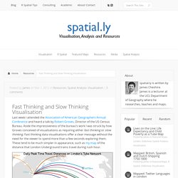
Aside the impressiveness of the bureau’s work I was struck by how Groves conceived of visualisations as requiring either fast thinking or slow thinking. Fast thinking data visualisations offer a clear message without the need for the viewer to spend more than a few seconds exploring them. These tend to be much simpler in appearance, such as my map of the distance that London Underground trains travel during rush hour.
The explicit message of this map is that surprisingly large distances are covered across the network and that the Central Line rolling stock travels furthest. It is up to the reader to work out why this may be the case. Or the seemingly impenetrable (from a distance at least), but wonderfully intricate hand drawn work of Steven Walter (click image for interactive version). VIZoSPHERE (launched) Visualization. All the buildings in Manhattan in 3-D map Taylor Baldwin mapped all of the buildings in Manhattan using a 3-D layout.… Get all caught up with The Avengers using this timeline It’s been a decade since the first Iron Man movie, and some 30…
Data Visualization Field on Twitter. By: Jeff Clark Date: Sun, 26 Feb 2012 I consider myself one small part of a community on Twitter that focuses on information visualization, computational design, and interaction design.
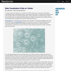
Collectively we tweet about our personal work, highlight other work of quality or that has interesting characteristics, critique approaches or individual designs, discuss tools and techniques, and suggest interesting datasets or projects. I'm grateful to be connected with such an interesting group of people and I've learned a great deal from them. Moritz Stefaner is an important part of this group and in July 2011 he created an interesting map of this community he calls The VIZoSPHERE. MetaLayer launches community to make better infographics (exclusive) How can big data and smart analytics tools ignite growth for your company?
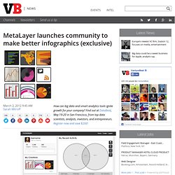
Find out at DataBeat, May 19-20 in San Francisco, from top data scientists, analysts, investors, and entrepreneurs. Register now and save $200! Fusion Tables - Gather, visualize, and share data tables online. A Line Walks Into a Bar. We all know visualizations can be a great way to represent data, but some visualizations are better than others at certain data. Sometimes, a bar chart is better than a line chart. This is because visualizations don’t just represent data, they also represent qualities of data. One of these qualities is the degree of continuity. There are three main levels of continuity that data can have.
Continuous – These are values like Temperature or Time. Designing Data Visualizations Workshop: Strata 2012 - O'Reilly Conferences, February 28 - March 01, 2012. Attendees: All attendees should bring paper an pen for quick sketching. Attendees should bring their own data to work with. Alternately, they can download interesting data sets from sites such as infochimps.com, buzzdata.com, and data.gov. People with access to a windows machine might want to install Tableau Public. Beautiful Visualization Datavisualization.
Why Is Data Visualization So Hot?