
The Collection. VGMaps.com: The Video Game Atlas. MigMap - Governing Migration. Chicago's Ethnic Mosaic in 2000. EMAS - Special Topics: American Indian Maps. Early Maps of the American South — Special Topics: American Indian Maps This page contains maps that were drawn by American Indians or copied from Indian prototypes.
Many can be viewed on the web sites of the Bibliothèque Nationale de France (BNF), the Library of Congress (LC), The Newberry library (NL), the Archives nationales d'Outre-Mer (ANOM), or Archives Canada-France (ACF). Click here for a complete list of repositories and their abbreviations. Images whose links are labeled "HMC photo" are posted here courtesy of the Harvard Map Collection, Harvard College Library. The images labeled "LC photo" are posted courtesy of the Geography and Map Division, Library of Congress. Fusion Tables - Gather, visualize, and share data tables online. Bust your data out of its silo!

Get more from data with Fusion Tables. Fusion Tables is an experimental data visualization web application to gather, visualize, and share data tables. Visualize bigger table data online Filter and summarize across hundreds of thousands of rows. Hypercities. GapVis: Visual Interface for Reading Ancient Texts. Making Maps: DIY Cartography. Online Communities.
30 Superb Examples of Infographic Maps. As you search the web you’ll come across a wide range of interactive and graphical maps.
Deciding when, where and how to integrate or display a map on your site is the first step, the second should be what technology and illustrations to use. If you’re all about interaction, JQuery, Ajax, or Flash are all effective technologies that hold their own ground. Map illustrations are a dime a dozen however, a strong and balanced display of graphics, information, and colors is what makes an infographic stand out and reach its target audience effectively. Deluge: How 300.000 Norwegians Move House in a Year.
The short animation titled "Deluge" [bengler.no] by Even Westvang reveals how public data can be analyzed to reveal potentially interesting patterns.
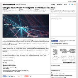
In particular, this movie demonstrates the patterns of 300.000 Norwegians moving house, by cross-referencing the tax records of about 4 million individual Norwegians from 2006 and 2007. In the movie, the data is filtered by paramaters like yearly income or age, and a distinction is made between 'incoming' (red) and 'outgoing' (blue) citizens. Personalworldmap.org. Blog Archive » Time travel. Map in photo above is a part of one of my final projects I did for my last school, London College of Printing (now London College of Communication).
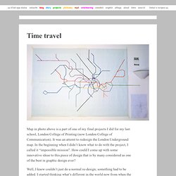
It was an attemt to redesign the London Underground map. In the beginning when I didn’t know what to do with the project, I called it “impossible mission”. How could I come up with some innovative ideas to this piece of design that is by many considered as one of the best in graphic design ever? NYC Subway Ridership, 1905-2006. The Human Body as a Subway Map. Metrography: London Reshaped to Match the Classic Tube Map. History of Cartography: Volumes One and Two. 1780 to 1784 Pennsylvania Maps. The end of the Revolutionary War, settled by the Treaty of Paris early in 1783, resulted in many maps published that year.
Maps issued in previous years with "British colonies" or similar title words were reissued in the 1780's with "United States" in the title, and few other changes. The first map of the United States 'compiled, engraved, and printed by an American' was Abel Buell's A NEW AND CORRECT MAP OF THE UNITED STATES OF NORTH AMERICA LAYD DOWN FROM THE LATEST OBSERVATIONS AND BEST AUTHORITY AGREEABLE TO THE PEACE OF 1783, published in 1784. Itinerary From London To Chambery, In Matthew Paris's 'Book Of Additions' Home - Gough Map. RAA - Travel - Maps & Motoring Info - Strip Map. 721_3359.pdf (application/pdf Object) Using Google To Map The Yellowstone Trail In Washington - AMERICAN ROAD® FORUM—the ultimate road trip planning community. Copyright AMERICAN ROAD, LLC 2006-2011. I'll be taking a two-day quick trip across Washington traveling as much as possible upon the old Yellowstone Trail.
Unlike other old roads that I've traveled (Route 66, etc), there's no guide book to tell me to "turn left at crappy dirt road and hope for the best. " So I had to gather some common sense, maps, hearsay, luck and prayers and map it out myself. I think I done good. But certainly not perfect. Not by a long shot. Here are links to how I'll be driving it with a little explanation along the way. Each link will go to a map on GoogleMaps. Seattle to Fall City (early more northerly alignment according to 1917 & 1924 Blue Books and others)*YT used 4th Ave, south to Jackson, but you can no longer go that way - used 2nd instead. Seattle to Fall City (later more southerly alignment - post 1925ish)*This is mostly based upon Hobb's 1926 map/guide. There was an even earlier alignment through Seattle, but the routing from the 1916 Blue Book makes no sense when compared with modern Seattle. Burnunit / Ethereal Cartography. A Republic of Desire The locus of the end points of projected desires and imagined journeys from my home(s), 1978-2009.
All projections A rainbow of imagined thrusts into the world. Not places I'd BEEN, places I LONGED to reach, journeys I envisioned. Ariock / Strip Map. Finding a Pathfinder. Bjørn Reese The Maersk Mc-Kinney Moller Institute for Production Technology, University of Southern Denmark Campusvej 55 DK-5230 Odense M breese@mip.ou.dk Bryan Stout 4531 Airlie Way Annandale, VA 22003 bstout@mindspring.com Abstract: The success of a given pathfinding technique for a computer game depends on the requirements and the assumptions of the game and the constraints it imposes.
This paper presents a classification of the factors that influences the performance of pathfinding techniques. This includes the dynamics of the game, the geometry of the players and the environment, the (un)predictability of movement, kinematic and temporal restrictions, interaction rules, and real-time performance. Choosing a pathfinding techniques that performs well is important to the success of artificial intelligence in computer games, because pathfinding is a fundamental building-block for the field of Artificial Intelligence. Not every game is suited for planned navigation. Amit’s Game Programming Information. What’s on this page?
I’m interested in producing complexity out of simple parts. This page contains bookmarks that I collected while working on games; I did not write most of the content linked from here. As a result the set of links here reflects the types of things I needed to know: only a few specific topics (not everything related to game programming), general ideas instead of platform-specific information (graphics, sound, compilers), and ideas and designs instead of source code (I find it easier to go from an idea to code than from code to an idea).
Other sites, like Gamedev Tuts+, Gamedev, and Gamasutra, cover lots more topics than mine does. Determining how to move around on a map is an interesting problem. These pages are about specific techniques for pathfinding and object movement: My current favorite algorithm is A*, because it can handle varying terrain costs well, and it seems to be faster than most graph searching algorithms. Mappy Tile Map Editor - A utility for creating flexible 'maps' for 2D and 3D tile based games. Tiled Map Editor. JIGS Map Graphics - Tile-based Computer Game Design Part I. Published on 11 / 01 / 11 Written by Lisa {cbavatar}left{/cbavatar} The development of JIGS has provided an exciting opportunity for us to delve into previously unexplored areas. While Rob works hard at the coding and architecture, I have turned my sights to the front end design aspects, specifically the game's maps.
Batman: Arkham City. Batman: Arkham City Game Guide & Walkthrough (1/129)next page This guide to Batman: Arkham City contains a very thorough walkthrough of the main story mode of the game. Most importantly, you can find precise instructions regarding completing missions, reaching important locations and safely moving through them and what gadgets you will need to complete the puzzles prepared by the creators. Mapstalgia. Mental Maps and Video Games. Back in the dark ages of video games, I got hooked on a couple of games. The first was Colossal Cave Adventure, the grand-daddy of all text-based games.
I, along with others, spent hours in the Tabor College computer lab typing stuff like: open grate go south take axe fight dwarf grab bird This addiction led to Zork, still text-based but a much more difficult game. As a visual learner, it became difficult for me to wrap my head around the many rooms, levels and hallways. What does a hardcore gamer do when he gets. The painfully convoluted process of claiming my free copy of 3D Classics Kid Icarus on 3DS was a lot more hassle than I expected, but I'm very glad I did it. Not only because the new game is all the better for its 'Original Mode' with its tightened controls, but because the final fortress level got me proper lost. So, after an hour or so going round in circles, I did the unthinkable: I drew a map.
Yes, I know you can find the dungeon map and that you can buy a torch and a pencil to show you where you are and where you've been respectively, but it's not as simple as that. The Top 7... Amazing video game maps that do. Video Game Maps: An Ode to Overworld Cartography. Gorgeous Travel Planner Shows Times, Rather Than Distances. A Size Comparison of Massive Open World Video Game Maps. Maps, directions, and video games: A model for how we perceive them : Cognitive Daily. The Video Game Atlas - GB/GBC Maps. Antique Maps and Historical Atlases - Goetzfried Antique Maps. Maps In Modern Web Design: Showcase and Examples - Smashing Maga.