
The Case For an Ideal Income Inequality. When Occupy Wall Street protesters began camping out in Zuccotti Park in 2011, Venkat Venkatasubramanian visited more than once.
He didn’t participate in the protests against wealth inequality, he said, “but I knew what they were talking about. I knew that these were all legitimate concerns.” The experience motivated Venkatasubramanian, today the Samuel Ruben-Peter G. Viele Professor of Engineering at Columbia University and director of the Complex Resilient Intelligent Systems Laboratory, to write How Much Inequality Is Fair?
Mathematical Principles of a Moral, Optimal, and Stable Capitalist Society, published this year by Columbia University Press. Our Broken Economy, in One Simple Chart - The New York Times. Income Growth Over previous 34 years But now, the very affluent (the 99.999th percentile)

Theconversation. Despite appearances to the contrary, the 2016 presidential follies managed to feature at least a few policy discussions amid all the name-calling.
Income inequality in particular has animated voters on both sides of the partisan divide, but the solutions advocated by candidates from each party are markedly different. Democrats claim higher taxes on the rich and more benefits for the poor are the best ways to reduce inequality. Republicans argue what we really need is more growth, accomplished by lowering taxes to spur work and investment with, it seems, benefit cuts to make up lost revenue. Remarkably, this debate has taken place based on partial and inappropriate indicators of U.S. inequality.
Each party is dead certain about how to address inequality, yet neither knows what it is. GINI index statistics - countries compared - NationMaster Economy. DEFINITION: Gini index measures the extent to which the distribution of income (or, in some cases, consumption expenditure) among individuals or households within an economy deviates from a perfectly equal distribution.
A Lorenz curve plots the cumulative percentages of total income received against the cumulative number of recipients, starting with the poorest individual or household. The Gini index measures the area between the Lorenz curve and a hypothetical line of absolute equality, expressed as a percentage of the maximum area under the line. Thus a Gini index of 0 represents perfect equality, while an index of 100 implies perfect inequality.. Citation "All countries compared for Economy > GINI index", World Development Indicators database. "All countries compared for Economy > GINI index, World Development Indicators database. 'All countries compared for Economy > GINI index, World Development Indicators database.
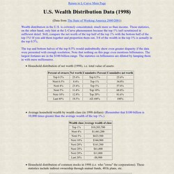
Economy > GINI index: Countries Compared Map. EPL-69-304-2005.pdf (application/pdf Object) US Wealth Distribution Data (1998) Return to L-Curve Main Page (Data from The State of Working America 2000/2001) Wealth distribution in the U.S. is extremely concentrated, much more so than income.
Files/SaezZucman2014Slides.pdf. Main-qimg-f6571fb249d85da64b6fe26bb9631a61 (PNG Image, 461x693 pixels) Bombshell Study: America's Wealthy Even More Obscenely Rich Than Anybody Thought. July 16, 2014 | Like this article?
Join our email list: The Surprising Number of "Near Poor" Given the shape of the job market, and the hollowing out of the middle class, is there any reason to think this will not get worse in the near future?
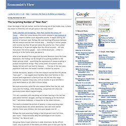
: Older, Suburban and Struggling, ‘Near Poor’ Startle the Census, NY Times: ...When the Census Bureau this month released a new measure of poverty, meant to better count disposable income, it began altering the portrait of national need. Perhaps the most startling differences between the old measure and the new involves data ... showing 51 million people with incomes less than 50 percent above the poverty line. That number of Americans is 76 percent higher than the official account... All told, that places 100 million people — one in three Americans — either in poverty or in the fretful zone just above it. White_paper_at_risk.pdf (application/pdf Object) Wonkbook: The 'recovery' has made inequality worse. Early in the recession, there was some talk that the economic crisis would, among other things, slow or even reverse the run-up in inequality.
It didn't. In fact, the recovery, such as it is, has made inequality worse. A member of the Occupy movement rests while holding a protest sign on the steps of Federal Hall near the New York Stock Exchange in New York, April 16. (LUCAS JACKSON - REUTERS) The Wall Street Journal reports that new numbers out of the Labor Department show that between the mid-2009 -- the technical end of the recession -- and the first quarter of 2012, workers in the top 10% of the income distribution saw their wages rise by 7% percent.
Workers in the bottom 10% only saw their wages rise by 2.5%. Living Paycheck To Paycheck: Two-Thirds Of Americans Are Struggling To Get By. SAN ANTONIO, Sept 19 (Reuters) - More than two-thirds of Americans are now living paycheck to paycheck, according to a survey released on Wednesday by the American Payroll Association.

The survey of 30,600 people found that 68 percent said it would be somewhat difficult or very difficult if their paychecks were delayed for a week. These results show Americans are still struggling with the recession's effects, the association said. "This study clearly shows that Americans are finding it hard to save," said Dan Maddux, executive director of the San Antonio-based association of payroll managers. Family Net Worth Drops to Level of Early ’90s, Fed Says. 60 Years of American Economic History, Told in 1 Graph - Jordan Weissmann. In the 60 years after World War II, the United States built the world's greatest middle class economy, then unbuilt it.
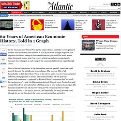
And if you want a single snapshot that captures the broad sweep of that transformation, you could do much worse than this graph from a new Pew report, which tracks how average family incomes have changed at each rung of the economic ladder from 1950 through 2010. Here's the arc it captures: In the immediate postwar period, America's rapid growth favored the middle and lower classes.
The poorest fifth of all households, in fact, fared best. Then, in the 1970s, amid two oil crises and awful inflation, things ground to a halt. The country backed off the postwar, center-left consensus -- captured by Richard Nixon's comment that "we're all Keynesians now" -- and tried Reaganism instead. And then it all fell apart. None of this is new history.But it's helpful to have a crisp layout of what's changed.
Pew-social-trends-lost-decade-of-the-middle-class.pdf (application/pdf Object) When income grows, who gains? Income Inequality Is At An All-Time High: STUDY. Income inequality in the United States is at an all-time high, surpassing even levels seen during the Great Depression, according to a recently updated paper by University of California, Berkeley Professor Emmanuel Saez. The paper, which covers data through 2007, points to a staggering, unprecedented disparity in American incomes. On his blog, Nobel prize-winning economist and New York Times columnist Paul Krugman called the numbers "truly amazing. " Though income inequality has been growing for some time, the paper paints a stark, disturbing portrait of wealth distribution in America. Saez calculates that in 2007 the top .01 percent of American earners took home 6 percent of total U.S. wages, a figure that has nearly doubled since 2000.
Banker, CEO Pay Largely Responsible For Rising Inequality: Study. In a recent defense of the 1 percent, Harvard economist Greg Mankiw admitted it might be bad if the rich got richer by sucking cash from the economy without giving any value back. A new study suggests many of the rich -- especially bankers and CEOs -- are doing just that. Josh Bivens and Lawrence Mishel, economists at the Economic Policy Institute, a left-leaning think tank, argue in a study responding to Mankiw that most of the rise in income inequality over the past few decades is due to the soaring pay of CEOs and Wall Street bankers who are milking money from the markets rather than generating much in the way of economic production. "A substantial part of the extraordinary rise of top 1 percent incomes is not a result of well-functioning markets allocating pay according to value generated, but instead resulted from shifting institutional arrangements leading to shifting of rents to those at the very top," Bivens and Mishel write.
The technical term for this is "rent-seeking. " Top Earners Doubled Share of Nation’s Income, C.B.O. Says. In addition, the report said, government policy has become less redistributive since the late 1970s, doing less to reduce the concentration of income. “The equalizing effect of federal taxes was smaller” in 2007 than in 1979, as “the composition of federal revenues shifted away from progressive income taxes to less-progressive payroll taxes,” the budget office said.
Also, it said, federal benefit payments are doing less to even out the distribution of income, as a growing share of benefits, like , goes to older Americans, regardless of their income. The report, requested several years ago, was issued as lawmakers tussle over how to reduce unemployment, a joint committee of Congress weighs changes in the tax code and protesters around the country rail against disparities in income between rich and poor.
In its report, the budget office found that from 1979 to 2007, average inflation-adjusted after-tax income grew by 275 percent for the 1 percent of the population with the highest income. Trends in the Distribution of Household Income Between 1979 and 2007. After-Tax Income Grew More for Highest-Income Households After-tax income for the highest-income households grew more than it did for any other group. (After-tax income is income after federal taxes have been deducted and government transfers—which are payments to people through such programs as Social Security and Unemployment Insurance—have been added.) CBO finds that, between 1979 and 2007, income grew by: 275 percent for the top 1 percent of households,65 percent for the next 19 percent,Just under 40 percent for the next 60 percent, and18 percent for the bottom 20 percent.
The share of income going to higher-income households rose, while the share going to lower-income households fell. State of Working America. Policy-driven inequality blocks growth for low- and middle-income Americans Daily stock indices, monthly employment reports, and even quarterly data on the gross domestic product are insufficient indicators for answering this vital question: How well is the American economy providing acceptable growth in living standards for most households?
EPI’s The State of Working America, 12th Edition looks broadly at available data and concludes that the answer is simply “not well at all.” This is not because the economy has failed to grow, on average. National income has grown enough to substantially improve the fortunes for all. State of Working America. Inequality_-_you_dont_know_the_half_of_it_-_22-07-2012-1.pdf (application/pdf Object) 20070111.pdf (application/pdf Object)
Where the 1 Percent Fit in the Hierarchy of Income - Interactive Graphic. Incomes starting at: $11 millionAverage income: $31 millionNumber of families: 14,000Share of total U.S. income: 5% Incomes starting at: $2 millionAverage income: $3.9 millionNumber of families: 135,000Share of total U.S. income: 6% Incomes starting at: $386,000Average income: $717,000Number of families: 1.35 millionShare of total U.S. income: 11% Incomes starting at: $108,000Average income: $167,000Number of families: 13.2 millionShare of total U.S. income: 25% Incomes starting at: $0Average income: $36,000Number of families: 132 millionShare of total U.S. income: 53% Ralph Lauren, $67 million Lew Frankfort, Coach, $50 million Jamie Dimon, JP Morgan Chase, $19 million Glenn A.
James S. Vikram S. The L-Curve: A Graph of the US Income Distribution. Share of Income Earned by the Top 1 Percent - Graphic. Assets & Opportunity Scorecard.