
How to Make an Infographic: Free Visual E-Book for Beginners. On average, Americans consume 63 gigabytes of information per person per day.

That’s roughly half of all the storage space in a new MacBook Air laptop. 15 Most Common Types of Data Visualisation — Datalabs. Global Carbon Footprints. About this graphic Graphics by Stephen Rountree and Adam Marr Source: World Resources Institute CAIT 2.0 climate data explorer Emissions data and national boundaries are from 2010.
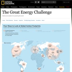
For current emissions, per capita emissions, and intensity, the data are measured in tons of "carbon dioxide equivalent. " That is, they include carbon dioxide and five other greenhouse gases (methane, nitrous oxides, hydrofluorocarbons, perfluorocarbons, and sulfur hexafluoride) as measured by their global warming potential. Cumulative emissions are measured in tons of carbon dioxide only. The emissions of Brazil and Indonesia may be understated because the numbers do not include calculations on land use change and forestry. There are high uncertainties in current measures of deforestation's contribution to greenhouse gas emissions, as international authorities work to develop a consistent methodology.
The Data Visualisation Catalogue. Radar graphs: Avoid them (99.9% of the time) Stephen Few doesn't like radar graphs, and he's not the only one who has written against them.
Infographics as an Assessment. A Case Study In How Infographics Can Bend The Truth. We’ve made the point time and time again that charts and graphs, though they feel official and true, can lie.
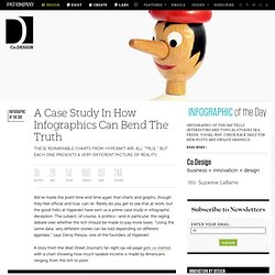
Rarely do you get to see that at work, but the good folks at Hyperakt have sent us a prime case study in infographic deception. The subject, of course, is politics--and in particular, the raging debate over whether the rich should be made to pay more taxes. "Using the same data, very different stories can be told depending on different agendas," says Deroy Peraza, one of the founders of Hyperakt. A story from the Wall Street Journal's far-right op-ed page gets us started, with a chart showing how much taxable income is made by Americans ranging from the rich to poor: Looking at that, the conclusion seems glaringly obvious: The rich don’t make so much money! 10 Steps To Designing An Amazing Infographic.
Information can be useful—and even beautiful—but only when it’s presented well.
In an age of information overload, any guidance through the clutter comes as a welcome relief. That’s one reason for the recent popularity of information graphics. Infographics are visual designs that help to explain complicated data in a simple way (mental-health emergencies at Burning Man, anyone?). Rendering High Resolution Maps in Kartograph. This is going to be a quick run-through the creation of the latest Kartograph showcase which is a high res vector map.
Select your map projection I really like the idea of starting the map creation process with choosing a map projection. As mentioned in my last post, the projection can be seen as a very crucial point of every map. It allows you to define the perspective on the geography. Amanda Cox Talks about Developing Infographics at the New York Times. 001.1 Graphing Fundamentals - chrisgemignani. 001.2 Graphing Fundamentals - Principles 1 - chrisgemignani. 001.3 Graphing Fundamentals - Principles 2 - chrisgemignani. Data science. Visualising Data » Resources. IMAODBC 2011: And the winner is … The Bo Sundgren Award of the International Marketing and Output Database Conference IMAODBC 2011 in Obidos Portugal goes to Xavier Badosa from the Statistical Institute of Catalonia Idescat.
The Year In Data. Owni’s data team – collectively known as Paule d’Atha – are pleased to present a selection of the best of the best of their weekly round-up of data on the web, from a year that’s seen so many wonderful, innovative, inventive, colorful, moving and funny projects.
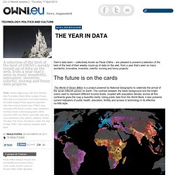
The future is on the cards The World of Seven Billion is a project powered by National Geographic to celebrate the arrival of the seven billionth person on Earth. The contrast between the black background and the bright colors used to represent different income levels, coupled with population density, across all five continents gives the map a beautiful clarity. Case studies. Blog » Hexbins! Binning is a general term for grouping a dataset of N values into less than N discrete groups.
These groups/bins may be spatial, temporal, or otherwise attribute-based. In this post I’m only talking about spatial (long-lat) and 2-dimensional attribute-based (scatterplot) bins. Such binnings may be thought of as 2D histograms. This may make more or less sense after what lies beneath. Showing Geo-Located Points with the 'HexBin' Method. Walmart locations all hexed up. Getting started with googleVis. Calendar View Visualisation. How to Make an Interactive Network Visualization. Networks!
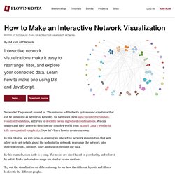
They are all around us. The universe is filled with systems and structures that can be organized as networks. Recently, we have seen them used to convict criminals, visualize friendships, and even to describe cereal ingredient combinations. Visualize Complex Data. Data can be overwhelming, intimidating, and obscure. When you’re trying to make your case, it’s important that you convey the story to your audience. That’s where data visualization can play a big role. Seven dirty secrets of data visualisation. Net magazine is the number one choice for the professional web designer and developer. It’s here that you find out about the latest new web trends, technologies and techniques – all in one handy package.
Each issue boasts a wealth of expert tips and advice, including in-depth features and over 30 pages of advanced front- and backend tutorials on subjects as diverse as CSS, HTML, JavaScript, WordPress, PHP, and plenty more. net compiles the hottest new sites from around the web, and being the voice of web design, our mission is to source the best articles written by the best people in the industry and feature interviews and opinions crammed with inspiration and creative advice. In short, If you're serious about web design and development, then net is the magazine for you. Editorial Advertising. Principles of Data Visualization. More Ways to Visualize Data: Charts. Maps are awesome. Adding charts to a map is even more awesome. VizWiz - Data Visualization Done Right. How to choose the good chart.
Had.co.nz. 5 Rules of Research/Sourcing Infographics. What could be worse than a poorly designed infographic? A poorly sourced one. Modern Approaches. About The Author. The 3 Phases of Infographic Design. 2012. What challenges? What challenges will bring us 2012 ? Mobile – social – open data and metadata – making data findable and attractive (visualisation!)! ‘Web technologies have become powerful enough that they are used to build full-featured applications; this has been true for many years in the desktop and laptop computer realm, but is increasingly so on mobile devices as well. A W3C document summarizes the various technologies developed in W3C that increase the power of Web applications, and how they apply more specifically to themobile context.’ See also this blog post about mobile: Thinking critically about “infographics,” “data visualizations,” and other visual junk.
Use-Infographics.jpg (800×1049) InfoGraphic Designs: Overview, Examples and Best Practices. 25 Best Infographics Of 2011 That Are Still Relevant Today. The Do's And Don'ts Of Infographic Design - Smashing Magazine. Advertisement. How To Design Your Own Infographics. Tips in Designing Effective Infographics. Getting the Most Mileage out of your Graphics. The Making of an Infographic: The Content Grid v2 - Jesse Thomas - JESS3. Code of Ethics for DataVis Pros.