
MapLab: Maps Don't Persuade People to Wear a Mask. As Covid-19 spreads uncontrolled across the U.S. amid a slow vaccine rollout, what would compel more people to don masks, avoid indoor gatherings and exercise social distancing?
Based on the results of one survey, probably not maps. New research published in JAMA Network Open suggests that while some maps can successfully communicate infection rates, they seem to have little impact on intentions to follow public health guidance, and some maps might actually undermine perceptions of risk. That includes familiar resources for visualizing the pandemic, such as the New York Times, the Centers for Disease Control and Prevention, and Johns Hopkins University’s Covid-19 data dashboard.
In May, Fagerlin and her colleagues surveyed a diverse sample of 2,676 U.S. residents, showing one of six maps that used different visualization styles and tabulations (shown below), then asking respondents about their knowledge of Covid’s spread and infection risks, as well as their intended health behavior. Urban Planning Resources for COVID-19 - Features. It isn't premature to declare 2020 the year of the coronavirus.

Every prediction made in December and January about the trends that would define this year were wrong—mine included. In 2020, auto manufacturers are making ventilators. Jeans companies are making masks. Public transit is empty, and cars stay at home all day long. The Internet, until recently a platform devoted to the sole purpose of pledging fealty to U.S. presidential candidates, now reads like a 24-hour shopping network for coronavirus hot takes.
COVID-19 Hospitalization Tracking Project. Behind Georgia’s Covid-19 dashboard disaster. 9.9k Shares 3.8k 5.2k Research for this story was supported by the Fund for Investigative Journalism.

On Tuesday, April 28, eight days after Brian Kemp sent shock waves nationwide as the first governor to announce he would reopen his state during the pandemic, a quiet storm was brewing over another of Kemp’s decisions. State officials were sending flurries of emails about the previous day’s launch of Georgia’s new Covid-19–tracking dashboard—the primary tool that business owners would use to decide when or whether to reopen, now that they could.
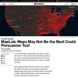
Tracking Covid at U.S. Colleges and Universities. Georgia AAUP guide to Fall 2020. Dashboards. CEID COVID-19 - Wastewater Surveillance in Athens, GA. COVID-19 Data Hub. NEGA Department of Health weekly Covid-19 report - 8/24/2020 - Tim Denson, District 5 Commissioner. The Northeast Health District is now providing a weekly report to assist with local COVID-19 informational needs.
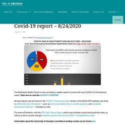
Click here to read the AUGUST 24 REPORT. All past reports can be found on the “COVID-19 Summary Data” section of the NEGA DPH website, and there is additional local information – such as how to get tested, links to current guidance, and shareable educational materials – available as well. MapLab: An Actionable Map of Covid Risk. Wherever Covid-19 continues to spread, the prudence of social gatherings weighs on quarantine-weary people.
With more than 20 million global recorded cases, the chance of an RSVP turning into a super-spreader event clearly isn’t zero. But what about a small group? What about in your community? Built by virus modelers and GIS experts at the Georgia Institute of Technology, a mapping tool offers some answers to would-be socializers in the U.S. Coronavirus in Georgia: COVID-19 Cases, testing and deaths dashboard and updates. [If you are on mobile and are not seeing our charts, please click here to reload full version of page] Q: What is the latest on coronavirus deaths in Georgia?
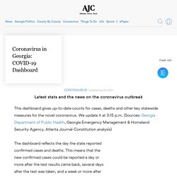
Explore» Follow the full AJC coverage of the coronavirus outbreak Q: What is the latest on people hospitalized for COVID-19 in Georgia? A: This is the number of people confirmed to have COVID-19 who are currently hospitalized, as published by the Georgia Department of Emergency Management & Homeland Security Agency. It began reporting this measure daily on May 2. FoodParent - ConcreteJungle. COVID-19 United States Cases by County - Johns Hopkins Coronavirus Resource Center. COVID-19 Event Risk Assessment Planning Tool. The Path to Zero: Key Metrics For COVID Suppression – Pandemics Explained. Harvard Global Health Institute, Harvard's Edmond J.
Safra Center for Ethics, Rockefeller Foundation, CovidActNow, Covid-Local, CIDRAP and many others join forces, launch new COVID Risk Level map and COVID suppression guidance for policy makers and the public Cambridge, July 1, 2020 -- Uncertainty is the currency of pandemics. As evidence on the new coronavirus, how it spreads and who falls ill from it emerges slowly, policy makers and the public have to base their decisions on the best information available.
Experts help interpret the evidence, but they may differ on details that can be confusing for non-experts -- and filtering out what matters from a rising sea of misinformation has become a daunting task. To help cut through the noise and sometimes conflicting advice, a network of research, policy and public health experts convened by Harvard’s Global Health Institute and Edmond J. “Robust TTSI programs are key on the pathway to suppression. Complete Streets + COVID-19. Across the country, communities and people are adapting to life amidst COVID-19.
The National Complete Streets Coalition is committed to advancing transportation systems that provide safe access for all users of all ages and abilities. We wanted to share and uplift strategies communities are using to respond to the unique circumstances brought on by this pandemic. The following map tracks community responses related to Compete Streets and complete communities. Mapping the impact of dockless vehicles. Click here to download the data from our dockless vehicle map.
Omaha, NE sets proposed rules for scooter program’s return Omaha is considering bringing e-scooters back to the city from June through November for the second year of its pilot program. So far, Bird and Lime have submitted proposals. The City Council also set the tone for the program with new rules, including a proposed $100 fine for anyone who rides on sidewalks or blocks access points. COVID-19 Community Mobility Reports. Each Community Mobility Report is broken down by location and displays the change in visits to places like grocery stores and parks. Learn more about the data. We’re working to add more countries, regions and languages in the coming weeks. This is an early release and reports will be updated regularly. The Community Mobility Reports were developed to be helpful while adhering to our stringent privacy protocols and protecting people’s privacy.
No personally identifiable information, such as an individual’s location, contacts or movement, will be made available at any point. Insights in these reports are created with aggregated, anonymized sets of data from users who have turned on the Location History setting, which is off by default. Introducing PolicyMap COVID-19 Quick Maps. Georgia Department of Public Health. GIS COVID-19 Georgia Specific Map - Georgia STEM. The following map is provided by Georgia STEM in response to the decision by Johns Hopkins to no longer report below state-level data in the United States as of March 10, 2020.
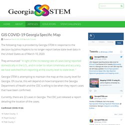
They announced ” In light of the increasing rate of cases being reported domestically in the U.S., and in order to retain timeliness and accuracy, we have switched from reporting at the county level to state level. “ Georgia STEM is attempting to maintain the map at the county level for Georgia. Of course, this will depend on how transparent the Georgia Department of Health and the CDC is willing to be when they report cases that have been confirmed. Currently, there are 22 cases in Georgia.
Coronavirus Disease (COVID-19) Maps, Solutions & Resources. Print Arcade. Data Tools and Apps. Interactive Maps. National Household Travel Survey. COVID-19 Cumulative incidence. 500 Cities Project: Local data for better health. Notice to 500 Cities Data Users: For the 2019 data release, 7 of the 27 measures based on BRFSS data could not be updated because the measures are only included in the even-year BRFSS administration.
These 7 measures are: all teeth lost, dental visits, mammograms, Pap tests, colorectal cancer screening, core preventive services among older adults, and sleep less than 7 hours. However, earlier estimates based on 2016 BRFSS data for these 7 measures remain available. Nonpartisan Government Data. After Georgia Reopened, 62,000 Non-Georgians Came To Visit: Data. ATLANTA, GA — Georgia has become a kind laboratory for what happens when states reopen their economies, but it's what was happening outside the state that alerted researchers at the University of Maryland, who on Thursday said they'd tracked location data on the smartphones of some 62,000 additional visitors to the Peach State between April 24 and May 1.
The location data, which was provided to the researchers after being stripped of users' personal information, presents the most complete look yet available at the ongoing effects of Georgia's plan to partially reopen its economy. "The pandemic has a lot to do with human mobility," said Chenfeng Xiong, an assistant professor and researcher at Maryland Transportation Institute, and who analyzed the smartphone data. The data on Georgia travel was included in the rollout of the institute's COVID-19 Impact Analysis Platform, which tracks the effects of the coronavirus outbreak and measures states' readiness to reopen. Related: Social media data in research: a review of the current landscape — SAGE Ocean. Challenges Despite its potential for insight, social media data comes with challenges. Twitter’s 2015 API update restricts free access to only 1% of tweets published in the last seven days.
Facebook have closed their doors further, preventing third-party apps from accessing user IDs for public pages. Once you’ve got the data, it is often unstructured and noisy. Collecting the Maps of the Coronavirus Pandemic. This interview is adapted from the latest edition of MapLab, CityLab’s biweekly newsletter about maps that reveal and shape our urban spaces. Sign up for the newsletter here. The 5.5 million-plus maps at the Library of Congress in Washington, D.C. are so many windows into history.
With items from the 13th century to the modern day, the world’s largest repository of geospatial data is always growing, with its keepers on constant lookout for new additions. Lately those librarians have had their hands full. John Hessler, a specialist in modern cartography and GIS at the Library of Congress, is collecting the maps of the coronavirus pandemic. Why Coronavirus Reporting Data Is So Bad. We have more data than ever to track a growing number of coronavirus cases, tests and deaths. But can we rely on these numbers?
Facebook has released a map of coronavirus symptoms crowdsourced from its users. What’s new: Facebook has released a map showing the proportion of people who say they have experienced coronavirus symptoms in each state in the US. The data was gathered from more than one million Facebook users who filled in a survey created by Carnegie Mellon University about whether they were experiencing symptoms like a cough or a fever. The map, which goes down to county level, will be updated every day. Facebook says it will create similar maps for other countries in the coming days and weeks, also based on survey responses. CEID COVID-19 - Home. Chicago uses anonymized cellphone data to show progress of COVID-19 measures. Dive Brief: Chicago residents stayed home nearly 80% of the time last week, according to a new data analysis of cellphone and mobile device movement, collected by health data company BlueDot.
In February and early March, data from BlueDot revealed that Chicago residents were only home an average of 59%-64% of the time.Mayor Lori Lightfoot said this data shows that Chicago is flattening its curve of COVID-19 cases. The rate of cases now doubles every 12 days, compared to last month’s rate of doubling every 2-3 days. Dive Insight: The city’s public health department is working with BlueDot to gather the anonymous location information from thousands of apps being used on local cell phones, according to ABC7Chicago.com. Coronavirus Case Data for Every U.S. County. CSSEGISandData/COVID-19: Novel Coronavirus (COVID-19) Cases, provided by JHU CSSE. Ncov_cases. COVID-19 GIS Hub. Georgia STEM COVID-19 Cases. Coronavirus COVID-19 (2019-nCoV) Data sources: WHO, CDC, ECDC, NHC and DXY and local media reports. Read more in this blog. Contact US. Downloadable database: GitHub: Here. Feature layer: Here. Confirmed cases include presumptive positive cases.