
Mapped: Solar Power by Country in 2021. Mapped: Solar Power by Country in 2021 The world is adopting renewable energy at an unprecedented pace, and solar power is leading the way.
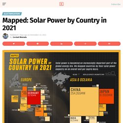
Despite a 4.5% fall in global energy demand in 2020, renewable energy technologies showed promising progress. While the growth in renewables was strong across the board, solar power led from the front with 127 gigawatts installed in 2020, its largest-ever annual capacity expansion. The above infographic uses data from the International Renewable Energy Agency (IRENA) to map solar power capacity by country in 2021. This includes both solar photovoltaic (PV) and concentrated solar power capacity. The Solar Power Leaderboard. MiseryMap. 35 Informative Maps People Shared On This Group That Might Change Your Perspective On Things (New Pics) For me, maps are the perfect fusion of art, information, insight, and entertainment.
They help us navigate both physically and in the realm of ideas. What separates a good map and a great one is that the latter doesn’t stop with just mapping the territory: it expands the borders of our imagination. There’s hardly a better place to see original, unusual, and interesting maps than this subreddit right here. Though we can’t mention the name (thanks, internet police!) , it’s a veritable treasure chamber for cartographers, amateur and professional alike!
Where are the World’s Ongoing Conflicts Today? In theory, nuclear weapon stockpiles are closely held national secrets.
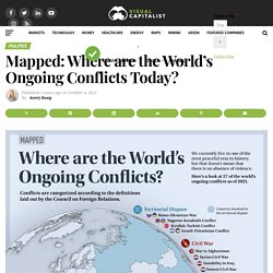
The leading countries have rough estimates that aren’t regularly updated, newly nuclear countries keep their capabilities vague and unclear, and Israel has never officially confirmed a nuclear weapons program. But thanks to limited disclosures, records, and leaks, we can visualize the full extent* of the world’s nuclear arsenal. This graphic uses estimated nuclear warhead inventories from the Federation of American Scientists as of August 2021. Based on these estimates, there are just nine countries with nuclear weapons in the world. The States With The Most Reported Missing Persons Cases Per 100K People, Visualized. The disappearance and death of Gabby Petito has fully captured the attention of America.
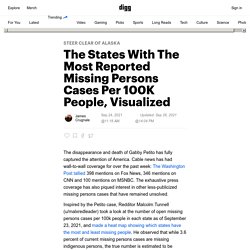
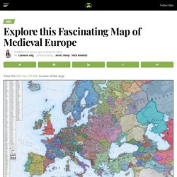
Cable news has had wall-to-wall coverage for over the past week: The Washington Post tallied 398 mentions on Fox News, 346 mentions on CNN and 100 mentions on MSNBC. See how your California neighborhood, city and county changed in the last decade. Our home on native land. Explore this Fascinating Map of Medieval Europe in 1444. Synthetic biology (SynBio) is a field of science that involves engineering life for human benefit.
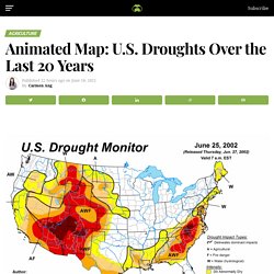
It has the potential to reshape many facets of society—from the ways we produce food, to how we detect and cure diseases. It’s a fast-growing field of science. In fact, by 2026, the SynBio market’s global revenue is expected to reach $34.5 billion, at a CAGR of 21.9%. While this fascinating area of research is worth paying attention to, it might be daunting to wrap your head around—especially if you don’t come from a scientific background. With this in mind, here’s an introduction to synthetic biology, and how it works. Animated Map: U.S. Droughts Over the Last 20 Years. From bean to bar, the cocoa supply chain is a bittersweet one.
While the end product is something most of us enjoy, this also comes with a human cost. Based on how much cocoa comes from West Africa, it’s likely that most of the chocolates we eat have a little bit of Cote d’Ivoire and Ghana in them. The $130B chocolate industry relies on cocoa farming for supply of chocolate’s key ingredient. Bronze Age slab found in France is oldest 3D map in Europe. Visualized: Mapping the World's Key Maritime Choke Points. Maritime transport is an essential part of international trade—approximately 80% of global merchandise is shipped via sea.
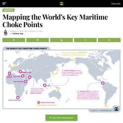
Because of its importance, commercial shipping relies on strategic trade routes to move goods efficiently. These waterways are used by thousands of vessels a year—but it’s not always smooth sailing. In fact, there are certain points along these routes that pose a risk to the whole system. Day and Night World Map. Visualized: A Global Risk Assessment of 2021 And Beyond. Risk is all around us.
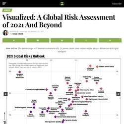
After the events of 2020, it’s not surprising that the level and variety of risks we face have become more pronounced than ever. Every year, the World Economic Forum analyzes the top risks in the world in its Global Risks Report. Risks were identified based on 800+ responses of surveyed leaders across various levels of expertise, organizations, and regional distribution. The 40 Weirdest (And Best) Charts We Made In This Long, Strange Year. Over the course of 2020, FiveThirtyEight’s visual journalists covered a historic election, an unprecedented year in sports, a raging pandemic and an economy in free fall.
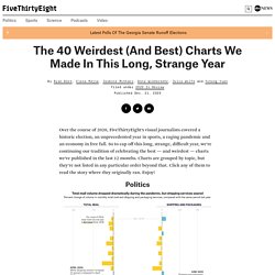
So to cap off this long, strange, difficult year, we’re continuing our tradition of celebrating the best — and weirdest — charts we’ve published in the last 12 months. Charts are grouped by topic, but they’re not listed in any particular order beyond that. Click any of them to read the story where they originally ran. Enjoy! The Year in Review: 2020 in 20 Visualizations - Visual Capitalist. Can you remember a year more life-changing than 2020?
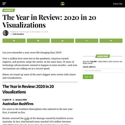
Over a million lives were lost in the pandemic, oil prices turned negative, and protests swept the streets. At the same time, 10 years of technology advancements seemed to happen in mere months—and now vaccinations are rolling out at a record speed. Below, we round up some of the year’s biggest news events with charts and visualizations. Graphic #1 ⟩⟩ January 2020. Dallas to New York distance (DFW to JFK) Rə - Home. This incredible Google experiment lets you time travel to your hometow. Zooming In: Visualizing the Relative Size of Particles. View the high resolution of this infographic by clicking here. Lately, the world’s biggest threats have been microscopic in size. From the global COVID-19 pandemic to wildfires ripping through the U.S. West Coast, it seems as though our lungs can’t catch a break, or more aptly, a breath.
Animation: The Population Pulse of a Manhattan Workday. It seems that humanity is always vying to exceed our past accomplishments, and nowhere is the evidence clearer than in the tallest buildings that make up our cities. Incredible Map of Pangea With Modern-Day Borders. View the high resolution of this infographic by clicking here. Strong brands create an emotional link with consumers, and tech brands are no exception.
In fact, Google, Amazon, Netflix, and even eBay rank as some of the most searched consumer brands worldwide. It’s hard to imagine life without these household names, but how do brand preferences shift and change across internet searches worldwide? This Fascinating World Map was Drawn Based on Country Populations. What if everyone received monthly payments to make life easier and encourage greater economic activity? That’s the exact premise behind Universal Basic Income (UBI). The idea of UBI as a means to both combat poverty and improve economic prospects has been around for decades. With the COVID-19 pandemic wreaking havoc on economies worldwide, momentum behind the idea has seen a resurgence among certain groups.
Parenting and Work Schedule During the Pandemic. Parenting with the stay-at-home, work-from-home, and learn-from-home orders is a tricky thing. What Matters Most to People in Each Country. This map shows where on Earth humans aren’t. A newly created map reveals the “wildest” places on Earth—places where humans have the lowest impact. 11 Cognitive Biases That Influence Political Outcomes. With the 2020 U.S. presidential election fast approaching, many people will be glued to the 24-hour news cycle to stay up to date on political developments. COVID-19 Deaths in Context: How Many People Die Each Day? How COVID-19 Has Impacted Media Consumption, by Generation. The Anatomy of the $2 Trillion COVID-19 Stimulus Bill. Unified Geologic Map of the Moon, 1:5M, 2020. People of the Pandemic Simulation Methodology / osserman. People of the Pandemic, a game that simulates social distancing in your ZIP Code.
Why I'm not making COVID19 visualizations, and why you (probably) shouldn't either. Form and Function: The Shape of Cities and Economies. : Flip the script on COVID-19. Black Swan Events: Short-term Crisis, Long-term Opportunity. Who is the higher income earner in your family? Over time, the U.S. has seen a rise in female breadwinners. Infection Trajectory: Which Countries are Flattening their COVID-19 Curve? Ranked: Global Pandemic Preparedness by Country. Coronavirus Explained and What You Should Do. The Death Toll Of History's Most Fatal Pandemics, Visualized. This Map Shows What Each State's Favorite Other State Is And It's Priceless. Animated Map Showing the Growth Of The US Via Railways & Interstate System. Interactive Coronavirus Outbreak Map - Bequests.co.uk. Map of the Moon If Its “Seas” Were Really Seas. Mapping Migration in the Face of Climate Change. Google Street View Users Glimpse Deceased Family on Google Maps. Traffic Light Sequences In Europe - Fleet Logging.
Canada Consumes More Electricity Per Capita Than All But 7 Other Countries. The Largest Seaport In Europe: Port of Rotterdam Map – MoverDB.com. Europe vs United States Sunshine Duration In Hours Per Year. Migrating Birds In Europe: Map Visualization. Animated Map Showing The Radioactive Cloud Moving Through Europe After The 1986 Chernobyl Disaster. NPR Choice page. Aratea: Making Pictures with Words in the 9th Century. New Interactive "Murder Map" Reveals the Meanest Streets of Medieval London.
An Interactive Map of Odysseus' 10-Year Journey in Homer's Odyssey. This Man ‘Travels’ In Google Maps And Some Of The Things He Has Discovered Are Bizarre. Guy Tries To Take A 15 Min ‘Shortcut’ Suggested By Google Maps, Gets A Lesson And A Trip Of A Lifetime. The Soviet Military Program that Secretly Mapped the Entire World. 42 Experimental And Mind-Bending Maps That You Won't See In Textbooks.