
Dataviz Challenge #1: How to Make a Circle Chart in Excel. Two weeks ago, I challenged readers to reproduce a circle chart from Innovation Network’s State of Evaluation 2012 report — using only Microsoft Excel or R.
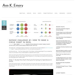
You can read the full blog post here. And the winners are… Tony Fujs, Andrea Hutson, Prince Rajan, and Bernadette Wright! Tony re-created the chart in R, and Andrea, Prince, and Bernadette re-created the chart in Excel. Here’s my how-to guide. At the bottom of this blog post, you can download an Excel file that contains each of the submissions. Step 1: Study the chart that you’re trying to reproduce in Excel. Here’s that chart from page 7 of the State of Evaluation 2012 report. Step 2: Learn the basics of making a bubble chart in Excel. To fool Excel into making circles, we need to create a bubble chart in Excel. We’re not creating a true scatter plot or bubble chart because we’re not showing correlations between any variables. Step 3: Sketch your chart on an x-y axis. It helps to sketch this part by hand.
Go slowly. Bonus. Beautiful HTML5 graphs & charts generator. Chart and image gallery: 30+ free tools for data visualization and analysis. November 7, 2013 03:21 PM ET The chart below originally accompanied our story 22 free tools for data visualization and analysis (April 20, 2011).
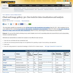
We're updating it as we cover additional tools, including 8 cool tools for data analysis, visualization and presentation (March 27, 2012) and Six useful JavaScript libraries for maps, charts and other data visualizations (March 6, 2013). Click through to those articles for full tool reviews. Features: You can sort the chart by clicking on any column header once to sort in ascending order and a second time to sort by descending (browser JavaScript required). Skill levels are represented as numbers from easiest to most difficult to learn and use: Users who are comfortable with basic spreadsheet tasks Users who are technically proficient enough not to be frightened off by spending a couple of hours learning a new applicationPower usersUsers with coding experience or specialized knowledge in a field like GIS or network analysis.
JavaScript Charts for the Grown-Ups. PRESENTING DATA: CHARTING AND GRAPHING - Compiled by Betty C. Jung. Making Data Visualizations: A Survival Guide And Other Resources. As part of my work as Visiting Scholar at the Packard Foundation this year, I’m facilitating a peer learning group based on “Measuring the Networked Nonprofit” and the next session we are focusing on the sense-making step of measurement.
This part of the measurement process is most the fun because it covers visualization, pattern recognition, and reflection. I wanted to take a deeper dive into resources out there that provide useful tips about how to do this step for folks who were not data scientists or data nerds. I did a quick scan of data visualization resources to look for practical advice on the process of thinking visually and some technical information on what chart to select and data storytelling. Here’s what I discovered. (1) Data Visualization Survival Guide: This resource (including the 176 slides powerpoint deck) was suggested by Devon Smith. Avoid 3d-charts at all costs. Talk pivot tables to me … RT @jonesabi OH re: data: “Is it well-structured enough and is it sexy?” Gapminder: Unveiling the beauty of statistics for a fact based world view. Create visualization.
How to Use FF Chartwell. Primarily suitable for Adobe Creative Suite, FF Chartwell for print uses OpenType ligatures to transform strings of numbers automatically into charts.

The data remains in a text box, allowing for easy updates and styling. It’s really simple to use; you just type a series of numbers like: ‘10+13+37+40’, turn on Stylistic Alternates or Stylistic Set 1 and a graph is automatically created. To help get you started using FF Chartwell we’ve created this video tutorial and here are some simple steps: ONE — Firstly always make sure the letter spacing is set to “0” (zero) TWO — Using the values 0-100, type the values, then use “+” to combine them into one chart. THREE — Want to bring a bit of color to your work? FOUR — Turn on Stylistic Alternates or Stylistic Set 1 and enjoy! To see the original data all you need to do is turn off Stylistic Set or Stylistic Alternates. Many Eyes. Datavisualization.ch Selected Tools. Create and design your own charts and diagrams online.
GGobi data visualization system. Business Intelligence and Analytics Software. SmartDraw – Communicate Visually.