Espace Pierre-Gilles de Gennes. Visualization Options. Le Data-journalism notre religion. Depuis la fin des années 90, les expériences concluantes de Data-journalism représentent une nouvelle jeunesse pour les métiers de la presse, longtemps dominée par les règles de la presse d'opinion.
En voici les principes fondateurs. Que défend OWNI. À l’opposé des intentions de la presse d’opinion, celle qui dicte une manière de penser le monde, une nouvelle presse émerge, désireuse de transmettre toutes les données susceptibles de lire le monde différemment, de nourrir toutes les pensées critiques, sans tenter d’en imposer une. Pour cette presse-là, le journalisme de données (ou Data Journalism à l’anglo-saxonne) s’apparente à une nouvelle profession de foi. Pirhoo est l’un de ces apôtres. Ce texte représente un retour d’expérience sur les caractéristiques très précises du Data Journalism, ou journalisme de données. 1. On le sait, par nature, développer nécessite d’être curieux : il faut en permanence recycler ses techniques et ses connaissances. Wisibility. Many Eyes. Working with Data in Protovis on Datavisualization. Free Data Visualization Software. How Might We Visualize Data in More Effective and Inspiring Ways.
We have many dashboards available to us today in many contexts: finance, forecasts, consumption, demographics, etc.
We witness the emergence of beautiful graphical representations more frequently than ever. Instead of flooding this post with examples of data visualization, I would like to put the spotlight on how we processes them, and what challenges that presents. A couple of years ago, we were tasked at IDEO to design dashboard visualizations for Ford's next generation hybrid vehicle, the Ford Fusion. Hybrid cars are efficient only if the driver maximizes the car's potential; in other words, if the driver learns to make sense of the complex mechanics of two motors and regenerative braking.
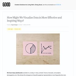
If the dashboard is the interface between the driver and the car, how might it coach drivers to make sense of this complexity and to adopt efficient driving habits? This is the key question we need to address when we put people at the center of evaluation (as Jocelyn Wyatt puts it). FlowingData. Examples. Enjoy these sample visualizations built with Protovis.
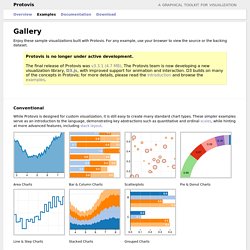
For any example, use your browser to view the source or the backing dataset. Protovis is no longer under active development.The final release of Protovis was v3.3.1 (4.7 MB). The Protovis team is now developing a new visualization library, D3.js, with improved support for animation and interaction. D3 builds on many of the concepts in Protovis; for more details, please read the introduction and browse the examples. Gallery of Data Visualization - Bright Ideas. Trendsmap - Real-time local Twitter trends. Gephi, an open source graph visualization and manipulation software. Datavisualization. Catherine from visualizingeconomics.com has written an interesting article about the roles in data visualization.
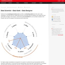
The posts that your reading right now are my thoughts about the diagram she created and how I would alter the stages in the process. I recommend reading her article first, as my answer is based on her thoughts. But here’s the diagram that illustrates well the basic idea: For highly complex visualizations it is important in my opinion to combine the visual representation with the interaction model early on. If we think that visual representation often starts with rough sketches it is my believe that interactivity should be treated the same way. The two fields strongly interact with each other and by planing the interactions together with the visuals the designer can find solutions to reduce information overload and to grant access to the needed information. So, my suggestion would be to switch 6.refine with 7.interact. A visual exploration on mapping complex networks.
Download Social Networks Visualizer software for free. Le « Camembert » : Par-delà la polémique, quand peut-on utiliser ce graphique ? 22 free tools for data visualization and analysis. 22 outils gratuits pour visualiser et analyser les données (1ère partie) Vous avez des données à explorer ?
Voici quelques outils qui pourront vous être utiles pour les transformer en informations et en graphiques attrayants. SketchUp. Looking 4 data visualization. Mapequation.org. 40 Essential Tools and Resources to Visualize Data. One of the most frequent questions I get is, "What software do you use to visualize data?
" A lot of people are excited to play with their data, but don't know how to go about doing it or even start. Here are the tools I use or have used and resources that I own or found helpful for data visualization – starting with organizing the data, to graphs and charts, and lastly, animation and interaction. AutoMap: Project.
Overview | People | Sponsors | Publications | Hardware Requirements | Software | Training & Sample Data AutoMap is a text mining tool developed by CASOS at Carnegie Mellon.
Input: one or more unstructured texts. Output: DyNetML files and CS files. AutoMap is designed to work seamlessly with ORA. AutoMap enables the extraction of information from texts using Network Text Analysis methods. AutoMap exists as part of a text mining suite that includes a series of pre-processors for cleaning the raw texts so that they can be processed and a set of post-processor that employ semantic inferencing to improve the coding and deduce missing information. AutoMap uses parts of speech tagging and proximity analysis to do computer-assisted Network Text Analysis (NTA).
AutoMap subsumes classical Content Analysis by analyzing the existence, frequencies, and covariance of terms and themes. Author Identifier. So who are the people that work on Scopus?
We thought it was time to let you meet them, in their own words. Rather than overwhelm you, I'll break this up into a few smaller groups. CiteSpace: visualizing patterns and trends in scientific literature. CiteSpace is a freely available Java application for visualizing and analyzing trends and patterns in scientific literature.
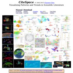
It is designed as a tool for progressive knowledge domain visualization (Chen, 2004). It focuses on finding critical points in the development of a field or a domain, especially intellectual turning points and pivotal points. Detailed case studies are given in (Chen, 2006) and other publications. CiteSpace provides various functions to facilitate the understanding and interpretation of network patterns and historical patterns, including identifying the fast-growth topical areas, finding citation hotspots in the land of publications, decomposing a network into clusters, automatic labeling clusters with terms from citing articles, geospatial patterns of collaboration, and unique areas of international collaboration.
The primary source of input data for CiteSpace is the Web of Science. Notes: Stanalyst v2. We Love Datavis. Cool Data Visualization Techniques - Information Visualization. Information aesthetics. IMPURE. Gapminder.org. Mind Mapping en ligne – outil collaboratif idéal ? « Gestion de Projets 2.0. Visual Understanding Environment. SimpleMind Touch - Mind Mapping on the iPhone and iPod. » Test du logiciel de mind mapping Xmind (version 3.0.2) - Lettres et Cartes Heuristiques. The Mind Mapping Site. Controversies. Information Is Beautiful.
Category : Graphic - Beautifl. Poïétique du design » Data flow. Information aesthetics - Information Visualization & Visual Communication. Journalism in the Age of Data. Moritz.stefaner.eu - / A visual exploration on mapping complex networks.