
Drooly Dog. Communication Nation. Web Design by Designer, Speaker and Writer Brian Hoff. Gamestorming. Poorly Drawn Lines. Junk Charts. This post is part 2 of an appreciation of the chart project by Google Newslab, advised by Alberto Cairo, on the gender and racial diversity of the newsroom.
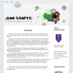
Part 1 can be read here. In the previous discussion, I left out the following scatter bubble plot. This plot is available in two versions, one for gender and one for race. The key question being asked is whether the leadership in the newsroom is more or less diverse than the rest of the staff. The story appears to be a happy one: in many newsrooms, the leadership roughly reflects the staff in terms of gender distribution (even though both parts of the whole compare disfavorably to the gender ratio in the neighborhoods, as we saw in the previous post.) Unfortunately, there are a few execution problems with this scatter plot. First, take a look at the vertical axis labels on the right side. I find this decision confounding. The horizontal axis? Here is the same chart with improved axis labels: Re-labeling serves up a new issue. Visual Mapping.com. Data Visualization, Infographics, and Statistics.
Conspire: A Mindjet Publication. The Presentationist — Tony's PowerPoint Weblog. A business vision, as most everyone knows, rarely becomes reality.
That’s fine. Western culture enjoys making guesses about the future and we know not to hold visionaries accountable for shortcomings. We aim, we shoot, we don’t always score. (Yes, even Steve Jobs had his string of flops.) Still, every so often, companies such as Microsoft and General Motors and produce a statement such as this video which hints at what they think the future will look like. And I will readily admit that I am not either. This video is yet another good example of “kinetic typography” (more about it here at Garr Reynolds’ blog). Someone online rhetorically asked “How many blogs had to die so that Twitter may live?” I do not feel a lot of remorse, though. If you’re arriving here via #CLE20, welcome! More of the usual “About Me” sort of information is on a page cleverly titled “About Me.” Oh, and I have a new fulltime job as of June 6, 2011. It can be. One more thing … a video promoting the conference. Presentation Tips from Olivia Mitchell. Passion for visual communication and presentation design.
The Extreme Presentation(tm) Method. The most popular thing we've ever posted on this blog has been, without doubt, the Chart Chooser.
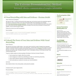
Available in nine different languages, the Chart Chooser has been featured in numerous books on presentation and data visualisation, and continues to serve as a very simple but effective tool for choosing a good chart. We have applied the same idea to the question of chosing different slide layouts, so here is the new Slide Chooser(tm). Try as we might, we couldn't fit it into one 8-1/2 x 11" (or A4) page, so we had to split it up on two pages: It works the same way the Chart Chooser does.
You begin with the question What is the main point of the slide? You can download the Slide Chooser here as a single, two-page pdf: Download Slide Chooser 2 pager An earlier version, laid out on a single, 11 x 17" (A3) sheet, looks like this: You can download this larger, single page version here: Download Slide Chooser 11x17. Duarte Blog. Just a couple more stops until the Death Star.

@sean_voegeli Many of our employees live a long way from the office. One of our designers has a particularly hellish trek. Instead of whining about it — or just staring at his phone like the rest of us — he started making it a #creativecommute. Sean Voegeli* is a talented illustrator, avid Instagrammer, and loyal Star Wars fan. First, where can we find your work? What tools do you use? I like Adobe Draw a lot. How has your #creativecommute affected your day? On the way home, it’s a good way to unwind and transition into dad-mode. How do you decide what to draw? Which comes first, illustration or photo? How long does each piece take to make? Why Instagram?
Do you have a favorite piece? “All strollers and droids must enter through the gate please.”