
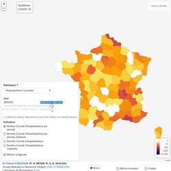
CoviCarte Dans quelles communes le virus circule-t-il ? - CovidTracker. CoviCarte Dans quelles communes le virus circule-t-il ?
CoviCarte est un outil de CovidTracker permettant de suivre l'activité de l'épidémie en France. Les données proviennent de Santé publique France, et sont mises à jour tous les soirs. La carte est interactive. Cette page est en cours de construction et s'améliorera au fil du temps. Bonne année 2021 ! France Coronavirus: 6,633 Cases and 148 Deaths - Worldometer. Coronavirus COVID-19 (2019-nCoV) Lancet Inf Dis Article: Here. Coronavirus Pandemic Data Explorer. VaccinTracker Covid19 : nombre de français vaccinés - CovidTracker. Quelle proportion des Français a été vaccinée ?
Combien faut-il encore vacciner de personnes avant d'atteindre l'immunité collective ? Quels sont les différents types de vaccins proposés ? Ce tracker permet de suivre la proportion de Français déjà vaccinés contre la Covid19. VaccinTracker est une initiative citoyenne indépendante et non officielle. Renkulab.shinyapps. Combien cas de Covid par région en France ?
Evolution du Covid-19 en France en temps réel. Cas de Coronavirus par région ou département. Number of COVID-19 vaccination doses administered per 100 people. Plateforme COVID-19. Géodes - Santé publique France. COVID-19 #CoronaVirus Infographic Datapack. COVID-19 #Coronavirus latest data visualized.
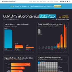
You are welcome to use this graphic in any way you please. » Flattening the Curve (NY Times) and interactive (Washington Post) » World Health Organisation dashboard » All the data in detail (Our World in Data) » How does Corona virus compare with flu? (NY Times) » Coronavirus is very different to Spanish flu (NY Times) » See our beautiful infographic books » Learn how to create impactful infographics & visualisations: online seminars » All our graphics. » Pandémie Covid-19 : où en sommes-nous ? (au 28 août) Nous vous proposons aujourd’hui un point de situation sur l’épidémie de Covid-19.

Et, cette semaine encore, les nouvelles ne sont clairement pas bonnes. Nous avons donc beaucoup travaillé pour vous proposer de nouveaux graphiques pour mieux comprendre la situation – n’hésitez pas à nous faire part de vos réactions en commentaires. Experience. Coronavirus COVID-19 (2019-nCoV) Lancet Inf Dis Article: Here.

Mobile Version: Here. Data sources: Full list. Downloadable database: GitHub, Feature Layer. Lead by JHU CSSE. Technical Support: Esri Living Atlas team and JHU APL. Cases and Death counts include confirmed and probable (where reported).Recovered cases are estimates based on local media reports, and state and local reporting when available, and therefore may be substantially lower than the true number.
Coronavirus tracked: has your country’s epidemic peaked? Cases or deaths Comparing the spread of coronavirus in different countries is difficult using the data being released by governments.

Confirmed case counts depend heavily on the extent of countries’ very different testing regimes, so higher totals may simply reflect more testing. Deaths are somewhat more reliable, but remain problematic because countries have different rules for what deaths to include in their official numbers. The most notable difference between countries’ Covid mortality figures is whether or not they include deaths outside hospitals, particularly in care homes. Some countries like France and the UK have even changed which deaths they include during the course of the epidemic. For either measure, we use a seven-day rolling average to adjust for the impact of administrative delays to reporting new data over weekends. Logarithmic or linear scales Adjusting for population. ++Armenia: Coronavirus Pandemic+++
Coronavirus Update (Live): 4,736,104 Cases and 313,498 Deaths from COVID-19 Virus Pandemic - Worldometer. How dangerous is the virus? There are three parameters to understand in order to assess the magnitude of the risk posed by this novel coronavirus: Transmission Rate (Ro) - number of newly infected people from a single caseCase Fatality Rate (CFR) - percent of cases that result in death Determine whether asymptomatic transmission is possible. Thibautfabacher.shinyapps. Leaflet Dr.Thibaut FABACHER, Pr.
Estimating the burden of SARS-CoV-2 in France. Abstract France has been heavily affected by the SARS-CoV-2 epidemic and went into lockdown on the 17 March 2020.

Using models applied to hospital and death data, we estimate the impact of the lockdown and current population immunity. We find 3.6% of infected individuals are hospitalized and 0.7% die, ranging from 0.001% in those <20 years of age (ya) to 10.1% in those >80ya. Across all ages, men are more likely to be hospitalized, enter intensive care, and die than women. The lockdown reduced the reproductive number from 2.90 to 0.67 (77% reduction). The worldwide pandemic of SARS-CoV-2, the coronavirus which causes COVID-19, has resulted in unprecedented responses, with many affected nations confining residents to their homes. Daily reported numbers of hospitalizations and deaths only provide limited insight into the state of the epidemic. Graphs and maps — EUROMOMO. Coronavirus tracked: the latest figures as countries fight to contain the pandemic.
FT Visual & Data Journalism team November 10, 2020 Print this page The human cost of coronavirus has continued to mount, with more than 50.2m cases confirmed globally and more than 1.24m people known to have died.

The World Health Organization declared the outbreak a pandemic in March and it has spread to more than 200 countries, with severe public health and economic consequences. This page provides an up-to-date visual narrative of the spread of Covid-19, so please check back regularly because we are refreshing it with new graphics and features as the story evolves. Europe’s average count of coronavirus-related deaths overtook Asia’s in early March, with Italy, Spain and the UK becoming the global hotspots. Latin America then became the epicentre of the pandemic, with the region accounting for about one quarter of deaths each day.
Graphiques sur la Covid-19: 4 choses à savoir. Cet article fait partie de la rubrique du Détecteur de rumeurs, cliquez ici pour accéder aux autres textes.

L’image qui revient le plus souvent dans les médias est celle de l’évolution du nombre de cas de coronavirus, dans un pays ou dans plusieurs, comme le fait le graphique du Financial Times ci-haut, remis à jour quotidiennement. Cela permet de comparer les pays entre eux, mais c’est une information incomplète. 1) S’attarder au nombre de décès ou d’hospitalisations plutôt qu’au nombre de cas.