
Kaggle: The Home of Data Science. The Atlas of Economic Complexity. The 14 Best Data Visualization Tools. Nishith Sharma is the co-founder of frrole, a social intelligence startup.
Raw data is boring and it’s difficult to make sense of it in its natural form. Add visualization to it and you get something that everybody can easily digest. Not only you can make sense of it faster, but you can also observe interesting patterns that wouldn’t be apparent from looking only at stats. OEC: The Observatory of Economic Complexity. In the News: Week of 6/11/2014. Best (and Worst) Infographics & Data Visualization. Free Online Data Training. Data visualization basic training; from spreadsheet to data mapping. kdmcBerkeley is offering four free online training courses in data journalism.
You'll learn basic data visualization skills, from spreadsheets to data mapping. Each of the four one-hour long courses builds upon the other; register for all four sessions or choose the session that best meets your needs. Officiële website van Google Analytics - Webanalyse en rapportage – Google Analytics. Pratyush Gupta on Behance. Paulo Estriga Information Designer. Francesco Franchi. New Ways to Visualize Your Data - Inside Microsoft Research. 60+ R resources to improve your data skills.
More free downloads and websites from academia:
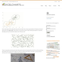
OpenIntro. Kaggle: Go from Big Data to Big Analytics. How to use gestalt laws to make better charts The Excel Charts Blog. Every chart starts with a table.
John Grimwade Information Graphics. Juice Analytics - Your data is meant for action. Free Data Visualization: 25 Best Tools. Date visualization can be a pain if one is not aware of the many tools one can use in its endeavor.
Data visualization is a process wherein data is shown in a simpler way in order for people to understand easily. Samples of data visualization tools include maps, graphs, pictures, and many more. Moritz.stefaner.eu - / Visualize your data. HTML5 JavaScript dynamic client side data visualization. RGraph - HTML5 and JavaScript charts.
Free Web Line Charts. Datajournalistiek.nl - 18 LinkedIn Apps, Tools, and Resources. I tweeted the other day about LinkedIn’s Resume Builder and I got a number of surprising responses from people I would have assumed would already know that LinkedIn had a resume builder.

LinkedIn has been cranking out new features and tools, and I realize that it’s too easy for me to assume that everyone else knows what I know, so I’m compiling all of the interesting offerings LinkedIn has released in 1 place for easy consumption. Open Cultuur Data » Ter inspiratie: 8 handige open source tools voor apps. Visualize This: An e-Patient’s Medical Life History. The following was originally Katie McCurdy’s response to the excellent, ongoing discussion about the future for self-tracking.

It’s too good not to elevate to a post of its own — Susannah.____________________________________________________________________________ Katie’s self-crafted medical timeline (Click to enlarge; see story below) 7 Innovative ways of visualizing the news. KrackPlot: social network visualization. KrackPlot is a network visualization tool intended for social networks, and designed to be quick and easy to run, yet highly customizable.
KrackPlot has been under development for many years. The current version, 4.3, is written in java, can read and write many graph formats and create resolution-independent output for Word or Powerpoint. You can download a self-installer for this version below. KrackPlot can also be run as an applet in a browser that supports java 1.4.2 or higher. Currently, we are researching ways to use motion in network visualizations to highlight changes in the network structure over time. Download. Over 100 Incredible Infographic Tools and Resources (Categorized)
This post is #6 in DailyTekk’s famous Top 100 series which explores the best startups, gadgets, apps, websites and services in a given category.

Total items listed: 112. Time to compile: 8+ hours. Follow @DailyTekk on Twitter to make sure you don’t miss a week! Update: Be sure to check out our latest post on infographics: Infographics Are Everywhere – Here’s How to Make Yours Go Viral. I love a good infographic! Emails. Plugins ~ 0.8 emails facebook gsoc new-york times plugin sna twitter During this summer, six students are working on Gephi with the Google Summer of Code.
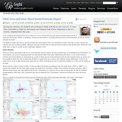
They contribute to Gephi by developing new features that will be integrated in the 0.8 version, released later this year. Yi Du is adding the module Direct Social Networks Import during this summer, which provides several kinds of importers like Emails, Twitter or Facebook. The goal of this article is to briefly introduce some of the importers, as well as several samples provided. Data Visualizations, Challenges, Community. NodeXL: Network Overview, Discovery and Exploration for Excel. Fernanda B. Viégas. Themail. Vizualize.me: Visualize your resume in one click. Christopher Baker. Email became an integral part of my life in 1998. Like many people, I have archived all of my email with the hope of someday revisiting my past. Gote Nyman's (gotepoem) Blog. Socrata.
Visual Understanding Environment. Enterprise Web User Experience Designer and Information Architect. Marumushi.com. Ubigraph: Free dynamic graph visualization software. UbiGraph is a tool for visualizing dynamic graphs. The basic version is free, and talks to Python, Ruby, PHP, Java, C, C++, C#, Haskell, and OCaml. Download Version alpha-0.2.4 Version alpha-0.2.4 is distributed as two separate components. The server application, which renders graphs, is distributed as a compiled binary. The client bindings, which use XMLRPC, are distributed under an open source license. Download now ➠ Watch demonstrations The demonstrations on our Demos page illustrate the underlying technologies and some example applications.
Watch demos ➠ Applications Algorithm Visualization. Automatic Email and Social Network Analysis « eDiscovery and Information Management. How implementing text-mining and other advanced analytics can help organizations understand complex email collections and social networks There is great interest in automatically detecting relation networks from email collections, from e-books, web-sites, blogs, micro-blogs and other social media. There are various methods to automatically measure particular properties of such social networks such as but not limited to: degree, closeness, betweenness, importance, prominence, local & global centrality, density, community structure & density, groups, leaders, etc.
This information can be derived from either the full-text by recognizing the named entities of persons, organizations and companies and their relations or from the natural attributes (from, to, subject, cc, bcc, etc,) of email messages and other social network communication. A great example of the automatic derivation of a relationship network for Leo Tolstoy’s Anna Karenina can be found here: Information aesthetics - Data Visualization & Information Design. Force Directed Emails Visualisation Using arbor.js. I have recently been playing around with ways of visualising my sent emails for an assignment at university. I have over 6 years worth of sent mail sitting in Gmail, collecting electronic dust (and occasionally being dusted off and looked at).
I downloaded all of my sent mail from Gmail (over 3000 conversations), making use of my university’s internet connection. I made use of thunderbird for this, as it stores emails in flat files on disk. I made a simple python script that takes this raw file and converts it into JSON. I have obscured the recipient names for the sake of their privacy only (my own privacy has already been destroyed by the likes of such sites as Facebook – see: Facebook is an appalling spying machine). ABOUT MAIL MINING. Visualize Yahoo! EMIST Download. Overview The EMIST ESVT (Experiment specification and visualization tools) provides an integrated environment to interact with DETER or EMULAB test-beds and to conduct network security emulation/simulation experiments. Commetrix - Dynamic Network Visualization Software - Dynamic Visualization of Networks - Dynamic Social Network Analysis Software Visualization - Dynamic Network Analysis - Virtual Communities.
Overview — NetworkX 1.6 documentation. Ben fry » Examples for Visualizing Data. Examples for Visualizing Data Source code for the book examples for the folks who have kindly purchased the book (lining my pockets, $1.50 at a time).