
Graphique en 3D - Les idéologies et organisations. Développé en complément de l'épisode 3 de la chaîne Youtube Esprit Critique, "la politique par les jeux de rôles", ce graphique interactif est le résultat des réflexions développées dans l'épisode.

Il propose un classement des idéologies politiques sur 3 axes. Le choix des axes est justifié dans l'épisode comme étant d'après moi les plus déterminants et parlants. Quant au placement des idéologies sur ces axes (et leur nombre de variantes représentées par les bulles), il est presque entièrement subjectif et reflète ma façon de penser. Ce classement ne prétend pas remplacer le clivage Gauche/Droite, il s'y superpose (activez le clivage gauche/droite dans les options pour voir comment). Pour plus d'infos, voyez l'épisode 2, "La Gauche et la Droite" L'application est prévue pour être intuitive, cliquez partout, vous finirez par trouver ce que vous cherchez. Cette application est développée par Tzitzimitl à l'aide de Blender et Blend4web et partagée sous licence Creative Commons CC By-NC-SA.
150 Interactive. A Periodic Table of Visualization Methods. AlgoTransparency. We want to see which information the YouTube algorithm is showing to people.
This algorithms is responsible for more than 700,000,000 hours of watch time every day, and it is not fully understood, even by the people who build it. Recommended videos appear in the “Up next” list on the right of the screen. (“When autoplay is enabled, a suggested video will automatically play next.”) We used a multi-step program to analyze videos recommended by its algorithm every day. Earthquake Data and Information. Human Terrain. History of the World: Every Year. Meet the 7 deadly sins of statistical misinterpretation - and how to avoid them. Statistics is a useful tool for understanding the patterns in the world around us.
But our intuition often lets us down when it comes to interpreting those patterns. In this series we look at some of the common mistakes we make and how to avoid them when thinking about statistics, probability and risk. 1. Assuming small differences are meaningful Many of the daily fluctuations in the stock market represent chance rather than anything meaningful. You can avoid drawing faulty conclusions about the causes of such fluctuations by demanding to see the “margin of error” relating to the numbers. If the difference is smaller than the margin of error, there is likely no meaningful difference, and the variation is probably just down to random fluctuations. 2. We often hear generalisations about how two groups differ in some way, such as that women are more nurturing while men are physically stronger. You can avoid this error by asking for the “effect size” of the differences between groups. 3. 4. 5. How to spot a misleading graph - Lea Gaslowitz.
This revealing map shows the world's ships in real time. The ocean is a big place, which makes it a pretty difficult thing to wrap our brains around.
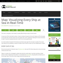
It covers over 70% of the Earth’s surface, is home to millions of species of life, and it makes up 97% of all water on the planet. But, with this massive size and ubiquity also comes a significant challenge for humans interested in trade: it must be constantly traversed in order for us to move goods around. As a result, millions of people hit the high seas each day to get cargo from one place to another. The vessels used range from tiny sailboats to massive oil tankers, some of which can get up to four football fields in length. Every Ship at Sea We previously posted an interactive map of shipping routes that used 250 million data points to show how boats moved across the ocean. Today, in a similar vein, we highlight a website that tracks the world’s ships in real-time, providing a unique picture of what is happening at sea. You may be wondering, does this really show every ship at sea? The Tree of Life.
DnB Noize – Radio Garden. Ships are triggering intense lightning storms. Heavily-laden ships carrying trade around the world leave behind a trail of storms and lightning.
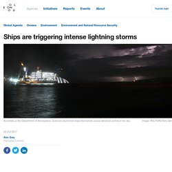
That’s the hypothesis of a team of researchers at the University of Washington, who found that emissions from ships were triggering intense lightning storms. The scientists at the Department of Atmospheric Sciences analyzed data from the World Wide Lightning Location Network (WWLLN) and noticed a certain pattern of lightning strikes across the Indian Ocean. The pattern could not be put down to atmospheric conditions. However, once they compared the lightning strikes with shipping routes an explanation began to emerge: the ships themselves were causing electrical activity in the sky.
Image: Thomton et al/Geophysical Research Letters/AGU “We already know that ships influence cloudiness and clouds,” the study’s lead author Joel A. What Powers the World? – Gocompare.com. How much of the world’s electricity is still reliant on coal, oil and gas?
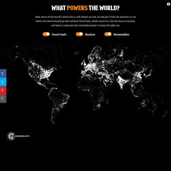
Flick the switches to see where the world would go dark without fossil fuels (FF), which countries rely the most on nuclear (N), and who is using entirely renewable power (R) to keep the lights on. Data on the share of fuel types used to produce electricity in each country was collated from International Energy Organisation. Regional estimates were used for countries where country-specific data wasn’t available.