
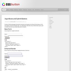
CSS3 Please! The Cross-Browser CSS3 Rule Generator. Color Scheme Designer 3. Designing Modern Web Forms with HTML 5 and CSS3 » LegendThemes.com. Recently I noticed that many web developers are still using HTML tables to layout their forms. Mainly it is because people stick with what they know, and have never taken the time to learn a better way. Once you learn to layout forms with standards compliant CSS it is actually quite easy! We will be using HTML5 and CSS3 to achieve great style and functionality without causing problems in less capable browsers. Animated CSS3 Calendar. CSS Button. CSS input boxes and submit buttons. The days of bland web pages with ugly text and layout are long gone, but the parts that make up a form have largely remained unchanged.
Here, I am attempting to describe various methods that may be used to enhance the look of your input fields and form buttons. Basic Form. Blur Menu with CSS3 Transitions. Creative CSS3 Animation Menus. Automatic Image Montage with jQuery. Arranging images in a montage like fashion can be a challenging task when considering certain constraints, like the window size when using fullscreen, the right image number to fill all the available space or also the size of the images in use.

With the following script you can automatically create a montage, either for a liquid container or a fixed size container (including fullscreen), with the option to fill all the gaps. View demo Download source Having a white space in the end of the container can, as well, be avoided optionally. Multi-level Photo Map - A location based image gallery app. Create Attractive Web Typography with CSS3 and Lettering.js. CSS has come a long way in recent years, and with new browser support for a hand full of CSS3 properties the possibilities are becoming more and more diverse!
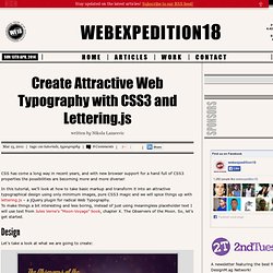
In this tutorial, we’ll look at how to take basic markup and transform it into an attractive typographical design using only minimum images, pure CSS3 magic and we will spice things up with lettering.js – a jQuery plugin for radical Web Typography. To make things a bit interesting and less boring, instead of just using meaningless placeholder text I will use text from Jules Verne’s “Moon-Voyage” book, chapter X. The Observers of the Moon. So, let’s get started. Create Spinning Rays with CSS3 Animations & JavaScript. Thomas Fuchs, creator of script2 (scriptaculous' second iteration) and Zepto.js (mobile JavaScript framework), creates outstanding animated elements with JavaScript.
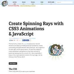
He's a legend in his own right, and for good reason: his work has helped to inspire developers everywhere to drop Flash and opt for JavaScript development for smooth UI's. One simple effect I enjoy is the script2 website's rotation of a ray image. Let me show you how Thomas did it! The CSS. CSS3 Gradients and Patterns « CSS3 Wizardry. Works in Desktop Safari, Google Chrome, Firefox, iPhone, Android, iPad The ability to create CSS3 background gradients on any HTML element offers a lot of potential to create visually satisfying and engage experiences in the browser.
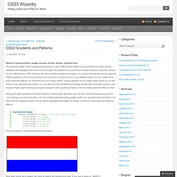
But gradients are just about creating a 60s acid inspired rainbow of color. Because an HTML element can have multiple background images, you can do tricky things such as layering different gradients. If you use a background color and use rgba colors in your gradient stops, you can create some truly interesting effects. Oh, and there are also image masks. Flexible Slide-to-top Accordion. Tucked Corners. Life at the bleeding edge (of web standards) CSS3 Patterns Gallery.
Browser support The patterns themselves should work on Firefox 3.6+, Chrome, Safari 5.1, Opera 11.10+ and IE10+.

However, implementation limitations might cause some of them to not be displayed correctly even on those browsers (for example at the time of writing, Gecko is quite buggy with radial gradients). Also, this gallery won’t work in Firefox 3.6 and IE10, even though they support gradients, due to a JavaScript limitation. Experiments with cascading style sheets. Prefix free: Break free from CSS vendor prefix hell! -prefix-free lets you use only unprefixed CSS properties everywhere.
It works behind the scenes, adding the current browser’s prefix to any CSS code, only when it’s needed. The target browser support is IE9+, Opera 10+, Firefox 3.5+, Safari 4+ and Chrome on desktop and Mobile Safari, Android browser, Chrome and Opera Mobile on mobile. If it doesn’t work in any of those, it’s a bug so please report it. Index_abc.png (Image PNG, 1830x1366 pixels) Une feuille de styles de base pour le media print. Nous avons parfois la fâcheuse habitude de penser que le Web n’est bon à être restitué que sur un écran d’ordinateur.
Pourtant, un grand nombre de documents web et d’informations en ligne sont parfaitement adaptés au médium d’impression. Non seulement pour faciliter leur consultation, les transmettre, mais aussi pour les archiver. Pour vous faciliter la tâche et ne plus la négliger, je vous propose une feuille de style dédiée à l'impression qui condense bonnes pratiques et astuces. Ces règles peuvent être externalisées dans un fichier CSS séparé, ou incluses directement au sein du document de styles global, déclarées à l’aide de la règle-at @media print {...}. L’objectif de cette feuille de styles est avant tout de poser un socle de bases communes (marges, couleurs, contrastes, tailles, gestion des sauts de pages et des veuves et orphelines), que vous pourrez adapter à vos convenances ou besoins personnels.
HTML, les couleurs. Tables RGB Tables. Spend your time innovating, not replicating. RGB Color for CSS. 10 of the Best CSS3 Code Generators. This article was written in 2011 and remains one of our most popular posts.
If you’re keen to learn more about CSS3, you may find this recent article on transform techniques of great interest. I have rose-tinted memories of CSS2.1. Rounded corners may have caused hours of Photoshopping grief, but it was simple. Most developers could recall the few dozen properties without referring to reference books every two minutes. CSS3 changes everything. CSS 3.0 Maker. Space CaCSS - Animated CSS3 background patterns. CSS. Free Webmaster Tutorials - Quackit.com. CSS3 Gradient Generator.
CSS Gradient Background Maker. CSS3 Generator. Chapter 8 : CSS Padding « CSS Basics. 15 Best CSS3 Generators For Lazy Designers. 15 Best CSS3 Generators For Lazy Designers.
CSS Design: Going to Print. CSS Positioning. The term "CSS positioning" refers to using CSS to position elements on your HTML page. CSS allows you to position any element precisely where you want it. You can specify whether you want the element positioned relative to its natural position in the page or absolute based on its parent element. Absolute positioning can be very useful for creating advanced layouts and cool visual effects such as overlapping elements to present a layered effect. Relative Positioning To determine whether the element will be positioned relatively or absolutely , you use the position property. To perform relative positioning in CSS you use position:relative; followed by the desired offset from either top , right , bottom or left . This example offsets the element 80 pixels from the left of where it would have been. Pompage.net : le web design puisé à la source. The CSS Box Model. At the risk of over-repeating myself: every element in web design is a rectangular box.
This was my ah-ha moment that helped me really start to understand CSS-based web design and accomplish the layouts I wanted to accomplish. We've talked about the positioning of these boxes a bit, and about their behavior. What we haven't talked about much is the box itself. How is the size of the box calculated exactly? 20 Awesome HTML5 Web Forms Tutorials. Advertisement HTML5 CSS3 forms let you get your contact form designs. Web forms are vital for communication between a website and the user, and you’d be hard pushed to find a website these days that didn’t have a form somewhere on it. HTML5 forms allow for cleaner, more semantic code, and CSS3 forms allow for cleaner, code-only effects to be created. When spiced up with a bit of jQuery, and when taking advantage of validation and other new features in HTML5, your new HTML5 CSS3 forms will rock.
Mise en forme CSS d'un formulaire accessible - CSS Debutant. Par défaut, les formulaires ne sont pas folichons. CSS3 Background-Clip Text & @font-face.