
The Infographics Gallery. ChartsBin.com - Visualize your data. Bechdel Test Charts. Infographs. InfoGraphics (Visual Maps) A Periodic Table of Visualization Methods. School of Data - Evidence is Power. Gapminder: Unveiling the beauty of statistics for a fact based world view. Image-wise: Helping Charles Dickens understand the Kindle. Growcase. Informational pictures pictures by sentenal01 - Photobucket. Visualization Tool. Tufte Edward. Data Visualized: More on Teaching With Infographics. Data Analysis for the People.
Social graph: The premium version of Wolfram Alpha automatically works out how to visualize data you provide, in this case mapping connections in an e-mail archive.

Shows like Numb3rs and CSI have popularized the idea of experts solving problems using data analysis. Now the “knowledge engine” Wolfram Alpha wants to help nonexperts try their hand at it. Wolfram Alpha looks like a Web search engine but can answer queries such as “how old is President Obama?” Or “heart disease risk 50-year-old male.” Can information be beautiful when information doesn't exist? Reader Steve S. sent in this article that displays nominations for the "Information is Beautiful" award (link).
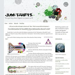
I see "beauty" in many of these charts but no "information". Several of these charts have appeared on our blog before. Dynamic Periodic Table. Think Quarterly by Google. Infographics. Data Visualization Gallery. Qunb - Find and Visualize numerical data. Worldometers - real time world statistics. Chrome Experiments - Home. Watch_Dogs WeAreData. Why Abraham Lincoln Loved Infographics. Near the end of 1861, with the American Union crumbling, President Abraham Lincoln became obsessed with an unusual document.
Nearly three feet in length, it appeared at first to be a map of the southern states. But it was covered with finely rendered shading, with the darkness of each county reflecting the number of slaves who lived there. South Carolina, the first to secede from the Union, featured a particularly dark coastline. Yet other parts of the South (like western Virginia) appeared as islands of lightness.
Handpicked free fonts for graphic designers with commercial-use licenses. Create A Font From Your Own Handwriting and Use It To Send Emails. I will show you how it works and how to capture the text for use in your own images using a little bit of a workaround. We have to use that workaround because as of now, PilotHandwriting does not allow you to download your font. If you are looking to be able to download the font for use in your word processing application then check out 2 Free Tools To Make Your Own Text Font.
Upon arriving at their website, you will be greeted by a little flash animation which surprisingly is not over the top and compliments the site. You will then be shown a YouTube video about how it works. When it is complete, you will see a printable chart for you to fill in. Go ahead and hit the Print button, print out the chart and then hit the right arrow on the screen to continue on to the next step.
Hit the button for the option you want to use and get ready to upload. Handwriting, Lettering, Type BRIEM.NET. The worst visualization I've ever seen (CNBC on the oil spill) 8 Horrible Data Visualizations That Make No Sense. Finally revealed: the optimal number of categories in a pie chart The Excel Charts Blog. 5 Minute Guide: Graphic Design Principles for Information Visualization. Laws of Simplicity. Organization makes a system of many appear fewer.
The home is usually the first battleground that comes to mind when facing the daily challenge of managing complexity. Stuff just seems to multiply. There are three consistent strategies for achieving simplicity in the living realm: 1) buy a bigger house, 2) put everything you don’t really need into storage, or 3) organize your existing assets in a systematic fashion. These typical solutions have mixed results. 20 Great Infographics of 2012. 2012 has certainly been an eventful year, with everything from elections, to olympics, to scientific breakthroughs, to major weather events.

To help review some of the things that happened, here are 20 of the best static infographics from the year. 1. There were several space related events this year. NASA’s Curiosity rover landed on mars, and successfully began collecting data. 60 Great Visualizations of 2012. 2012 has been a great year for all kinds of data visualizations.
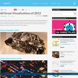
Data owners are realizing that the best way to communicate the insights buried in their data is by visualizing it. This means there have been tons of great static infographics, motion graphics, and interactive visualizations created this year. Remove to Improve (gif) Terrible infographic comic SMBC. November 06, 2013.
Data Underload #9 – Big Graphic Blueprint.
Infographics - Food. Daily chart: The Big Mac index. A Day On My Plate: Athletes’ Meals. Photographic Series Showing What 200 Calories Looks Like in Different Foods. Photographic Series Showing What 200 Calories Looks Like in Different Foods July 14, 2013 in Uncategorized See part 2 of this blog by clicking HERE!

WiseGEEK just conducted a very visual and informative study and presented a photo series, which compares what 200 calories actually look like in different foods. Global Peace Index the economist. Overworked America: 12 Charts That Will Make Your Blood Boil. Inequality in America and the Incomes of the Super Rich. Months since Occupy Wall Street stopped preoccupying Main Street, income concentration at the top continues to feature prominently in the news and politics.
The extent to which the incomes of the super-rich dwarf those of the rest of us in "the 99 percent" is difficult to convey. Even the striking statistics on the share of income received by the top fail to provide a useful visualization of what inequality looks like in contemporary America. The Histomap: Four Thousand Years of World History. Size in volumes. This page displays the current size of the English Wikipedia (without images) in print volumes, per mathematical calculation.
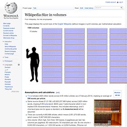
Assumptions and calculations[edit] Encyclopædia Britannica: two rows of volumes in shelves Inspiration: the size of Wikipedia in volumes in 2006 This shows 2,625 million words across 4.45 million articles (as of February 2014), implying an average of 590 words per article.Same source shows 21.21 GB (=22,923,237,680 bytes) across 2,625 million words, implying 8.08 bytes/word. ASCII uses 1 byte/character which in turn implies 8.08 characters/word. Corporate Leadership: Then and Now. The Color of Logos » Emblemetric. Color has become an even more important aspect of logo design in today’s web-based world. How has color been used in US logo design over the past several decades? Analysis of United States Patent and Trademark Office data can provide some answers.
Being Defensive: How psychotherapy sees you. The Illustrated Guide to a Ph.D. Matthew Might, a computer science professor at the University of Utah, writes: “Every fall, I explain to a fresh batch of Ph.D. students what a Ph.D. is. It’s hard to describe it in words. So, I use pictures.” It’s September 26. Complex Philosophical Theories Explained in Basic Shapes. Britain vs. America in Minimalist Vintage Infographics. CHARTS: Newspapers Don't Care When Notable Women Die. If a notable woman dies and a major national newspaper doesn't report it, did it actually happen?
Big papers' lists of significant deaths in 2012 overwhelmingly feature men. The Washington Post put 18 women and 48 men on its list. On the other side of the country, the Los Angeles Times listed 36 women and 114 men. Everything You'll Ever Need To Know About Napping. Causes-of-violent-death.jpg 920×553 pixels. Gun-death tally: Every American gun death since Newtown Sandy Hook shooting (INTERACTIVE) The answer to the simple question in that headline is surprisingly hard to come by.
Infographics in Context. Inequality Is. Is. The Economic Policy Institute (EPI), a non-profit, non-partisan think tank, was created in 1986 to broaden discussions about economic policy to include the needs of low- and middle-income workers. EPI believes every working person deserves a good job with fair pay, affordable health care, and retirement security. To achieve this goal, EPI conducts research and analysis on the economic status of working America. EPI proposes policies that protect and improve the economic conditions of low- and middle-income workers and assesses policies with respect to how they affect those workers.
US vs Euro Values (Pew) Holy infographics: the bible visualised. Anna Wintour's Brand Anna. Front Row to Fashion Week - Interactive Feature. Gamification-education.png 1000×5700 pixels. Female-Character-Flowchart.png 2,147×1,926 pixels. Chicks Rule? History's 100 Geniuses of Language and Literature, Visualized. Word Tree. A word tree is a visual search tool for unstructured text, such as a book, article, speech or poem. A Model of The Creative Process. OII Network Visualisation Example. Literary Pie Charts. Holy Lord and God! Transparency. Budget Puzzle: You Fix the Budget - Interactive Feature. Scotusromneyobama260dpi.jpg 1067×769 pixels. Congress. At the National Conventions, the Words They Used - Interactive Feature.
XKCD ran an interesting infograph today on American Politics from the revolution to now. What all did he get wrong and what is presented in a partisan/misleading manner? : AskHistorians.