
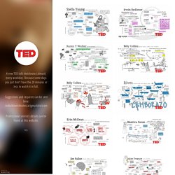
World Map. Best Infographics. Data Viz Done Right. The Directory of News Visualizations. The Data Visualisation Catalogue. Tedsketchnotes.tumblr.com. View photo #TED #tedtalk #ted talk #tedtalks #ted talks #stella young #sketchnote #sketch note #visualization #disabled #inspiration #exceptional 1 month ago 3.
Infographics. I have to say I am mildly addicted to finding these great infographics.
They are an excellent way of presenting a vast amount of information in a lively, visually interesting way. I am set on finding the best of them and when I get some time in the summer actually creating my own! Click the images below to view the full version/slideshow. Infographic List. Best Infographics - Infographics blog - Infographic finder. Best Infographics of the Day. 98 days ago: "Photo"
Travel Infographics. Exciting Things To Do In Florida Florida, the land of sunshine, has amazing places to see and exciting things to do for every travelers.
This infographic showcases fun for kids, romantic places to see and adventurous things to do in Florida. Ireland’s Atlantic Way Top 15 Signature Sights The Wild Atlantic Way is the world’s longest coastal driving route. It takes in the North West, West, Mid-West and South West of Ireland. Vizual Archive Infographic Submission SiteVizual Archive. OECD Regional Well-Being.
Truth Facts. Infographics + Pinterest = Pinfographics. Infographic. Floatingsheep. Tax Talk from H&R Block. Google's Geographies of Religion. “Religion is probably, after sex, the second oldest resource which human beings have available to them for blowing their minds” Susan Sontag Following up on the earlier discussion of the user-created geographies of religion, the following maps simultaneously display all four religious references (Allah, Buddha, Hindu, Jesus) in order to visualise distinct religious cyberscapes.

Below we see the data on a global scale. This map clearly mirrors many of the expected religious geographies of the offline world: references to Allah being most prominent in the Middle East, references to Buddha being most prominent in East Asia, references to Hindu being most prominent on the Indian subcontinent and references to Jesus being prominent in Europe and much of the Western Hemisphere. Interestingly, there are are no large-scale homogeneities in the data and this reflects the sometimes scattered nature of religious practice in the world. In Asia a similar amount of diversity can be seen. Infographic. WTF Visualizations. Bad Graphs. Infographic: How Rich Is Your Religion?
As a born and bred atheist, I don’t know terribly much about the bible, but if you asked me, I could probably summon up a few vague platitudes, like “be nice to your neighbors” and “blessed are the poor.”

So, exactly how poor are Jesus’s disciples today? An infographic from GOOD and Column Five demonstrates how religion lines up with income in America, examining how faith and wealth mingle in contemporary society. Click to enlarge. “It’s no secret that the distribution of wealth is inequitable in the United States across racial, regional, and socio-economic groups,” write the designers at Column Five, a Newport Beach creative agency that specializes in data viz and infographics.
“But there is a distinct variance among and within America’s faiths, as well.” While this chart only shows the money coming in, it would be fascinating to include the average amount of charitable giving amongst each group. It’s a fascinating glimpse at how faith matches up with income. Many Eyes. 10 Jaw-Droppingly Awesome Infographics on Education. Infographics can change the way we learn, the way we see information put in front of us.
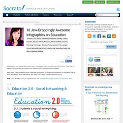
They help us digest that information and leads us to draw important conclusions more swiftly. After doing a little research online I was able to discover 10 gorgeous infographics on education that do more than simply show information, they relay it in a really potent and amazing way. Edit: If you liked this post, you might also like our 22 Mind-Blowing Infographics on Education, too! 1. Education 2.0 – Social Networking & Education 2. 3. 4. 5. 6.
Our Work. A visual exploration on mapping complex networks. Infographics by Shahed Syed. Pulp Fiction Timeline. Statista - The Statistics Portal for Market Data, Market Research and Market Studies. Architecture Infographics. While The WA100, Building Design’s annual ranking of the world’s largest architecture firms, isn’t perfect (see our controversial article here), it does reveal a lot about the state of architecture today.

And for 2013, the research shows that there are finally brighter days ahead for architects – just not at home. BD’s research reveals that China remains the world’s largest construction market (a title it’s held since 2010); that the Asia-Pacific Market is expected to be the largest by 2020 (with projected value of $4.6 trillion dollars); and that China, India, and Brazil offer the best growth potential for architectural services. Not surprisingly, the survey’s top three ranking firms – Aecom, Gensler, and IBI Group – all have a significant presence in these markets. However, are these mega-firms really the best models to aspire to?
With the economic crisis making it everyday more evident that there are more opportunities abroad than at home, where is a firm to go? Almost certainly not. Search infographic Questions. Chart of the day. Ideas, issues, knowledge, data - visualized! The Infographics Showcase - Data Visualization - Infographic Design. The Miso Project. Infographic Site Dot Com — The Best Inforgraphics on the Internet. They Rule. Infographics for Students - Top 3 Online Schools : Online ... Welcome to Visual Academy, OnlineSchools.org's novel attempt at furthering education and creating a hunger for more knowledge through the use of visual learning techniques.
Visual learning is a learning style in which teaching is accomplished through the association of images and techniques with ideas, concepts, data and other information. While the concept of purely visual learners has been debunked, the benefits of using graphics to introduce new concepts and ideas are still worth mentioning. Mixing things up, such as conveying data with pictures rather than straight text, can boost attention. Datavisualization. Killer Infographics by Submit Infographics.
Number Picture - Crowd-Sourcing New Ways For People To ... Data Visualization, Infographics, and Statistics. Information aesthetics - Information Visualization & Visual ... Cool Infographics. Work. Infographics Blog: Reviews of the Best Infographic Design Ideas. Infographic Gallery. Infographics & Data Visualizations.
Visualizing.org. Vizual Statistix: Archive. Graphs, Infographics. Richard Johnson - Illustrator.