
Home-rotation. Data Viz Done Right. Wp-content/uploads/2014/07/SixPrinciplesofCommunicatingData.pdf. The Data Visualisation Catalogue. Visits: A visualisation tool for location histories and photos. Visits is a new visualisation tool by Alice Thudt, Sheelagh Carpendale and Dominikus Baur that lets you browse your location histories and explore your trips and travels.
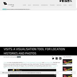
The tool is based on a research project from the University of Calgary. You can find the corresponding publication here: A. Thudt, D. Baur, S. Carpendale - Visits: A Spatiotemporal Visualization of Location Histories, EuroVis 2013. Based on an innovative interactive map-timeline the visualisation elegantly comprises a main map element that shows the bigger-picture view of the places you have visited with a series of sequenced circular map snippets that encode when and how long you have stayed in each location.
You can learn more about the project here and, of course, the authors are keen to invite anyone to create their own 'visit' story. Plotly. MAKE YOUR OWN INFOGRAPHIC. @komox37. 46 Tools To Make Infographics In The Classroom. Infographics are interesting–a mash of (hopefully) easily-consumed visuals (so, symbols, shapes, and images) and added relevant character-based data (so, numbers, words, and brief sentences).
The learning application for them is clear, with many academic standards–including the Common Core standards–requiring teachers to use a variety of media forms, charts, and other data for both information reading as well as general fluency. It’s curious they haven’t really “caught on” in schools considering how well they bridge both the old-form textbook habit of cramming tons of information into a small space, while also neatly overlapping with the dynamic and digital world.
So if you want to try to make infographics–or better yet have students make them–where do you start? The 46 tools below, curated by Faisal Khan, are a good place to start. A Primer On Infographics In The Classroom. A Primer On Infographics In The Classroom by Pamela Rossow If you are a K-12 teacher or a college professor, you may be searching for new ways to promote digital literacy in your classroom.
Or just plain literacy literacy, for that matter. Infographics can be useful teaching tools as they use so many elements of traditional “teaching”: the writing process, research, and planning, all while combining digital and traditional text forms. What exactly are infographics? Infographics are “graphic visual representations of information, data or knowledge intended to present complex information quickly and clearly”[i]. What are infographics made up of? Infographics 4 primary components: Text Features: White Space, Font, Colors, Shapes, etcIdea Organization: Cause-Effect, Chronological Order, Attributes & Characteristics, etc.
How can I use infographics in the classroom? Create and share visual ideas online. Immersion: a people-centric view of your email life. 8StepstoCreateanInfographic_4fd9f83b0f91f.jpg (988×2869) Make Beautiful Heat Maps. Junar · The Open Data Platform. Venngage. Public Data Explorer. The Anatomy Of An Infographic: 5 Steps To Create A Powerful Visual. Information is very powerful but for the most bit it is bland and unimaginative.

Infographics channel information in a visually pleasing, instantly understandable manner, making it not only powerful, but extremely beautiful. Once used predominantly to make maps more approachable, scientific charts less daunting and as key learning tools for children, inforgraphics have now permeated all aspects of the modern world. I designed a couple of infographics back in college, the need arising especially around the time Soccer World Cup fever spiked. It was a fun process representing the different groups, predicting winners in each group at each stage and creating a mock pairing of teams that would clash all the way leading upto the finals. I was a devout Argentinian supporter at the time.
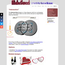
Infographics can appear daunting to some with the sheer amount of data they present, but designed in the right manner and step by step, they can actually be one of the most fun things you will ever create. 1. 2. Online Diagram Software and Flowchart Software - Gliffy. Intersect this! “Intersection” The Intersection design is a Venn diagram with two overlapping circles - you control what is in the circles and (just as importantly) what lies between.
If you have trouble on an older computer, try using an alternative version. This is a 400x300 design, with 800x600 available to subscribers. There are related designs available. Options Problems? Timeline Eons FREE. Free Vector World Maps Collection. Piktochart- Infographic & Presentation Tool. Vizualize.me: Visualize your resume in one click. Create free online charts with online chart builder ChartGizmo.com - Use our chart software for visualizing your data. Interactive maps and visualizations. Draw Diagrams Online using Collaborative Diagram Tools.
Many Eyes. Create Share Infographics. Inkscape. Draw Freely. Free Data Visualization Software. Create Infographics.