
Hans Rosling's 200 Countries, 200 Years, 4 Minutes - The Joy of Stats - BBC Four. A rather awesome blog about rather awesome infographics. Ngram Viewer. Design Shortlist – 2nd challenge! It’s just beautiful to see so many different approaches interpreting the same numbers.
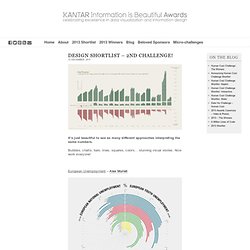
Bubbles, charts, bars, lines, squares, colors… stunning visual stories. Nice work everyone! European Unemployment – Alex Murrell €uro Recession – Ben Willers Euro Debt Crisis - Hang Io Eurocrisis 2011 – The Outliers - Erik Boertjes Emerging Volatility in the Eurozone Crisis - Jane Pong European Debt Crisis: GDP & Debt - Severino European D€bt - Will Stahl-Timmins Punching the Clock – Brian S. The European Debt Crisis, Unfolded – Ben Croker Ready… Debt… Go! Mapnificent - Dynamic Public Transport Travel Time Maps. Channelography. We worked with BBC Research & Development over an 18 month period, investigating the stories and statistics that could be created from metadata around BBC programming, schedule data and subtitle feeds.
This work resulted in Channelography, a website and web service that ingests the BBC's TV schedule and subtitle feeds on a daily basis, analysing and summarising the data over time and by channel. The subtitle files are processed with a text extractor that picks out the key people, places, brands and organisations that were mentioned in the programme. The huge database that this data created allowed us to run a number of interesting queries, such as whether David Cameron was mentioned more or less than Gordon Brown in the run up to the election, or whether the amount of documentaries and drama on BBC channels is increasing or decreasing.
The project led to several follow-up pieces of work, including the BBC Dashboard and A Pocket Guide To BBC TV 2010. Anatomy of a Mashup: Definitive Daft Punk visualised. Interactive 3D model of Solar System Planets and Night Sky. Find London Buses Quickly and Easily. Climate Wisconsin. The Noun Project - Building a Free Collection of Symbols by Edward Boatman. Holographic maps kick the crap out of traditional 3D images. I FIRST heard of Amazon’s new “promotion” from my bookseller daughter, Emily, in an e-mail with the subject line “Can You Hear Me Screaming in Brooklyn?”

According to a link Emily supplied, Amazon was encouraging customers to go into brick-and-mortar bookstores on Saturday, and use its price-check app (which allows shoppers in physical stores to see, by scanning a bar code, if they can get a better price online) to earn a 5 percent credit on Amazon purchases (up to $5 per item, and up to three items). Books, interestingly enough, were excluded, but you could use your Amazon credit online to buy other things that bookstores sell these days, like music and DVDs.
New York magazine: data done right. I always feel jealous when I pick up a copy of New York magazine, jealous that my own home city, London, doesn't have such an intelligent, funny and well-designed equivalent title to document its life and times.
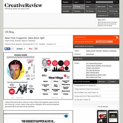
There are lots of things that New York does well, but the thing it does best is its infographics. After Information is Beautiful's David McCandless had his infamous set-to with Neville Brody on Newsnight, the role of infographics has been increasingly questioned: many are beautiful but are they also meaningless? The infographics in New York are sometimes the former, but never the latter. What sets New York's infographics apart (created by the design department under design director Chris Dixon) is that they combine journalistic rigour with design excellence in almost equal measure.
A particular favourite is regular feature The Neighbourhood News. Google Suggest Venn Diagram Generator. Spending Review. Mprehensive spending review interactive: you make the cuts. Vnmc - Creationism vs. Darwinism in Education. Project Vote Smartâs VoteEasy ⢠Visualizing.org. Infographic and Data Interface Videos: the Latest of the Greatest. United States. Ideas, issues, knowledge, data - visu. Schooloscope. Maps. Flashlight Projector Map Concept. Chromaroma. DataArt on BBC Backstage - Visualisations.
Typographic town logos in hiragana/katakana. [Typographic logo for Kamagaya (Chiba) spells town name in katakana] Japanese town logos -- official symbols designed to communicate the identity of each municipality -- come in a vast array of shapes and colors.

Many of these municipal symbols incorporate typographical elements (particularly kanji, hiragana, katakana, and Roman letters) into their designs. In most cases, the stylized characters are straightforward and easy to spot (even if you don't read Japanese), but sometimes you have to bend your eyes to see them. Helveticons. 15 examples.
Data Visualization is a method of presenting information in a graphical form.

Good data visualization should appear as if it is a work of art. This intrigues the viewer and draws them in so that they can further investigate the data and info that the graphic represents. In this post there are 15 stunning examples of Data Visualization that are true works of art. Click on the title or image for a larger view of each visualization. The Strengths of Nations Here’s an image that discusses the variations in how different nations pursue science. Madrid.Citymurmur CityMurmur tries to understand and visualize how media attention reshapes the urban space and city. Genome. Paris Captured in 26 Megapixels Worth of High-Rez Photos - infor. Multicolr Search Lab - Idée Inc.