
Translation Text Expansion: How it affects Design. Strictly necessary Performance Targeting Functionality Unclassified Strictly necessary cookies allow core website functionality such as user login and account management.

Performance cookies are used to see how visitors use the website, eg. analytics cookies. Targeting cookies are used to identify visitors between different websites, eg. content partners, banner networks. Functionality cookies are used to remember visitor information on the website, eg. language, timezone, enhanced content. Unclassified cookies are cookies that do not belong to any other category or are in the process of categorization.
Cookies are small text files that are placed on your computer by websites that you visit. Best Practices For Mobile Form Design. Quick summary ↬ Users can be hesitant to fill out forms. That is why it is our goal as designers to make the process of filling out a form as easy as possible. Nick shares some techniques that can help you design effective forms. (This article is kindly sponsored by Adobe.) Forms are the linchpin of all mobile interactions; it stands between the person and what they're looking for. Every day, we use forms for essential online activities. Forms are just a means to an end. What Does a UX Designer Actually Do? [2021 Guide] What is UX design, and what does a UX designer actually do?
It’s a question I’ve been asked frequently since completing the CareerFoundry UX Design Program. Surprisingly, the question comes not only from friends and family, but also from employers and people who work in the tech industry. There’s still a lot of confusion surrounding the field, which is why, as a UX designer, you’ll often find that your first task in a new job is to clearly explain the value you’ll be bringing to the company and how you’ll do so. The purpose of this post is two-fold. ESC POS Guide2. Web Typography: Designing Tables to be Read, Not Looked At. Good designers spend a great deal of time sweating over typography.
They agonise over typefaces, iterate through type scales and meticulously apply white space, all in the service of the reader. Then comes along a table with the temptation to get creative, and all thoughts of the reader go out of the window. And yet tables are there to be read, referenced and used, not merely looked at. Article Continues Below. Top 30 Power BI Visuals List & Chart Types Explained 2021 - Mindmajix. According to DOMO, over 2.5 quintillion bytes of data are generated every single day, and 90% of the data in this world has been created in the last two years.
It is a tough task to manage this huge amount of data and make sense of all of it. So, the majority of organizations are using Business Intelligence Visualization tools to derive value from data. Among these, Power BI is one of the best visualization tools to handle the data in distinct patterns and make observations. Data proliferation can be managed as part of the data science process, which includes data visualization. Using different Power BI visuals or chart types in 2021, you can manage a vast amount of data quickly and effectively.
Top 30 Power BI Visuals List and Chart Types. Admin Dashboard Wireframe Template. Customize our admin dashboard wireframe template to track business intelligence data – and effectively monitor your sales and website traffic.
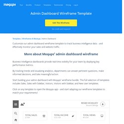
Business Intelligence dashboards provide real-time visibility for your team by displaying key performance metrics. By tracking trends and visualizing analytics, departments can answer pertinent questions, make informed decisions, and take meaningful action. Start building your admin dashboard with Moqups’ wireframe bundle. This full selection of templates includes Sales, Sales with Sidebar, Visitors, Visitors with Sidebar, and New User templates. 9 best to do list apps of 2021. To-do lists don't need to be complicated—plenty of people use a pen and paper for the job without any problem.
And yet a new to-do list app seems to come out every day. Why? Because keeping track of your tasks is an intensely personal thing, and people will reject anything that doesn't feel right pretty much instantly. That makes it hard to find the right app. 9 best to do list apps of 2021. Admin Dashboard Wireframe Template. Top 10 Application-Design Mistakes. Designing complex applications is a challenging undertaking.
Building applications that have both the depth to support complicated tasks and the intuitiveness to make it clear how to get that work done is a tremendous challenge. We spend a full day on this topic in our Application Design for Web and Desktop course, but we could easily spend a month to catalogue every type of problem we’ve encountered in our user-research studies. Making general recommendations about common application-design problems is difficult, because so many of the problems we observe are domain-specific. This was true 11 years ago, when the first version of this article was written, and remains so today. Thus, our first recommendation is to do user research with your target audience: Despite the domain-specific nature of most app usability problems, here are 10 common mistakes that we frequently see across industries. 1. Apps that keep quiet leave users guessing. 1.a. 2.
Email Design. Top 10 Application-Design Mistakes. Mobile UX. Form Design. Component Design. Table Design. Healthcare UX. Design Systems. How to Design Destructive Actions That Prevent Data Loss. Data loss is one of the greatest frustrations users can experience with computers.
They not only lose their data but also their time and money they put into it. For businesses, this could mean hundreds of man-hours and thousands of dollars lost. Don’t let this happen to your users. Avoid horizontal tabs. Why Good User Experience Design Is So Important. What is end-user experience?
It’s generally accepted that the online perception and standing of a brand is defined by the end-user experience. User experience (UX) forms the foundations on which the values of that brand are delivered in the digital world. This means that the user interface, ease of use and speed of a website must all be optimised. Providing top quality content and products alone is just not enough in today’s competitive marketplace.
Why User Experience Matters. The user experience (UX) matters because it’s directly tied to how users perceive your site.
If they have a poor UX while browsing your page, it’s unlikely they’ll stay long, recommend others to the site, or sign up for your marketing materials. In fact, research shows that 88 percent of your customers won’t give you another chance after a bad experience. Our individual preferences play a big role in the sites we frequent, so building an effective UX strategy might seem overwhelming. But in our experience, we’ve found that a quality UX can be summarized with three ideas: How to Download Files Using Safari on Your iPhone or iPad. In your work or personal life, you’ll sometimes need to download a file on your iPhone or iPad.

Using the new feature introduced in iOS 13 and iPadOS 13, you can now do this directly in Safari. No third-party app needed! How to Download Files Using Safari Safari’s download manager is a hidden new feature in the iOS 13 and iPadOS 13 updates. If you’re going about your day, browsing the web, you probably won’t be aware of the feature. Medical Usability: How to Kill Patients Through Bad Design. Usability is often a matter of life or death. In a fighter plane's user interface, for example, taking a second off the time required to operate targeting-and-firing systems offers pilots a dramatic edge in dog-fights. The most striking example of how bad design can kill comes from in-car user interfaces: thousands of deaths per year are related to drivers being distracted by overly complex designs. Conversely, good automotive design can save lives. As an example, take my new Lexus LS430's slightly nagging navigation system, which tells you far in advance whether the freeway exit you need will be to the left or the right.
This feature gives you plenty of time to change lanes, rather than having to wait until the last moment, which is when you typically spot the road sign. Medical systems have also provided many well-documented killer designs, such as the radiation machines that fried six patients because of complex and misleading operator consoles. Author Adam Silver. Choosing the best trendline for your data - Access. When you want to add a trendline to a chart in Microsoft Graph, you can choose any of the six different trend/regression types. The type of data you have determines the type of trendline you should use.
Trendline reliability A trendline is most reliable when its R-squared value is at or near 1. 5 UX KPIs You Need To Track. Share Share Tweet Share Pin It We love to measure things. Beautiful UI Design for API Developer Portals. The Content Chicken and the Design Egg Problem - 20px - Twenty Pixels. Notifications design pattern example at Analytics at Google - 5 of 4. Mobile - Why the 360x640px resolution is currently the most used one? - User Experience Stack Exchange. iPhone 12 vs Designers. How fragmentation will affect the way… Above you can see an example design of an app we’re currently building at HYPE4. As you can see it’s not ideal, as especially the top and bottom spacing require adjustments between the phones to look right.
On some phones the main button requires scrolling, so we’ll have to adjust the entire card and font-sizes for these devices to still manage and fit it.
Tools. Courses : Web Design & Development. Interactive Media Design and Usability. The Interactive Media Design and Usability course introduces students to the tools and concepts of user-interface (UI) design combined with a method of project development that utilizes an industry-proven production process. The course explores both behavioral and structural patterns of UI design along with information architecture (IA) for interactive deployment, user navigation techniques, and page layout for the interactive medium. Web Design and Usability. How To Improve Advanced Search UX? There are different ways to display the values against a parameter. You can select an approach that best fits with your current context and requirements. 1. Input box. Best Practices For Mobile Form Design. The Ultimate List of UX Topics All Beginners Should Know. When entering a new field, there’s usually a standard curriculum to learn.
Front-end developers learn HTML & CSS. Content producers learn the basics of copywriting. How to Ask About Gender in Forms Respectfully. In tech, there are “edge cases”. API design is UI design — a way to collaborative handoff. Product Management Definition and Examples. Product management is vital to delivering innovations and driving business growth. It is an important organizational role that is growing in popularity.
For example, 15 percent of MBA students at MIT's Sloan business school go on to take jobs in product management — making it the second-largest job category for graduates. Atomic Design. Input fields - Placement of More Information/Help Icon button for Radio Buttons - User Experience Stack Exchange. 8 Best Practices for Designing a Helpful Contact Page. The recipe for a website in 1995: Take one gray page, add a visitor counter, sprinkle with rainbow horizontal lines, insert poorly animated construction worker, add a “contact us” page and link the completed page to your web ring. 27 Eye-Opening Website Statistics [Updated for 2019] 44 Types of Graphs and How to Choose the Best One for Your Data.
Why Doctors Hate Their Computers. Are Computers Getting Between You and Your Doctor? A Collection of Design System Resources. The Role of Design in Electronic Health Records: Past, Present, & Future — Gregory Schmidt. User Journey Vs User Flow – Differences & Similarities. How to approach your UX Portfolio as a Mid or Senior level designer. Brain,heart,balance,emotion,intelligence - free photo from needpix.com.
7 loading pages that make waiting (almost) fun. User experience and web design considerations for hospitals and health systems. Scenarios, User Stories and Use Cases…Oh My! UX is not UI. Best Practices for Homepage Links on websites. We've Got the Wrong Idea About UX. Why Product Thinking is the next big thing in UX Design. Dimensions Vs Metrics: What's The Difference? Icon Usability. 6 Ecommerce Checkout Page Optimizations for Higher Conversion [2018] Usability Testing Accordion-Style Checkouts: 2 UX Pitfalls that 75% of Sites Neglect - Articles.
The Definitive Guide to Shopping Cart Abandonment. Usability Testing Accordion-Style Checkouts: 2 UX Pitfalls that 75% of Sites Neglect - Articles. When You Shouldn’t Take That UX Position. Search Patterns: Design for Discovery. Best Practices for Search. Treatise on User Experience Design: Part 1. Understanding User Behavior with Google Analytics - Analytics Help.
Search interface: 20 things to consider. Design Debt. How to tackle design debt. UX Debt in the Enterprise: A Practical Approach User Experience Magazine. Strategic, Operational, Analytical or Tactical Dashboards? Why Use BPMN over Flowcharts - MCFTech. UX Debt in the Enterprise: A Practical Approach User Experience Magazine. Faceted Search Definition, Examples & Best Practices — Dynamic Yield. Integrating UX Design methodologies into software development. UX Deliverables. Poor Management and Mediocre UX Design Go Together. UX for Product Managers - Daniel Elizalde. Top 10 articles about UX & Psychology in 2018. Material Design for Enterprise apps – Enterprise UX. Are UX Developers a Thing? Why Hybrid Designers Are So In-Demand Right Now. Top 20 UX Design Blogs And Resources You Should Follow in 2018. When does good User Experience become evil? – UX Collective.
Lonely Planet Travel Guides and Travel Information. 10 Great Sites for UI Design Patterns. Top 20 UX Design Blogs And Resources You Should Follow in 2018. Best Practices for Search. 10 Usability Heuristics with Examples – prototypr. Filtering UI: A Horizontal Toolbar Can Outperform the Traditional Sidebar - Articles - Baymard Institute. How To Improve Your Search Experience – Daniel Tunkelang – Medium.