
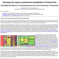
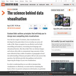
Data visualisation and Infographics tools. 2015 data visualizatiin. Concept map. An Electricity Concept Map, an example of a concept map A concept map or conceptual diagram is a diagram that depicts suggested relationships between concepts.[1] It is a graphical tool that designers, engineers, technical writers, and others use to organize and structure knowledge.

A concept map typically represents ideas and information as boxes or circles, which it connects with labeled arrows in a downward-branching hierarchical structure. The relationship between concepts can be articulated in linking phrases such as causes, requires, or contributes to.[2] Overview[edit] A concept map is a way of representing relationships between ideas, images, or words in the same way that a sentence diagram represents the grammar of a sentence, a road map represents the locations of highways and towns, and a circuit diagram represents the workings of an electrical appliance. Concept maps were developed to enhance meaningful learning in the sciences. Differences from other visualizations[edit] Treemaps for space-constrained visualization of hierarchies.
Started Dec. 26th, 1998 by Later updates by Ben Shneiderman and Catherine Plaisant - Last update Sept 2014 Our treemap products: Treemap 4.0: General treemap tool (Free demo version, plus licensing information for full package) PhotoMesa: Zoomable image library browser (Free demo version, plus licensing information for full package) Treemap Algorithms and Algorithm Animations (Open source Java code) A History of Treemap Research at the During 1990, in response to the common problem of a filled hard disk, I became obsessed with the idea of producing a compact visualization of directory tree structures.
Since the 80 Megabyte hard disk in the HCIL was shared by 14 users it was difficult to determine how and where space was used. Tree structured node-link diagrams grew too large to be useful, so I explored ways to show a tree in a space-constrained layout. Charts. Visual aids and templates. Network Visualization. Vintage data visualization: 35 examples from before the Digital Era. This is a guest post by Tiago Veloso, the founder of Visual Loop, a collaborative digital environment for everything related to information design and data visualization.
He lives in Brazil, and you can connect with him online on Twitter and LinkedIn. If you follow us regularly on Visual Loop, you’ve probably noticed we like to featured not only modern interactive visualizations and infographics, but also examples from the past, from the time when there were no computer softwares to help analyzing and designing and no Internet to access and share data. Graphics, charts, diagrams and visual data representations have been published on books, newspapers and magazines since they exist, not to mention old maps and scientific illustrations, and despite the lack of tools such as the ones we have at our disposal nowadays, they are as inspiring and important as the best contemporary visualizations.
A Map of Physics (1939) (A 1939 Map of Physics) (Via Strange Maps) (image:John Snow,1854 ) (image:P. Many Eyes. Data Visualization: Top 20 Amazing Tools. It’s often said that data is the new world currency, and the web is the exchange bureau through which it’s traded.
As consumers, we’re positively swimming in data; it’s everywhere from food labels to World Health Organisation reports. 20 free data visualisation tools. In this article, I want to focus on tips and tools that are free and easily accessible.
There are loads of great paid tools out there, and I use many of them. But it is hard to expect someone just getting into this field to pay for expensive software without actually knowing what they are getting into. This article looks to expand the list to even more tools and resources you can use to help you get started creating beautiful data visualisations for the web and print. From data journalism, where you are scrubbing and combining datasets, to ornately designed infographic style posters, you need to understand the tools and your audience to succeed. This article will point you in the right directions to both improve your skills as well as open your eyes to new resources. Cleaning up Anyone who works with data sets will tell you that a big portion of your time is spent cleaning it up into a usable format! Over the years a more and more tools have been created to help ease the pain. Open Refine. The science behind data visualisation. Over the last couple of centuries, data visualisation has developed to the point where it is in everyday use across all walks of life.
Many recognise it as an effective tool for both storytelling and analysis, overcoming most language and educational barriers. But why is this? How are abstract shapes and colours often able to communicate large amounts of data more effectively than a table of numbers or paragraphs of text? An understanding of human perception will not only answer this question, but will also provide clear guidance and tools for improving the design of your own visualisations. In order to understand how we are able to interpret data visualisations so effectively, we must start by examining the basics of how we perceive and process information, in particular visual information.
System 1 vs System 2 To better understand the differences between System 1 and System 2, consider Figure 1. The 37 best tools for data visualization. It's often said that data is the new world currency, and the web is the exchange bureau through which it's traded.
As consumers, we're positively swimming in data; it's everywhere from labels on food packaging design to World Health Organisation reports. As a result, for the designer it's becoming increasingly difficult to present data in a way that stands out from the mass of competing data streams. Get Adobe Creative Cloud. Tools - WikiViz.