
Simulating The World (In Emoji) Nicky case, jan 2016 Note: It looks like your browser doesn't support emoji, but don't worry!
I switched this page over to a fallback font, so you can still enjoy it. It's not 🌟full-color🌟 emoji, but oh well. Such is life. So, I used to live in California. Point is, our world is run by complex systems. That’s where simulations come in! A Tiny Forest For Tiny Trees As it turns out, forest firefighters already use computer simulations to tackle wildfires, in real time! First, emergence: complex systems can arise from simple rules. Second, all complex systems have things in common. 🌲→🔥 Trees sometimes get hit by lightning & catch on fire.
Sims can help explain a system, but they're also great for exploring systems. For example, what do you think would happen now, if you increased tree growth? And now, you get to run that experiment. A Forest With Thunderbolt & Lightning, Very Very Frightening Ah, you predicted that higher tree growth would lead to more trees. This is thinking in systems.
What Killed The Infographic? A few years ago, the Internet was awash in groundbreaking data visualizations.
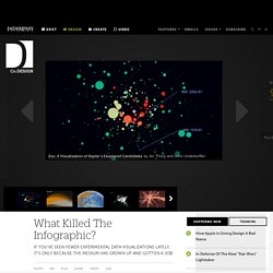
There was Aaron Koblin's deeply influential map of flight patterns around the U.S. Periscopic's exhaustive, haunting portrait of gun violence in the United States. Jer Thorp and John Underkoffler's Minority Report-like interface for exploring the galaxy. Today, you'd be lucky to find a cheap knockoff in a world dominated by crappy promotional infographics churned out for viral attention. Business Intelligence and Analytics.
Business Intelligence and Analytics. Gallery · mbostock/d3 Wiki. Wiki ▸ Gallery Welcome to the D3 gallery!
More examples are available for forking on Observable; see D3’s profile and the visualization collection. Please share your work on Observable, or tweet us a link! Visual Index Basic Charts Techniques, Interaction & Animation Maps Statistics Examples Collections The New York Times visualizations Jerome Cukier Jason Davies Jim Vallandingham Institute for Health Metrics and Evaluation Peter Cook Charts and Chart Components Bar Chart Histogram Pareto Chart Line and Area Chart Pie Chart Scatterplot and Bubble chart. Gallery · mbostock/d3 Wiki. Top Data Visualisations. Interactive data visualisations of the UK’s creative economy. Today we are publishing two interactive data visualisations that describe the UK’s Creative Economy (click the images below to view).
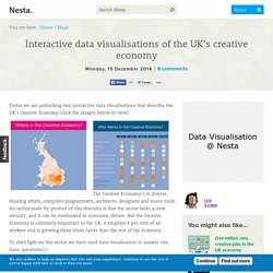
The Creative Economy[1] is diverse, housing artists, computer programmers, architects, designers and many more. An unfortunate by-product of this diversity is that the sector lacks a clear identity, and it can be overlooked in economic debate. But the Creative Economy is extremely important to the UK: it employs 8 per cent of all workers and is growing three times faster than the rest of the economy. To shed light on this sector we have used data visualisation to answer two basic questions[2]: Where in the UK is the Creative Economy most concentrated?
DataViz History: Charles Minard’s Flow Map of Napoleon’s Russian Campaign of 1812. Charles Minard’s Flow Map of Napoleon’s Russian Campaign of 1812 [Click on map to see full size version] The chart above also tells the story of a war: Napoleon’s Russian campaign of 1812.
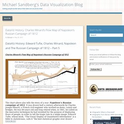
It was drawn half a century afterwards by Charles Joseph Minard, a French civil engineer who worked on dams, canals and bridges. The Good Country Index ― IIB Studio. Motion@Waterloo goes live. Audi, the UK’s leading premium automotive brand, is to be the launch partner of Motion@Waterloo, the UK’s largest indoor advertising screen, which goes live for the very first time at London’s Waterloo railway station on 10 February 2014.

Motion@Waterloo is a powerful new communications channel at the UK’s busiest station, delivering a captive audience of four million commuters every fortnight. Part of JCDecaux and Network Rail’s vision for the future of rail advertising, it consists of a state-of-the-art, 40 x 3 metre, 6mm pixel, high-definition screen spanning the length of the concourse. It will launch with the Audi Dashboard, a creative concept featuring branded content developed specifically for the Motion@Waterloo site by ad agency BBH London and produced by Grand Visual. The Audi Dashboard features live statistics and contextual messages about “One day in the life of Waterloo” – a series of quirky station facts which are compared to the Audi range. Financial Times Graphic World. A day in the life. Earth - Your life on earth. Explore BBC Earth's unique interactive, personalised just to you.
Find out how, since the date of your birth, your life has progressed; including how many times your heart has beaten, and how far you have travelled through space. Investigate how the world around you has changed since you've been alive; from the amount the sea has risen, and the tectonic plates have moved, to the number of earthquakes and volcanoes that have erupted. Flight Risk. U.S. Gun Deaths in 2013. A Day in the Life.
Images. Seeing patterns. Clip Art Vector of Cute vector illustration of a city street - Vector... csp3111306. General visuals. Twitter visuals.