
Francesco Poroli / Art Director & Illustrator. Getting people excited about their data one visual at a time. Inscription Journaliste - entre2piges. » GeoFLA & D3.js : carte interactive des départements français Lookingfora.name. Créer une carte interactive dans une page Web n’a jamais été aussi facile.
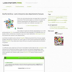
Petit tutoriel rapide sur comment récupérer les données géographiques des départements ou cantons français et les utiliser avec la librairie Javascript D3.js >> Voici le résultat final << Récupérer Nous allons récupérer les données géographiques sur le site professionnel de l’IGN. Ces données sont librement téléchargeables et réutilisables pour vos projets, même commerciaux. Les fichiers récupérés sont au format Shapefile. Transformer La méthode la plus simple que j’ai trouvé c’est d’utiliser l’outil en ligne du site myGeoData. Vector Converter – L’outil en ligne de myGeoData Avant d’envoyer quoi que ce soit, il vous faut créer une archive avec les différents fichiers nécessaires à l’outil pour la conversion. Le fichier .shxLe fichier.shpLe fichier.prjet le fichier .dbf.
VHX.
D3.js. Processing. Accueil. AmCharts, pour les cartes et graphiques : 6 outils gratuits de data visualisation. The Functional Art: An Introduction to Information Graphics and Visualization. Journalisme graphique. Raw.
Animated Information Graphics: Using Data and Motion to Reveal the Story. In this class you'll learn how to create information graphics that use data and reveal stories through animation.

You'll learn how to go from data/reporting to an engaging and animated information graphic. What You'll Learn An overview of the approach to starting with a set of data and assetsFiguring out the story and whats important or interesting about the dataCreating hierarchy of interesting elements and an organizational schemeWriting a scriptCreating the final storyboard We'll also cover things like best practices and some tips to keep in mind as you work on your project.
What You'll MakeStudents will make a storyboard for an animated information graphic. Who This Class is ForThis class is for anyone is interested in data, information graphics, animation and telling compelling stories. Le magazine de la Data : informations, initiatives, projets, applications et perspectives sur la Data en France et en Europe. Open Data Institute. Questions - Askbot: Open Source Q&A Forum.
Viz Index. A comparative risk assessment of burden of disease and injury attributable to 67 risk factors and risk factor clusters in 21 regions, 1990–2010: a systematic analysis for the Global Burden of Disease Study 2010. Background Quantification of the disease burden caused by different risks informs prevention by providing an account of health loss different to that provided by a disease-by-disease analysis.
No complete revision of global disease burden caused by risk factors has been done since a comparative risk assessment in 2000, and no previous analysis has assessed changes in burden attributable to risk factors over time. Methods We estimated deaths and disability-adjusted life years (DALYs; sum of years lived with disability [YLD] and years of life lost [YLL]) attributable to the independent effects of 67 risk factors and clusters of risk factors for 21 regions in 1990 and 2010. We estimated exposure distributions for each year, region, sex, and age group, and relative risks per unit of exposure by systematically reviewing and synthesising published and unpublished data. Findings Interpretation Funding Bill & Melinda Gates Foundation.
STAT. Datavisualization.ch Selected Tools. DataViz: Programming languages, toolkits and libraries. This is part of a series of posts to share with readers a useful collection of some of the most important, effective and practical data visualisation resources.
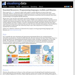
This post presents the range of data visualisation programming languages, toolkits and libraries, sometimes used in isolation, often used in partnership to accomplish specific functions. Please note, I may not have personally used all the packages or tools presented but have seen sufficient evidence of their value from other sources. Whilst some inclusions may be contentious from a quality/best-practice perspective, they may still provide some good features and provide value to a certain audience out there. Finally, to avoid re-inventing the wheel, descriptive text may have been reproduced from the native websites if they provide the most articulate descriptions. Your feedback is most welcome to help curate this collection, keep it up to date and preserve its claim to be an essential list of resources! D3.js. Michael Agar Design. I’m settling down to eat Sunday roast beef and its various accompanying vegetables in my local pub in South London.

Various singletons and couples are reading the ‘quality’ Sunday press; the Independent on Sunday, the Observer, the Sunday Telegraph and the Sunday Times. One couple is sitting nearby. She reads a pull-out glossy magazine, he reads a three page supplement of Obama vs. Romney. The small baby boy is bashing his Yorkshire pudding with his rattle as if it were the most bashable object on the planet. Like Dad, I’m reading all the coverage of the U.S. election, and am enjoying the comment and analysis, the pros and cons, the calm and then hysterical. Having followed American politics rather closely since 1997 — although I have to admit slight Bush-bashing in later years — I don’t really know what to make of this election.
“Rarely has a presidential campaign been as unsatisfying as the one now drawing to a close.