
UI Patterns For Mobile Apps: Search, Sort And Filter. Advertisement As I was waiting for a table at a local restaurant the other day, I flipped through a couple of the free classified papers.
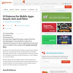
I was shocked to realize how dependent I’ve grown on three simple features that just aren’t available in the analog world: search, sort and filter. AutoDirect and some of the other freebies are organized by category (like trucks, vans, SUVs) but others, like Greensheet, just list page after page of items for sale.
I would actually have to read every single ad in the paper to find what I wanted. No thank you, I’ll use Craigslist on my phone instead. A Three Step Guide to Usability on the Mobile Web. Designing mobile sites is a different kind of web design.
Much like your first experience of designing for the desktop web, it can be both exhilarating and daunting in equal measures. So many possibilities, yet so many usability restrictions. Don't panic, we've been there too. As the guys responsible for maintaining the .mobi top level domain, we work with experts and beginners on a daily basis to help them get the best out of their mobile web strategies. UI Guidelines for mobile and tablet web app design.
Official user interface (UI) and user experience (UX) guidelines from the manufacturers, links to which you can find below, are a source of inspiration for mobile web and app design.
Here, you will find guidelines, samples, tips, and descriptions of common mistakes. Many of the guidelines focus on native application development, but we can apply most parts of them to mobile web design too. Remember to provide the best possible experience on each platform. Do not deliver an iPhone experience to a BlackBerry user. Mobile Input Types. HTML5 inputs and attribute support. BII REPORT: How Location-Based Data Is Making Mobile Advertising Explode.
Redesigning The Country Selector. The country selector.
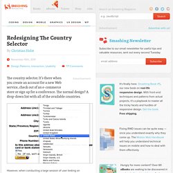
It’s there when you create an account for a new Web service, check out of an e-commerce store or sign up for a conference. The normal design? A drop-down list with all of the available countries. However, when conducting a large session of user testing on check-out usability (which we wrote about2 here on Smashing Magazine back in April 2011), we consistently found usability issues with the massive country selector drop-downs. Jakob Nielsen reported similar issues as far back as 20003 and 20074 when testing drop-downs with a large number of options, such as state and country lists. So, this past summer we set out to redesign the country selector. First, let’s take a closer look at the usability problems of traditional drop-down country selectors. The Usability Issues. Sample Form Submit. Website Prototypes - ProtoShare.
Creating a Seamless Cross-Platform Online Experience for Mobile Users. By Katherine Lynch Introduction According to Google Analytics, in September 2009, the Drexel University Libraries website ( received over 141,500 unique visitors.
ResponsiveDesignGuideFnll0110121.pdf. Mobile Accessibility. Introduction "Mobile accessibility" generally refers to making websites and applications more accessible to people with disabilities when they are using mobile phones.
WAI's work in this area includes people using a broad range of devices to interact with the web: phones, tablets, TVs, and more. This page summarizes existing and developing resources related to mobile web accessibility. Mobile Graded Browser Support. Relationship between Mobile Web Best Practices (MWBP) and Web Content Accessibility Guidelines (WCAG) Abstract This technical report describes the similarities and differences between the requirements in Web Content Accessibility Guidelines (WCAG) and Mobile Web Best Practices 1.0 (MWBP).
Introductory information and links to related documents are in Web Content Accessibility and Mobile Web: Making a Web Site Accessible Both for People with Disabilities and for Mobile Devices. Status of This Document This section describes the status of this document at the time of its publication. Other documents may supersede this document. What’s working in mobile advertising — and what might work in the future. As Mary Meeker, the Queen of the Internet, made clear earlier this year, mobile is on the wrong side of a monetization gap.
While consumers are spending more and more time on mobile devices, advertising revenue there is still lagging well behind traditional online — some $30 billion was spent in online advertising last year in the U.S. vs. $1.6 billion for mobile ads. Ad rates on mobile are 5 times lower than on desktop. Advertisers are expected to chase the eyeballs to mobile, though to what extent and how quickly is unclear. Mobile presents particular challenges for advertisers because they don’t have the same retargeting tools (like cookies) that they have online, the screens are smaller, and ads have the potential to be more intrusive than on the desktop. Personal and Ubiquitous Computing, Volume 15, Number 6. In this paper, we describe research into use of multifunctional mobile phones by working adults and posit the device as a plausible realization of ubiquitous computing.
We investigate how users actively adapt and adopt the different functions in smart phones to suit their needs and lifestyles. Through an interview and diary study, we discover how the smart phone is used in pragmatic and seamful ways, regardless of the interface of the specific phone selected or the particular features available. Abstract. Personal and Ubiquitous Computing, Volume 13, Number 5.
Mobile services differ from other services because of their temporal and spatial attributes.
Mobile services additionally differ from each other in their value-added to the end-user. Some services—such as emailing and voice—are more business oriented. On the other hand, various free-time oriented services are provided in new smartphones, such as imaging and music playback. Touch Gesture Reference Guide. The Touch Gesture Reference Guide is a unique set of resources for software designers and developers working on touch-based user interfaces. The guide contains: 1) an overview of the core gestures used for most touch commands 2) how to utilize these gestures to support major user actions 3) visual representations of each gesture to use in design documentation and deliverables 4) an outline of how popular software platforms support core touch gestures (below).
Download Touch Gesture Reference GuideTouch Gesture Cards. Gestures. Facebook. Tips On Android Usability Testing. Posted on 03/08/2011 in Android App Testing by Mike Brown The following post was written by mobile app tester Chris Polkamp as part of uTest’s “Crash Courses” series. You can read similar posts in the uTest Forums (membership required).
Background: In these days there is a wide range of software, this applies to desktop software, but mainly for web and mobile apps. At the time this course was written there are about 300,000 iPhone apps and 200,000 Android apps. My opinion and experience is that the performance and usability of an app can make the difference. Therefore, it is important for app developers and testers to focus on usability from the very beginning. 5 Simple Tips for Designing Better iPhone Apps. As users shop the Apple App Store looking for new apps to buy, they judge their potential purchases based on design. We’re told early on in life not to judge a book by its cover, but without a way to trial an app, screenshots are one of the few ways a user can judge the quality of it. Since it’s not possible for someone to judge ease-of-use (usability) or code-quality just by browsing the App Store, judging entirely based on design makes sense, and so apps with better design tend to be chosen more often when compared with competing apps.
So how can we design better apps? Well, I’m glad you asked. I’ll discuss five simple tips that will help. 1. When we talk about an app’s design, we’re talking about two main components. Experience design is all about the goals of the app, such as which features to include, and how the user will accomplish those goals. The user interface design is what that experience looks like visually. Image source: MOObileFrames. » Henny Swan's blog. Last June the Accessibility Team at BBC launched the BBC Mobile Accessibility Guidelines.
You can find out more about the background of the guidelines in a previous post. Over the last few months we have taken on board feedback, both internal and external, refined the requirements, revised some techniques and most importantly housed the guidelines in their own prototype HTML app. We wanted to take the standards and guidelines out of their dry Word format so they would be easier to read and use. There’s a lot of information in the document – it covers HTML, Android and iOS techniques after all – plus it has advice relevant to UX, development and editorial so we wanted to find a way to present the information so that it was a bit more targeted to you, your discipline and what issue you are wanting to address. We’ve added an optional feature of offline storage so that you can access them whenever you want regardless of connection.
Thank you. A Primer on Responsive Design. The concept of responsive design—the practice of creating digital experiences that adapt to seamlessly deliver content suited to the device context of the user’s operating system, screen size, or orientation—has been around for quite some time. For a variety of reasons, more companies are now giving responsive design serious consideration. The implications of moving to a responsive approach of creating adaptable designs can seem overwhelming, but the benefits can be significant. For example, one Siteworx customer went from less than three percent mobile page views to over 10% by making their website more mobile-friendly (not even optimized).
When to Consider Responsive Design It’s important to understand how consumption of online content is used and what’s really happening in a responsively designed site. Rosenfeld Media - Content Everywhere Book Site. Input Types: Give Users the Right Keyboard on Mobile Forms. By anthony on 08/23/11 at 10:20 pm Typing is easy for most users when they do it on a computer. But when they do it on a mobile device, it’s harder for them because they can’t see all the keys on a keyboard at once. Most mobile operating systems have designed separate keyboards optimized for specific form field inputs to make users’ lives easier.
These optimized keyboards are there to use, but most developers fail to include the right input types in their code to take advantage of them. Abstract. Smartphones Are Creating New Habitual Behaviors. Design Patterns: Faceted Navigation. A Field Guide To Mobile App Testing. Advertisement. Mobile UI Design Patterns: 10+ Sites for Inspiration. Mobile News is Still Consumed at Home and at Habitual Times. Part of the power of mobile technology is that activity can occur anywhere; in transit, at a sports game, at work and at home. We are no longer tethered by place to the internet. Uncovering Context With Mobile Diary Studies. A Look Inside Mobile Design Patterns - UX Booth. Tsohn-mobileneeds-chi08.pdf (application/pdf Object) Is Mobile Affecting When We Read? Printed media used to allow us to read in the places we found most comfortable.
When you imagine yourself reading the newspaper it’s probably in your favorite chair, at the breakfast table, or at the cafe with an orange mocha frappuccino in your hand. When & Where Are People Using Mobile Devices? Google Testing Smartphone Optimized Icons In Mobile Results. Mobile UI Patterns. Design Patterns for Mobile Faceted Search: Part II. Mobile Web Design: 10 Tips To Better Usability. What are the various screen-control gestures that can be used during a Splashtop Remote session? : Splashtop Remote - Support.
Touch Target Sizes. Best Practices for Mobile Web App Testing, Part I. Seven Guidelines For Designing High-Performance Mobile User Experiences. FaThumb: A facet-based interface for mobile search. 16 Mobile Website Best Practices. Proto.io - Silly-fast mobile prototyping.
Keynotopia: User Interface Design Libraries for Keynote, PowerPoint and OpenOffice. UI Stencils—Android Stencil Kit. UI Stencils—iPhone Stencil Kit. Ultimate Collection of Printable Mobile Sketching Templates. A practical guide to tactical mobile prototyping. Sample Functional Specs - Applications For Good. Usability for Mobile Devices. 5 Can’t-Miss Usability Tips for Mobile Website Designs. 7 usability guidelines for websites on mobile devices. Trackpad - UI Guidelines - BlackBerry Smartphones - 6.
C mobileOK Checker. Mobile user research methods « Researching Usability.